

You know, "The following program is brought to you in living color on NBC." I don't think I'm any great shakes as an artist or renderer, but I do like my coloring abilities. Not so much the shapes there, but the choices. They may not be exactly accurate, but they're very rich and interesting to look at.
Don't you agree Kirk's shirt is a strange and fascinating garment? I think the originals were made of velour, which gives them a thickness and surface texture that comes across as particularly Star Trekian on TV. Nothing wrinkles exactly like a Starfleet uniform tunic. Now that we have Blu-Ray, we can see the nap more in early episodes. The third season seems to have substituted some other material for velour. Also, Kirk's tunic is longer and more tapered to his body. His hair is a little longer, too.
But the point of all this blather is what the heck color was Kirk's shirt in the first two seasons? We like to say "gold," but it's kind of a greenish-gold that sometimes appears yellower and sometimes a kind of off-green (if I can be permitted to create such a thing). The cartoon series gave him a yellow-orange shirt. I've seen art with that corrected to something closer to the live action color, but those never look quite as charming to me. My Mego Kirk definitely had a shirt much closer to yellow.
I read somewhere the Kirk shirt (and by extension, the Chekov and Sulu shirts as well) is actually a color known as tenne. This is an orange-brown that can go so far as to be quite yellow. It worries me. I'm a worrywart about color.
It's probably better to be like the colorists at Gold Key. In the early issues of their Star Trek series, they simplified their lives by making everyone's shirts green, except Spock's.
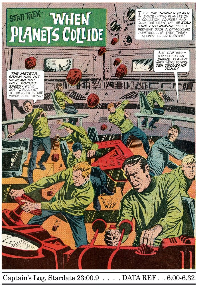 |
| Star Trek #6 (December 1969), art by Alberto Giolitto |
No comments:
Post a Comment