Al Feldstein, who headed Mad magazine, dies at 88
These EC/Mad guys did almost as much to shape my worldview as my parents did. I have to admit I don't know a whole lot about them because I'm not a big biography person. The work and the sensibilities inherent in it, those are the things I pick up on. The EC horror, science fiction and humor books certainly had a sensibility. They weren't just toss-away stories. They had a tongue-in-cheek quality, an overall identity and when you read them, you feel simpatico with the creators in a way you get from more personal works rather than the big corporate stuff.
Well, I do, anyway. I've always felt a meshing of mindsets with the EC crowd, something akin to friendship with their work. Al Feldstein's slickly-lined, somewhat stiff and sometimes even lurid covers were my gateway to a world I understood at once. How could I resist such cleanly-rendered horrors? And Feldstein didn't just draw those covers. He edited the books and wrote stories in them, too. Then he went on to take over Mad after Harvey Kurtzman left and run that book for about a million successful years.
I mean, holy cats, Mad magazine! Jack Davis, Mort Drucker, Angelo Torres, Don Martin!
Anyway, what I don't know about Al Feldstein would fill several libraries of books. I wish I'd been more knowledgeable when I spoke to Jack Davis (the only EC/Mad creator I've ever had any kind of contact with, and it's a memory I'll treasure from a pretty bad year) so I could have asked about Feldstein. But he's encoded in my DNA now.

Wednesday, April 30, 2014
First pass at interpreting the New Mutants as 60s-70s Hanna-Barbera characters!
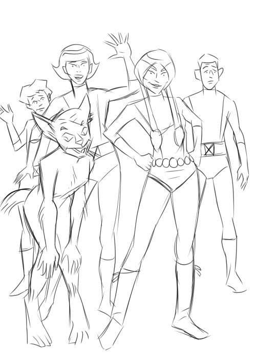
Inspiration struck yesterday and I couldn't rest until I made this image. There I was, teaching English, and I started wondering what the New Mutants characters-- my all-time fave super team-- would look like as 1960s-1970s Hanna-Barbera cartoons. Obviously, Dani Moonstar would be the central character and steal most of the screen-time, and Sam Guthrie would be the clumsy, self-doubting comedic relief, with Rahne Sinclair as Dani's cutesy-pie animal sidekick a la Scooby-Doo and various members of his family. Xi'an Coy Manh would be the mature voice of reason and Roberto da Costa the cocky muscle. Too many uncertain lines and I haven't finished designing Rahne in her half-wolf form. The doodles I did at work were a lot better than this. The first Xi'an I drew had some appealing lines in her face and along the hair flip I didn't quite capture here. That really inspired me to think I could pull this off. How wrong I was!Then again, I did this in about 15 to 20 minutes this morning while eating breakfast and drinking coffee. I'll give it another go this evening and this weekend and see if I can't improve it. Ink it and apply a wash or maybe some watercolors. I'd love for it to come out looking like something found in the HB files, forgotten for years. Again we see there is nothing my imagination can possess which my fumbling art skills cannot take away.
To end on a positive note, I largely avoided tangents (except, most glaringly, Dani's highlights meeting her eyebrows and where her boot fringe meets Xi'an's shinbone), which pleases me, and I really like Sam's body language here. Just a slight slumping of the shoulders conveys quite a bit about his lack of self-confidence without over-selling it.
Re-downloading those Gold Key Star Trek comics inspires this Captain Kirk ink drawing...
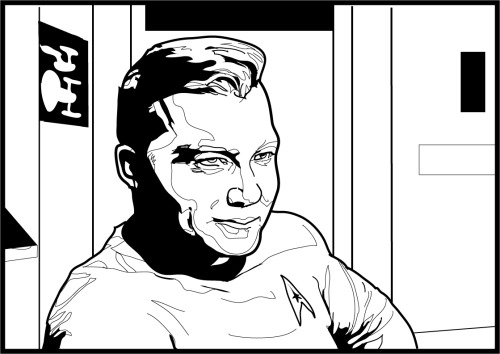
Not really. Actually, it was the other way around. I've been writing about Comixology and drawing lately and working on this drawing reminded me I needed to get those Star Treks back onto my phone. Any excuse for drawing Trek characters, though, is a good one. Grabbing the new Comixology iPhone app requires we download all our comic books again. There are a few series I absolutely cannot do without: Kamandi, New Mutants, Teen Titans and, of course, Gold Key Star Trek. I'd add New Gods and Mister Miracle if they were available. There's one more, but I blog about it elsewhere because it falls outside our mission statement here. It's nice being able to carry around entire runs of Fantastic Four, Uncanny X-Men and Amazing Spider-Man, too.
The first thing I did when I started the app is fill one very important area of it with Kamandi. Yesterday, I started the process of re-acquiring my digital Trek books from IDW. You have two options. One is to purchase the individual issues, which is my preference. Be warned, though-- for some reason the first few substitute the old Checker Publishing softcover artwork for the original comic book covers. Then they start in with the original and very lovely photo-montage covers and-- even better-- the off-model fully-painted ones! The other option is to buy them in little groups as collections. At $11.99 a pop, that's probably the cheaper of the two, but for me, money is little or no object.
Well, even if you think I'm an ass for shilling for Comixology-- I haven't meant to; it's just worked out that way-- please enjoy Captain Kirk wearing something of a smirk. I need to fix his left eye, mouth and chin, but I'm almost as satisfied with this drawing as ol' Kirk here is with himself!
Tuesday, April 29, 2014
Bizarre Dani Moonstar sketch!

Dani Moonstar is upset about something, possibly how screwed up I made her hand. Or maybe it's how oversized I drew her head. Or maybe it's that Superman-type monstrosity in the foreground. I did this as a warm-up before doing a more serious drawing. Strictly linear Sam "Cannonball" Guthrie makes an appearance with either his left arm extremely foreshortened or else his hand swollen to impossible size. Judging by his expression, the latter is very much a possibility. Bored with that, I started copying Alex Toth faces to fill in some space. I like the expression on that guy on the far left: "Why are you doing this? Is it because you hate art?"
A few more words on Comixology...
Okay, so I downloaded and set up the new iPhone app, downloaded a few of my comics to it and gave it a try. Not bad, not bad. I think it's as good a reading experience as you could expect on an iPhone with its relatively tiny screen. Comixology seems to have addressed my main complaint-- the difficulty of getting out of a comic once you're in one so you can read another. This was driving me crazy. Where the heck do you press the screen? I found it a lot easier in the new app.
One feature that's gone is the ability to buy comics within the app itself. I found that out via IDW's website. There's all this new Amazon.com-related info there, none of which I understand. I have a ton of IDW comics on Comixology and I was a little concerned when I couldn't find their listings on the actual website. The ones I've already paid for are still there, so that was a relief. I'll say it again-- buying a license to read comics on your various devices is not the same as buying the actual comics and you're subject to losing access to a lot of books you've paid the same price for as you would a physical copy no one can come confiscate from you.
This is why I haven't invested heavily in old school Star Wars comics on Dark Horse's website, as much as I crave Archie Goodwin-Al Williamson-Carlos Garzon magic. And also those Carmine Infantino-drawn oddities like talking rabbits, Sergio Aragones as a space pirate and whatnot. With the license reverting to Marvel, I have this worrisome feeling the Dark Horse issues will vanish from computers around the world.
So not being able to find single issues of IDW's Powerpuff Girls (one of the best comics to come along in quite some time, but I don't cover it here because it's not archaeological) had me thinking along those lines. Did something happen with the Amazon purchase? I'm at work and can't research this further or look into whether the various parties are working through legal agreements or if I'm just an idiot who can't search Comixology properly. I lean towards the latter. The point is, my stuff is still there. And I don't really care about buying comics within the iPhone app. I can never remember my Apple password anyway!
One plus of the changeover to the new app is the $5 gift card Comixology gave me. And lo and behold, Marvel Monday just happened to have Amazing Spider-Man for .99. This was exactly what I was hoping for. Well, not quite. What I really wanted was Fantastic Four #50 and some more Nick Cardy Teen Titans, but I'm not going to complain because I picked up five classic Spidey issues, four by Steve Ditko and one by John Romita. I love me some Ditko-Romita-John Buscema-Gil Kane Amazing Spider-Man.
Well, the next step is re-downloading everything. You can find all your books in something called the "cloud," which makes me think of magical nonsense spaces and floating castles of pink gingerbread and blue sugar-cream where knights in gleaming armor and ladies in flowing damask fly around on winged dragons, but apparently is just a computer server somewhere.
IDW's got this crazy New Gods Artist's Edition coming out...
Have you seen this monster? I'll bet it weighs twenty or thirty pounds! If you're as big a Jack Kirby nut as I am (and some of you are bigger Kirby nuts because I've talked to you or read your online postings), you're going to want this. Not only does it have Kirby's New Gods stories from issues 1-8 printed from the originals as if they are the originals (notes and paste-ups and corrections and all that secret stuff revealed), it's got fold-outs in full color. Fold-outs of concept paintings and maps
I never imagined the Jack Kirby New Gods Artist's Edition was going to be cheap by any means. It's not. It's $125.00. But it has to be worth it, because from what I've seen so far, the book isn't just full of treasures; it has the potential of being a treasure itself!
I never imagined the Jack Kirby New Gods Artist's Edition was going to be cheap by any means. It's not. It's $125.00. But it has to be worth it, because from what I've seen so far, the book isn't just full of treasures; it has the potential of being a treasure itself!
Sunday, April 27, 2014
A few words on Comixology...
While I've got several bookshelves at home groaning under the weight of trade collections of old comics like New Gods, New Teen Titans, New Mutants, Uncanny X-Men, Tomb of Dracula, Creepy, Eerie and assorted other old school delights, my primary reading source for vintage comics (and new) these days has been Comixology. And despite a glitch here or there and the lack of Fantastic Four #50 and the rest of the Nick Cardy/Bob Haney-era Teen Titans, I'm pretty well satisfied with Comixology.
I carry a huge collection of individual issues around with me on my iPhone. Or, rather, I did until the other day when Comixology retired their old iPhone app in favor of a new one. I only just downloaded it so I can't say if it's an improvement over the old. The old one was a little frustrating when I wanted to stop reading one book and switch to another. Finding the sweet spot on the screen proved difficult and I'd be stuck paging through a comic, back and forth, while puffing out my cheeks or whatever the hell it is I do when I'm mildly annoyed. But it was worth it to have a collection like that at my fingertips, especially when waiting for a bus or riding a train.
Comixology's at-home reading app has vastly improved. The newest reading method beats their older one. When they gave customers the option to beta-test it, I found it more responsive and easier to enjoy because the pages displayed larger. You can zoom way in on panels and really look at the details. Of course, since most of these comics came out in the days of cheap printing on newsprint, and they've been subject to some at-times clumsy restorations, this isn't always the best way to experience them. The guided-view technology is generally well-handled, with panel transitions appearing almost cinematic at times. Guided-view provides zoom-ins for emphasis and scans full-page panels in ways that seem well-chosen. I haven't noticed whoever programs that for any particular book screwing much of anything up as far as reading flow goes, and in fact, for some newer books where the panel-to-panel order can be... er... confusing at best, Comixology has managed to provide a clarity which enhances the reading experience. You know, by actually giving you one when the artist has failed to.
While my preferred way of reading will always be sitting up in bed with an actual book in my hands, turning real pages, Comixology is providing me with a convenient way to tote a lot of books around while also saving shelf space at home. I tend to worry about licensing agreements giving out and since thanks to copyright laws and corporate issues you can't download the comics and store them on your own hardware to preserve what you paid for forever (you're actually buying a license to read them rather than the ownership of the actual comics), but as long as Comixology and the publishers maintain friendly relations and my books stay available, then I have no complaints about the service.
Getting 5 bucks to spend thanks to the iPhone app changeover is pretty nice, too. I just wish I could spend part of it on Fantastic Four #50!
Thursday, April 24, 2014
I present Kung-Fu Frankenstein!
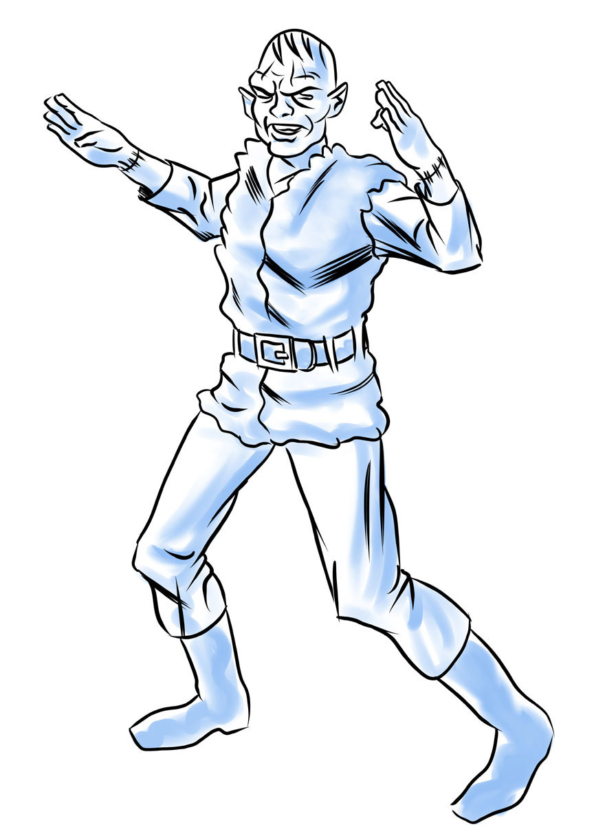
I wrote about this guy the other day, mixed in with some other blather about Kirby knows what. I don't. I've forgotten. Anyway, this is a character I came up with at work last week. I doodled a couple of quick concept drawings, aiming for a kind of Jack Kirby-Steve Ditko-late 60s Marvel synthesis. Trust me-- he looked a lot better in my mind!
I had this idea of mocking up a comic book cover or two from a fictional bottom-feeding type company where the editor-in-chief or publisher saw what was happening at Marvel and it blew his mind. Unfortunately, his imagination wasn't up to the task, and his budget only afforded him to hire guys as talented as I am. These sad circumstances led to this character, a shoddy Hulk rip-off and eventual disaster. I was going to create a whole pseudo-history for the company complete with hack freelancer writers and artists rapidly descending the professional career ladder on their way to destitution. Which, I admit, isn't very funny when you consider this actually happened to real people back then, including some formerly top names.
Still, I was enthused enough with the idea that evening to whip out this more realized concept piece, which proved to me what a terrible idea the whole thing was in the first place. I still like the character and elements of the design, and a quick Google-search revealed there is not already a character named Kung-Fu Frankenstein. Or, if there is, it's not well-known enough to show up on Google. So just maybe I got there first for a change. (UPDATE: Yet another Google search reveals a movie of some kind called Kung Fu Frankenstein and various references to "Frankenstein's Kung Fu Monster." Yes, I know the monster is not named "Frankenstein," but rather its creator; however, I bow to childhood tradition in this matter and imagined my mythical comic book publisher would have as well.)
Which reminds me. This morning I was doing a little reading about Dan Clowes' Lloyd Llewellyn and I made a startling discovery about myself! First of all, Clowes is a legitimate genius of the form. I got into him via Ghost World, like a lot of jerks-come-lately, but when I did, I went whole-hog into his back catalog... as far back as just past Lloyd Llewellyn. Which is why I was curious about it.
Anyway, to end this shambling story, this led me to a Wikipedia search (first resort of the lazy and time-pressed; there are no others) and to the realization my genre is Lowbrow Art. Or "pop surrealism," which is too pretentious for my taste. I realize I'll never be paid to produce art, which is kind of depressing, but at the same time I'm feeling enlightened by this realization. I am affiliated with a movement and now my tongue-in-cheek, vaguely asshole-ish approach to drawing superheroes makes sense. I'm probably not capable of producing straight adventure material, so I'll just have to resign myself to admiring it.
Now this doesn't mean I won't keep trying to improve my art skills. What it means is, I'll probably become more precious and affected, without first having gone through a commercial period.
Tuesday, April 22, 2014
Supergirl versus Darkseid...
Sure, why not? More of my silly art. This is a detail from an early work in progress with a strangely cross-eyed Supergirl. You know, I looked at what I'd done this morning and I felt excited and energized by it.
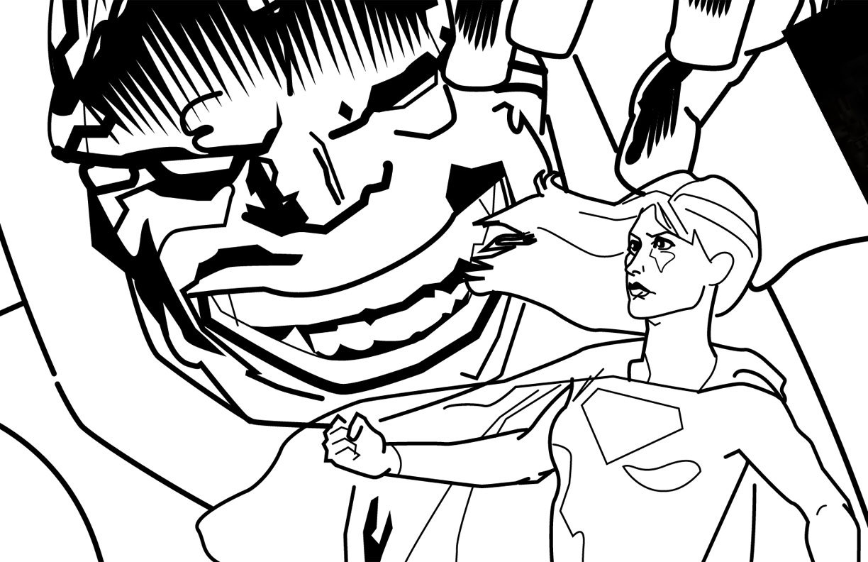
"You're really getting somewhere with this art stuff, baby!" I told myself. "You can fix those eyes and finish Darkseid's face and body and you'll really have something to brag about!"
Then I took a look at it between classes at work and all I saw were a bunch of jumbled, randomish lines refusing to coalesce into an image. What made sense at 6am at the start of the day stood revealed as a potential disaster at 9:30. That was a real downer. Looking at it now, I see it's nowhere near as dire as I thought then, but I also see now I have plenty of work ahead of me yet. My ambition may have exceeded my abilities once again. Lots to fix in order to salvage this one.
Sunday, April 20, 2014
On industry phonies...
Recently I've become interested in comic industry phonies. By that I mean people who lie about professional credits, pretend artists who rip off people with fake art or by taking money for commissions or other work and then never producing, people who set off Kickstarter disasters and the occasional oddball who gloms onto an actual professional then claims the relationship is more than it is. Stuff like that. Some of these people become Internet infamous with a lot of blog entries and message board discussions to keep you busy for hours plumbing the depths of their strange stories. These things are sickly fascinating, but after immersing myself in a number of them, I end up feeling nervous and paranoid about ending up inside one of these narratives!
This is why I'm always careful to characterize myself as the outsider I am. A fan who likes to do fan art and the occasional semi-scholarly analysis or deep reading of the comics I like. I can bring some of my art school and graphic design knowledge to bear on certain things, but for the record, my comic book industry print career consists of having one fan letter published in a Sgt. Rock comic and another in Comic Book Artist magazine. Like many people obsessed with funny books, I once submitted a story proposal to a publisher and never heard back from them. Rejection by silence. But I still love their comics and will continue buying them. Yeah, and since I have these semi-slick drawing skills, I've even thought about trying to do commissions. I'm worried about taking someone's money with good intentions, then not producing their product. I do not want to risk that. Nor would I enjoy getting into legal trouble with copyright laws. I haven't a clue how those things work.
I will, on occasion, on this very blog, engage in some satirical hoaxing. Or rather, I'd like to!
The other day I came up with a character and got this bright idea to write up a story about a low-rent comic book company from the 1960s and their one flagship title that brought them a brief taste of success but ultimately failed, sinking the company in the process. I had this idea I'd create the writer and artist, a couple of marginal types barely eking out a living providing back-up stories here and there finding themselves ineptly riding a short tide of fame before wiping out. I was going to do a cover or two and some panels from the stories, done in a Jack Kirby-meets-Steve Ditko style, which would have been perfect for what I'd planned. Whenever I try to draw like either of those guys (which is often, because they're great and it's fun!), it invariably comes out like the exact kind of amateurish schlock art appropriate for some crap company where the employees could see what was happening elsewhere but couldn't quite match it despite their best efforts.
What inspired this flight of imagination? Thinking up the name, "Kung Fu Frankenstein." Imagine a 1960s where Marvel's success inspires the worst comic book company in the world to try that as a title, complete with a pseudo-Stan Lee "You, the reader!" type rap. This idea enchanted me for about... oh... an hour before I thought, "Jeez, what are you, some kind of idiot?" I drew a character concept, put it on Deviant Art and my Tumblr blog and slapped whatever passes for sense back into my head.
Where was I?
Oh, yeah. Fakes!
What is the purpose of telling lies about yourself? Some of these con-artists actually go to cons and pretend to be artists. They make a few bucks that way. Others may be mentally ill, and if so, they have my sympathy. Some are just inveterate grifters who go from one scam to another because they've become programmed that way by years of practice or habit or messed-up internal wiring. Shoot, I don't know. But telling tall tales about having worked on some comic book as a ghost or something when you haven't is really a pathetic thing to resort to as a claim to fame.
Anyway, spending too much time in these depths can also be depressing. It's much better to spend your time reading the actual comics.
Wednesday, April 16, 2014
On how I'm starting to get into George Tuska...
Did you ever have a comic book artist whose work it took you a while to get into? George Tuska is that guy for me. I've probably seen hundreds of comics with his artwork in them, but never really put much thought into them. For me, George Tuska was the guy who did that Marvel Planet of the Apes adaptation where Taylor looks more like Steve Reeves, the actor from those Italian Hercules movies, than Charlton Heston. And the apes look as though they leaped out of a humor mag. I don't think he was the ideal choice for the material. The typical, dynamic Marvel approach, which Tuska excelled at, is more appropriate to broadly-acted superheroics than rather downbeat sci-fi adventure flicks.
Of course, now I understand Marvel couldn't get the likeness rights to use Heston. Licensing was different back then. Nowadays you see Luke Skywalker, and he's drawn to look exactly like Mark Hamill. Back then, the best artists were allowed to do was to give the characters similar hair color. And sometimes, as with the Apes comic, not even that much. I've also come to love those funny Tuska ape faces. As advanced for their time as they were, the make-up appliances in the movie have a certain rigidity. Actors like Roddy McDowall and Kim Hunter learned to twitch and contort their faces underneath to keep the make-up in some kind of motion and prevent the characters' faces from freezing into masks, but there's no disguising the simple up-and-down movement of the mouths and lack of lip animation. Tuska was able to take some artistic license with them and give the apes all kinds of gaping expressions. None of it is particularly subtle, but it doesn't really have to be. Alfredo Alcala will always be my Planet of the Apes artist of choice, because his ornate work fits the material and matches its melancholy mood. Mike Ploog and Tom Sutton battle it out for second place, but I appreciate Tuska's powerful figure work and over-the-top facial acting.
This morning I read an online exchange between a pro-Tuska writer and a strongly anti-Tuska fan on why Tuska is underappreciated. I've seen more and more of this kind of stuff lately, and the more I'm exposed to Tuska and his work, the more it appeals to me. It's not so much the opinions of others that sway me. It's looking at pages and not being able to deny Tuska produced solid work. It may not be as spectacular as this artist or another-- name any of the greats-- but it's more than just serviceable. And when teamed with a sympathetic inker, Tuska could really shine. The underpinnings are there-- the exaggerated, heroic anatomy, the dynamic poses, the clear and easy-to-read storytelling. A few loose pages I've seen with his pencils and decent ink jobs really look fun and lively.
I've only scratched the surface of George Tuska, but exposure has convinced me to invest some time in Tuska appreciation. Now I just need to read more stories with his art!
Spidey says, "Everything is A-OK!"
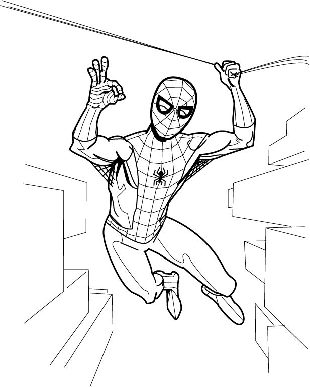
Because he's a big Mercury 7/NASA fan, I guess. This is a drawing I'm working on along with a number of other ones. I'm on fire lately! After drawing Spider-Man enjoying a sandwich, I felt like doing one where he's acting like he does in the comic books. I need to fix the webbing on Spider-Man's costume, make an adjustment to his anatomy here and there and fix the perspective and add some windows and balconies and other architectural features to the background. Then I'm going to give it a John Romita/John Buscema/Gil Kane era color job. I'll never be skilled enough to be one of those real comic book artists, but I do feel I've upped my game quite a bit lately. It's been fun and that's the most important thing.
Wednesday, April 9, 2014
Dude, you're reading a Dell 1: Alex Toth versus The Real McCoys (Dell Four Color Comics #1071, January-March 1960)
Why adapt The Real McCoys into comic form? Why anything? Maybe there were kids all over these great United States who were really into Walter Brennan. Maybe some suit at Dell felt the misadventures of dirt farming hicks was the coming craze like the hula-hoop or rock and roll when he handed artist Alex Toth this assignment. The Real McCoys ran on ABC and then on CBS from 1957-1963, and it's one of those supposedly classic old television programs I've never watched. I do a mean Walter Brennan impression, though. That Dell executive may have been on to something, because they ended up publishing four The Real McCoys books, just two fewer than they did of Rawhide! And Rawhide starred Clint Eastwood as ramrod Rowdy Yates!
Alex Toth produced some treasures for Dell. There's his work on The Land Unknown (you can see a gorgeous, richly textured page from that story at The Comics Journal, illustrating their interview with Dean Mullaney and Bruce Canwell); Walt Disney's Darby O'Gill and the Little People (one of my favorite comics ever and a page from which you can find at the TwoMorrows site along with an interview with Toth himself that appeared in Comic Book Artist #10); Clint and Mac; the John Wayne airplane flick The Wings of Eagles; and the charming No Time for Sergeants, a film which starred Andy Griffith. You remember Griffith. He would later play Sheriff Andy Taylor on his own program for Danny Thomas Productions, the same studio that made The Real McCoys. Those comics are all worth tracking down.
I have no idea how Alex Toth felt about drawing Walter Brennan's bucolic sitcom misadventures, but I don't imagine it was a dream job for him by any means. "Wild Wheels," the lead story in The Real McCoys (Dell Four Color Comics #1071, January-March 1960), the first issue, does feature elements that would play to his strengths. Real human beings doing relatively realistic things, plus all kinds of cars. I know Toth liked to work a bit on the minimalist side, or essentialist, if you prefer. The drawing is in what you leave out, simplify, simplify, simplify, edit yourself ruthlessly. Well, Toth the hell out of these drawings!
Let's take a closer look at a few pages.
Here's, from near the start of "Wild Wheels," we see a Toth interpretation of a Walter Brennan-caused traffic jam (oh, you crazy Grampa!) on a busy freeway. Toth, probably exceeding in a single image the entire The Real McCoys shooting budget for half a season's worth of episode production, turns the top two tiers of the page into one large panel. Toth may not have been giving the art his all, but this page is a shows some of the storytelling techniques he uses to overcome the limitations of the Dell six-panel page format. The eye enters the image at the usual spot, top lefthand corner where Toth places a concrete overpass in stark white, kind of crushes the cars driving along top of it, then leads us down the on-ramp (backwards!) to the busy middle-ground where suddenly we have dialogue balloons and sound effects.
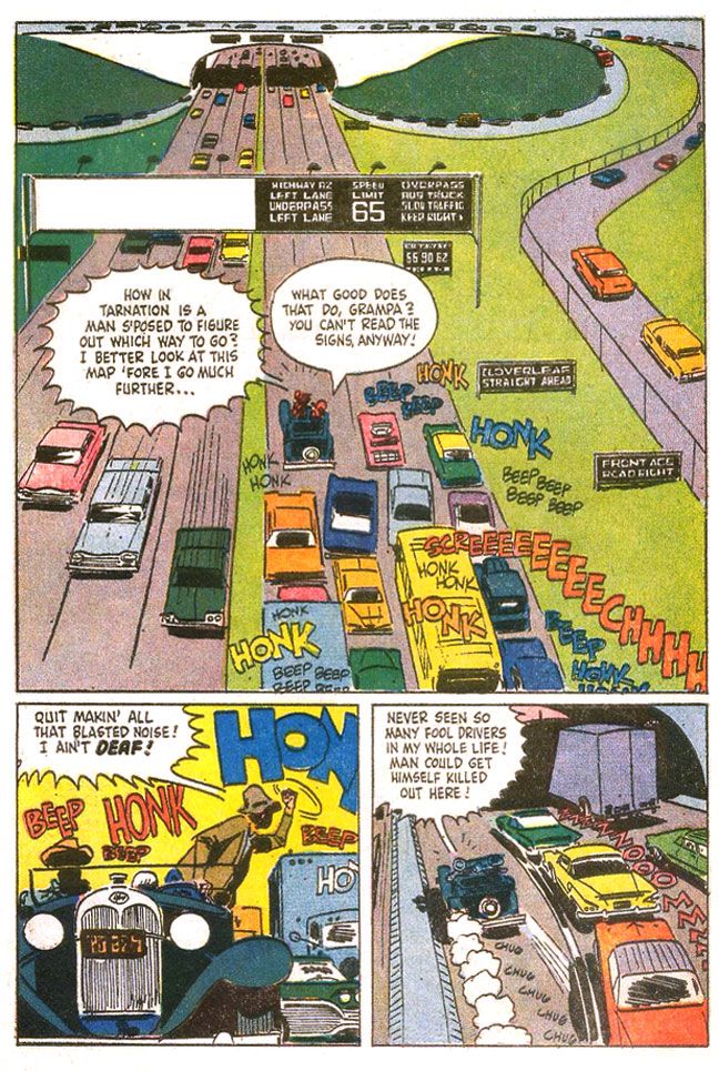
This gives us time to absorb the situation-- the same way a TV show or film might use an establishing shot, then pan along it before introducing the main characters, which Toth does when he starts to speed up the pace and inserts action by cramming all the truly important stuff in the center of the page, in the area that would be the second two-panel tier (although the large balloons break into the top tier area), and just before quick-cutting the action in the two bottom panels.
It also means Toth can fill a page with a minimum of actual drawing. To that end, Toth leaves the grassy median and shoulders as open areas to be filled with green. No Tothian dabs of ink spotted here or there to suggest detail. While I'm in favor of leaving out visual noise, the rendering here feels unfinished.
There are a lot of cars, though, on the lower half of the page. At first, given the overhead angle and one-point perspective, the backed-up cars become an almost abstract suggestion of the typical American automobile, brightly colored rectangles lacking wheels. As we find ourselves in the middle of the action, with a more grounded viewpoint, Toth adds sparse detailing to the vehicles, resolving them a bit more with tailfins and brakelights, but leaving the troublesome in-perspective work of the oval tires simply suggested through quick brushstrokes underneath. Maybe we'd like to see those tires and hubcaps all worked out in proper perspective, but with Toth, even a shortcut like these inky blobs work as undercarriage shadows, as opposed to something a wannabe like I would do, where you'd see it just as ink. Grampa's jalopy with its old-fashioned rounded shapes and circular headlights contrasts sharply with the ultra-modern boxes around it.
The fist-shaking pose isn't particularly original, but I love the skewed "beeps" and "honks," which invoke different volume levels and pitch. One big blue "honk," probably from a truck, a smaller red one no doubt from a car. "Beep" is probably one of those Volkswagen VWs. The hot yellow background contrasts with the cooler blue/gray fore- and mid-ground elements to give this panel a frenetic energy even though everyone's just kind of sitting there because of Grampa. The last panel has a great sense of movement, with the two-point perspective animating the cars into the tunnel, along with the speedlines and exhaust puffs from Grampa's car, which is badly in need of an emissions inspection. The purple-gray highway and the light purple truck passing into shadow and the orange sky-- complementary colors-- also create deep-focus depth, and allow the primary-colored cars to pop.
Other pages throughout show Toth rushed this one. It's not even so much just the uninvolving groups of figures and lack of backgrounds. The linework itself shows a certain lack of precision that comes from slapping down ink in a hurry. It's especially evident on this page, where the cop wears some misshapen sunglasses on his indistinct face and poor Richard Crenna looks as if he's in for some serious sinus problems.
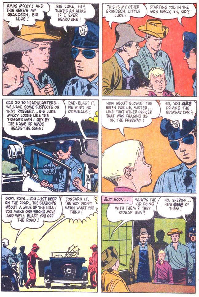
Yawn. The script is uninspired. In case you haven't figured it out, the guys take a fishing trip, but end up mistaken for criminals. I don't know how idiosyncratic the TV show was, but this is the generic kind of thing you could plug any characters from any property into. Even ramrod Rowdy Yates on a horse instead of a junk car. There's a half-hearted attempt at slapstick, but it's borrowed-- the ol' "fish hooks catch each other under the boat" gag used in one of Our Gang's later, lesser MGM shorts, "Three Smart Guys." If you're going to steal gags to liven up a dead story why steal from a stinker? Or maybe they took it from another source. It seems mighty familiar. As if unimpressed himself, Toth doesn't bother with a lot of drawing of nature during this interlude, either. Pine trees that are simply suggested with dabs of angular ink jut from horizontal lines indicating a landscape, but it's curiously under-grown.
Eventually, just before the readers put down The Real McCoys to re-read Darby O'Gill or else fall asleep, Grampa and family end up involved in a car chase complete with winding mountain roads and desperate bank robbers blasting away. Only during this sequence does Toth finally seem fully engaged with the material. Again, this is probably more expensive-looking than The Real McCoys ever got on TV, but how should I know? If I were going to write a script for even something like One Day at a Time for Toth to illustrate, I'd make damn sure I stuck a car chase in there at some point.
Here's a page that makes The Real McCoys as exciting as an episode of The Untouchables.
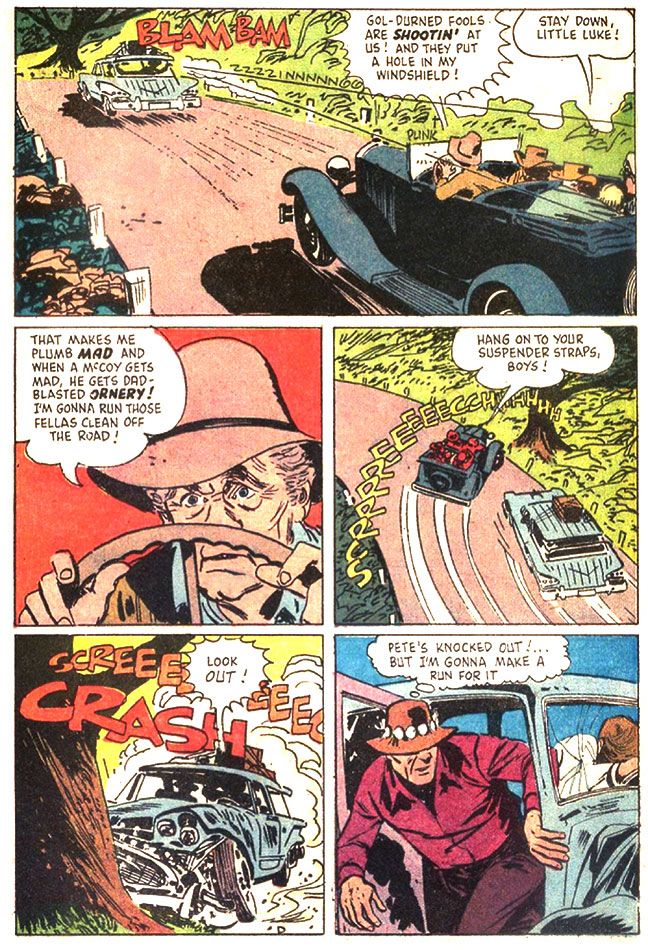
Do you buy Grampa's ancient car being able to pull off such a wicked, professional pursuit-driver level maneuver? One wonders why the bank robbers didn't blast away at the McCoys as they passed. This all seems like a plot contrivance, but Toth does some fine work here. If you look at the third panel, with that improbable stunt, you see the tree the car crashes into in the fourth panel. The tree doesn't just pop out of nowhere. Toth thinks the action through. Excellent placement of sound effects and dialogue, too. It helps set the chronology of the sequence, compressing three distinct moments-- immediate pre-crash break-squealing, a character reaction and then the crash itself-- into one effective panel. Nice Billy Jack hat on that guy in the fifth panel.
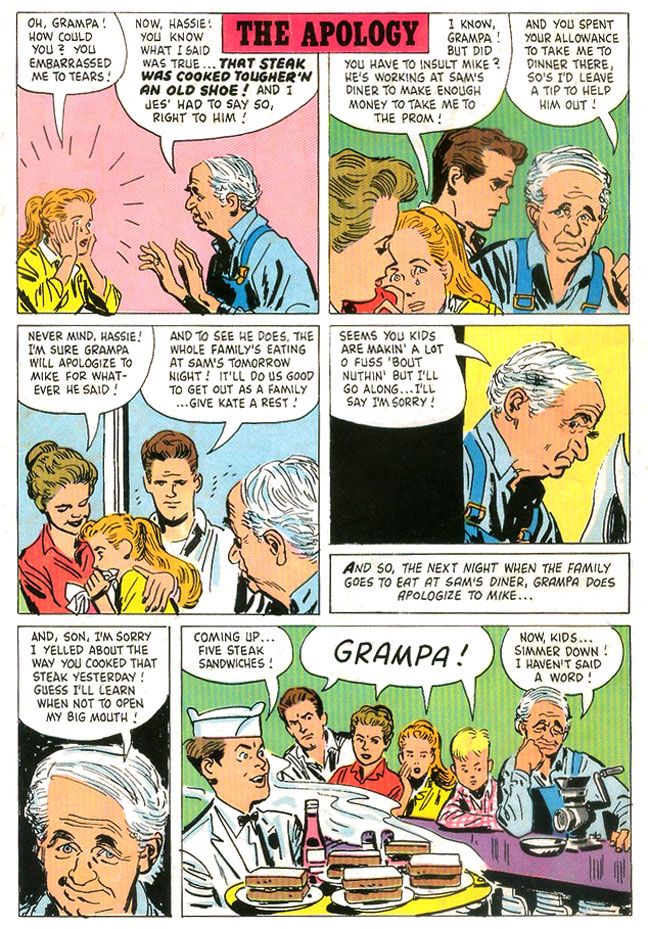
But even on some of the more inert pages, there are still little touches of Tothian brilliance. There's some nice facial acting on Grampa in "The Apology," a one-page gag story that appears on the comic's back cover. I absolutely love the wry expression in the fifth panel in particular.
Alex Toth produced some treasures for Dell. There's his work on The Land Unknown (you can see a gorgeous, richly textured page from that story at The Comics Journal, illustrating their interview with Dean Mullaney and Bruce Canwell); Walt Disney's Darby O'Gill and the Little People (one of my favorite comics ever and a page from which you can find at the TwoMorrows site along with an interview with Toth himself that appeared in Comic Book Artist #10); Clint and Mac; the John Wayne airplane flick The Wings of Eagles; and the charming No Time for Sergeants, a film which starred Andy Griffith. You remember Griffith. He would later play Sheriff Andy Taylor on his own program for Danny Thomas Productions, the same studio that made The Real McCoys. Those comics are all worth tracking down.
I have no idea how Alex Toth felt about drawing Walter Brennan's bucolic sitcom misadventures, but I don't imagine it was a dream job for him by any means. "Wild Wheels," the lead story in The Real McCoys (Dell Four Color Comics #1071, January-March 1960), the first issue, does feature elements that would play to his strengths. Real human beings doing relatively realistic things, plus all kinds of cars. I know Toth liked to work a bit on the minimalist side, or essentialist, if you prefer. The drawing is in what you leave out, simplify, simplify, simplify, edit yourself ruthlessly. Well, Toth the hell out of these drawings!
Let's take a closer look at a few pages.
Here's, from near the start of "Wild Wheels," we see a Toth interpretation of a Walter Brennan-caused traffic jam (oh, you crazy Grampa!) on a busy freeway. Toth, probably exceeding in a single image the entire The Real McCoys shooting budget for half a season's worth of episode production, turns the top two tiers of the page into one large panel. Toth may not have been giving the art his all, but this page is a shows some of the storytelling techniques he uses to overcome the limitations of the Dell six-panel page format. The eye enters the image at the usual spot, top lefthand corner where Toth places a concrete overpass in stark white, kind of crushes the cars driving along top of it, then leads us down the on-ramp (backwards!) to the busy middle-ground where suddenly we have dialogue balloons and sound effects.
This gives us time to absorb the situation-- the same way a TV show or film might use an establishing shot, then pan along it before introducing the main characters, which Toth does when he starts to speed up the pace and inserts action by cramming all the truly important stuff in the center of the page, in the area that would be the second two-panel tier (although the large balloons break into the top tier area), and just before quick-cutting the action in the two bottom panels.
It also means Toth can fill a page with a minimum of actual drawing. To that end, Toth leaves the grassy median and shoulders as open areas to be filled with green. No Tothian dabs of ink spotted here or there to suggest detail. While I'm in favor of leaving out visual noise, the rendering here feels unfinished.
There are a lot of cars, though, on the lower half of the page. At first, given the overhead angle and one-point perspective, the backed-up cars become an almost abstract suggestion of the typical American automobile, brightly colored rectangles lacking wheels. As we find ourselves in the middle of the action, with a more grounded viewpoint, Toth adds sparse detailing to the vehicles, resolving them a bit more with tailfins and brakelights, but leaving the troublesome in-perspective work of the oval tires simply suggested through quick brushstrokes underneath. Maybe we'd like to see those tires and hubcaps all worked out in proper perspective, but with Toth, even a shortcut like these inky blobs work as undercarriage shadows, as opposed to something a wannabe like I would do, where you'd see it just as ink. Grampa's jalopy with its old-fashioned rounded shapes and circular headlights contrasts sharply with the ultra-modern boxes around it.
The fist-shaking pose isn't particularly original, but I love the skewed "beeps" and "honks," which invoke different volume levels and pitch. One big blue "honk," probably from a truck, a smaller red one no doubt from a car. "Beep" is probably one of those Volkswagen VWs. The hot yellow background contrasts with the cooler blue/gray fore- and mid-ground elements to give this panel a frenetic energy even though everyone's just kind of sitting there because of Grampa. The last panel has a great sense of movement, with the two-point perspective animating the cars into the tunnel, along with the speedlines and exhaust puffs from Grampa's car, which is badly in need of an emissions inspection. The purple-gray highway and the light purple truck passing into shadow and the orange sky-- complementary colors-- also create deep-focus depth, and allow the primary-colored cars to pop.
Other pages throughout show Toth rushed this one. It's not even so much just the uninvolving groups of figures and lack of backgrounds. The linework itself shows a certain lack of precision that comes from slapping down ink in a hurry. It's especially evident on this page, where the cop wears some misshapen sunglasses on his indistinct face and poor Richard Crenna looks as if he's in for some serious sinus problems.
Yawn. The script is uninspired. In case you haven't figured it out, the guys take a fishing trip, but end up mistaken for criminals. I don't know how idiosyncratic the TV show was, but this is the generic kind of thing you could plug any characters from any property into. Even ramrod Rowdy Yates on a horse instead of a junk car. There's a half-hearted attempt at slapstick, but it's borrowed-- the ol' "fish hooks catch each other under the boat" gag used in one of Our Gang's later, lesser MGM shorts, "Three Smart Guys." If you're going to steal gags to liven up a dead story why steal from a stinker? Or maybe they took it from another source. It seems mighty familiar. As if unimpressed himself, Toth doesn't bother with a lot of drawing of nature during this interlude, either. Pine trees that are simply suggested with dabs of angular ink jut from horizontal lines indicating a landscape, but it's curiously under-grown.
Eventually, just before the readers put down The Real McCoys to re-read Darby O'Gill or else fall asleep, Grampa and family end up involved in a car chase complete with winding mountain roads and desperate bank robbers blasting away. Only during this sequence does Toth finally seem fully engaged with the material. Again, this is probably more expensive-looking than The Real McCoys ever got on TV, but how should I know? If I were going to write a script for even something like One Day at a Time for Toth to illustrate, I'd make damn sure I stuck a car chase in there at some point.
Here's a page that makes The Real McCoys as exciting as an episode of The Untouchables.
Do you buy Grampa's ancient car being able to pull off such a wicked, professional pursuit-driver level maneuver? One wonders why the bank robbers didn't blast away at the McCoys as they passed. This all seems like a plot contrivance, but Toth does some fine work here. If you look at the third panel, with that improbable stunt, you see the tree the car crashes into in the fourth panel. The tree doesn't just pop out of nowhere. Toth thinks the action through. Excellent placement of sound effects and dialogue, too. It helps set the chronology of the sequence, compressing three distinct moments-- immediate pre-crash break-squealing, a character reaction and then the crash itself-- into one effective panel. Nice Billy Jack hat on that guy in the fifth panel.
But even on some of the more inert pages, there are still little touches of Tothian brilliance. There's some nice facial acting on Grampa in "The Apology," a one-page gag story that appears on the comic's back cover. I absolutely love the wry expression in the fifth panel in particular.
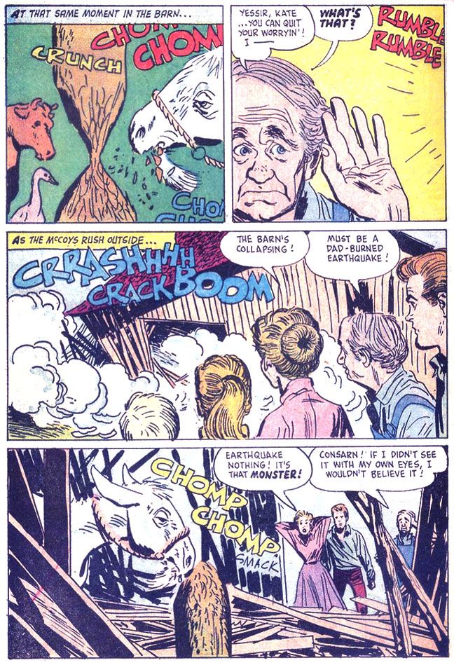
Oh, the second story is about a goat that eats the McCoys' barn. It's not exactly prime Toth, either, but it's the only place you'll ever see him draw a goat eating a barn.
I love the cow and goose in the first panel. The cow in particular wears a dismayed "What the hell?" expression, as if she can't quite process what she's seeing. I hope they weren't injured when the barn collapsed!
Tuesday, April 8, 2014
More imperfect comic book memories: Ants climb the ladder of intelligence and some idiots land their spaceship on the sun...
Years ago, when I was a kid, one of my friends lived on the next street. His house was across the alley from ours, so we used to hang out a lot in our backyards. Either he or his older brother collected all those black and white horror and sci-fi magazines Marvel/Curtis put out back then. I don't remember the titles after all this time, but I do have some vague memories of reading a story about some doomed astronauts who had accidentally landed their spaceship on the sun and couldn't take off again. So they bickered for seven pages, then died on the eighth. My takeaway from this is a feeling of claustrophobia.
I always enjoyed anthology comics, even when they creeped me out or cost me a night's sleep. I rarely bought them, so what I'd do was furtively read them at the store, then put them back on the spinner rack. The perfect crime! Only every so often, my curiosity would cost me. A story would give me a passing chill, warmed by the bright summer day outside. Then I'd forget about it. Sometime after dinner, when I hit the sheets and turned out the light, the story would return, its unsettling qualities magnified by my own imagination.
One such story, which I could have sworn was in the DC book Time Warp, but may have been in the brief early-80s revival of Mystery In Space, featured a luckless space traveler who crash-landed his rocket ship on some desert world where it started leaking some of his nutrient fluid. You know, space food. Whatever our astro-people ate up there where they couldn't get turkey sandwiches or Pop Tarts toaster pastries.
Some space ants started drinking the stuff and would return daily with more and more advanced technology. First, little wheeled wagons. Later, trucks with internal combustion engines. The astronaut, trapped in the wreckage upside down (if I remember correctly, which I doubt), watched in fascination as the ants progressed along our human scientific advancement tree. By the time rescue approached, the astronaut had become the reluctant witness to black-on-red ant warfare, which ended in an atomic blast because the ants had invented the atom bomb. The rescuers chalked it up to the wrecked ship's atomic powerplant blowing up, but the last panel showed them walking away, having failed to notice a teensy-tiny wagon overturned in the dirt.
Or maybe they were earth ants. Or maybe the story was in some Marvel comic or other. Or a Charlton. Or perhaps it never existed at all and I only dreamed it and instead of writing it as a short story and submitting somewhere and making a billion dollars I just gave it away like an idiot. Nah, I'm pretty sure it exists and one day I'll find it and learn the only thing I remember accurately about it is the astronaut. And those others, the ones from the black and white magazine, actually landed on Saturn and had a picnic.
Monday, April 7, 2014
I haven't forgotten you!
We're coming off spring break here, heading into another school year and it's looking to be a busy one. As you can probably tell, I used my recent surplus of free time to work on my art. After a year or more without completing anything of note and confining my drawing to doodles, sketches and experiments, I've once again re-dedicated myself to producing finished pieces. I have this vague dream of eventually reviving my art career in some small way. Back when I was a graphic designer, I had access to tools and time, but when I moved to Japan to teach English, art became just a hobby.
I'd like to reverse that.
Oh, I have no idea where I'm going with this and I've been out of the game so long I don't even know where to start, beyond doing the actual drawings and paintings. Most of the art jobs I see posted online take the form of, "Artist wanted. I'm out to get rich as a famous comic book/children's book/animation person. I've done the easy part and now I need someone to do the difficult, time-consuming stuff I don't know how to do so I can fulfill my dreams. Your work must be of professional quality. Looking for someone with the imagination of Dr. Seuss and the rendering skills of Norman Rockwell, so only send samples if you can meet my high standards. Salary: $0."
Anyway, between my quixotic ambitions and the work I'm actually paid to do, I haven't been spending much time reading or writing about comics. I've got a couple of posts about Alex Toth's Dell work coming up, but you're probably going to find Spider-Man eating sandwiches and crap like that here for a while.
Coming up: More Spider-Man, Supergirl versus Darkseid and Superman versus Batman!
Wednesday, April 2, 2014
Superman versus the Thing (in color)

There! Yet another ridiculous image I've had in my head for a while. I imagine after Superman and the Thing settle their difference, they'll go have a meal or share a drink or something and become really good friends.
Subscribe to:
Posts (Atom)