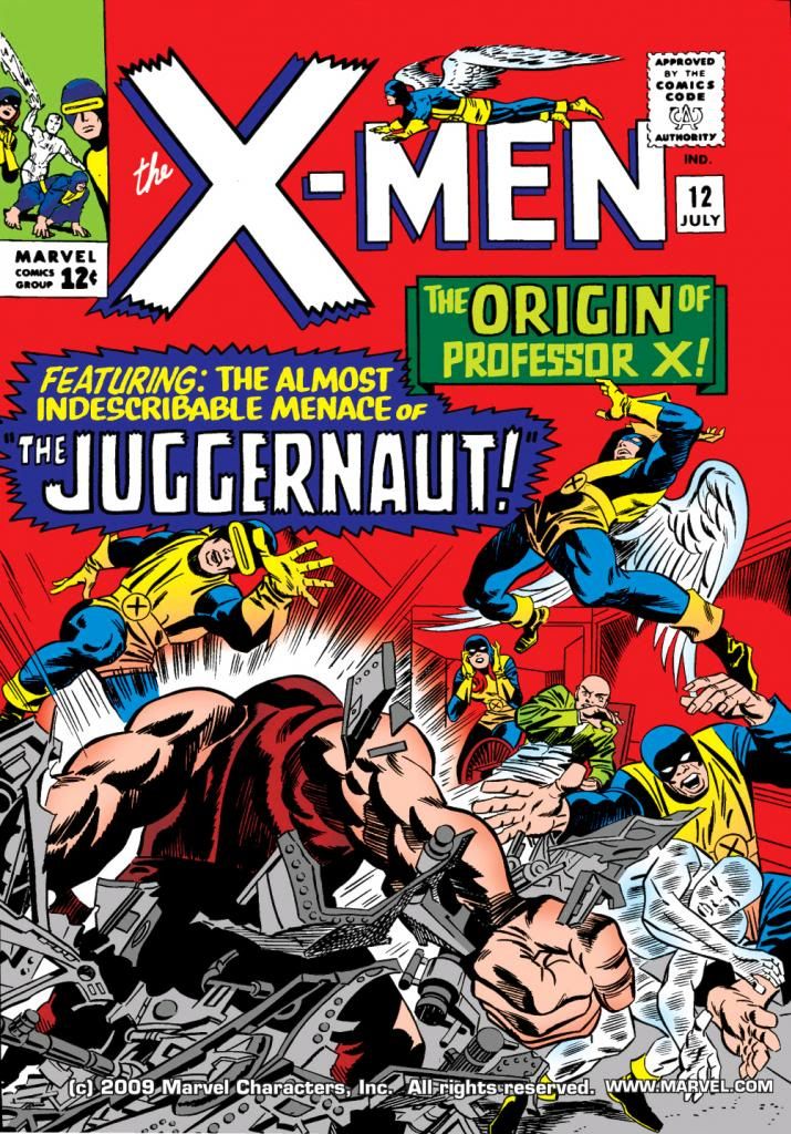
Jack Kirby and Alex Toth are tops of the pops as far as I’m concerned. When I found out Alex Toth penciled X-Men #12 (July 1965), I had to track it down. When I read he did this over Kirby layouts, I grew a little concerned.
You know, the two artists had almost diametrically opposed approaches to the page. Toth practiced an elegant minimalism, with poses largely naturalistic. Heavy black-spotting, cinematic. Kirby drew in a more expressionistic way, his figures displaying emotions and actions at their most extreme. Statue-like figures surrounded by crackling force fields and radiating forces, as if their struggles produce an energy that threatens to consume the paper they’re printed on.
But then I thought, why not combine Toth and Kirby? This kind of artistic dissonance can produce in collaboration an energy of its own, like unstable two radioactive molecules exchanging electrons and we get an artistic nuclear reaction producing a startling, never-before-thought-of beauty. Or, in this case, X-Men #12, a comic book China syndrome. A Three Mile Island in print.
Flash back to 1965. Stan Lee, always on the hunt for artists (a number of DC regulars did Marvel jobs under assumed names back then), gave Alex Toth a call-- or mailed him a letter for all I know-- and offered him an issue of X-Men. I'm no comic book historian, but I think Kirby was spread pretty thin at this point and dropping X-Men to concentrate on Marvel's better-selling titles. But as to why Lee would offer this particular book to Toth in particular-- well, that's for people who know more about the inner workings at the House of Ideas. Suffice it to say, Lee offered and Toth accepted.
So far, so good. As so many other artists had to at Marvel, Toth went to work on pages previously laid out by Kirby, the creator of the Marvel house style. Maybe this was meant to smooth the art transition for the readers. Maybe Toth asked for this arrangement himself. After all, he was used to working from full scripts, not from Stan Lee posing on his desk. To make sure Toth's work became fully Marvel-ized, Lee then assigned inker Vince Colletta, a frequent Kirby collaborator, to...
"Fix" isn't quite the word for what Colletta did. While Colletta certainly has his shortcomings-- a cursory Google search will come up with ample listings of them, especially in conjunction with his inks on Kirby-- nowhere are they more on display than in this ham-fisted job on top of Toth pencils. Gone are the smooth, graceful lines of Toth and instead, we find crinkly, crabby scrawlings, wonky faces and malformed hands galore, plus trange interpretations of light and shadow that show Colletta wasn't quite sure of what Toth was getting at. Toth was known for drawing handsome men and beautiful women. Kirby drew them as powerhouses seemingly carved from stone or molded from steel. The mutants on display in this book are the kind you find preserved in alcohol in dark closets in abandoned madhouses.
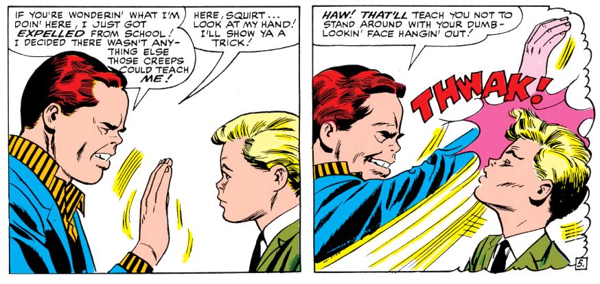
Joe Sinnott might have salvaged this job with his slick line, confident black-spotting and willingness actually to draw with ink and fix proportions, but it's pretty obvious Colletta just isn't up to the task. Check this out:
Lumpy Rutherford-- NOOOO!!! This looks like the worst comic book adaptation of a secret Leave it to Beaver episode ever. That red-haired jerk is Cain Marko, Charles Xavier's step-brother. They don't get along, as you can see. While Cain has a pert Toth-style nose, his hand looks like someone shoved sausages into a latex glove. That's neither a Toth hand nor a Kirby hand-- it's a hand no one bothered to finish drawing.
In Colletta's defense, I really doubt Toth gave him all that much to work with. They'd team together again at DC on Hot Wheels with much better results-- although Toth might dispute that if he were still around. The difference there might have been Toth being more engaged with the material than he is here and unencumbered by another artist's layouts.
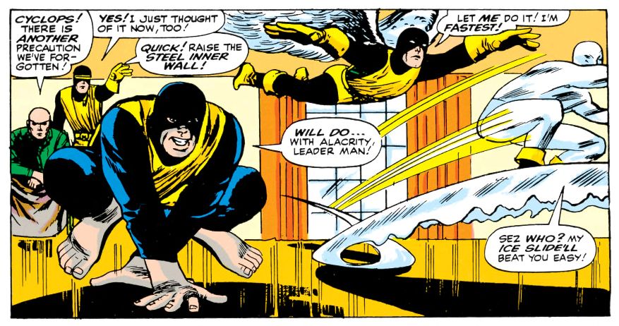
Anyway, a few panels in this book look very Tothian, as if he took his time to really shape the image, but for whatever reason, throughout most of this book Toth appears to have largely traced Kirby's figures without adapting them to his own naturalistic proportions and scale. While he uses a lot of those parallel ray bursts that make the characters look as though they're exploding with strange energy-- but never seems to have reconciled the Kirby approach to these kind of abstracted effects with his own minimalism and Colletta spent about two seconds puzzling them out before slapping down the ink. There's also a chance Toth might not have drawn any of these effects and Lee, dissatisfied with too much negative space in the panels, either added those lines himself or had someone in the art department do it.
Here's another unfinished hand:
Another problem is the color reconstruction is lousy. This comic was never meant to be printed on slick, glossy paper with modern line-screens. Despite a growing serious fandom and popularity on college campuses and with the heads, comics in the mid-60s were still disposable rags printed on the cheapest paper. Lee, Kirby, Toth and Colletta all knew this. This didn't necessarily mean they hacked it out without a care, although X-Men #12 seems to stink of that. It just means they were under no illusions of creating something of lasting impact. They weren't dreaming history here or anticipating bloggers deconstructing every aspect of every panel on one page out of the hundreds they touched that month. They were working to support families or pay alimony and they knew, as professionals, how to get the most out of the shoddy materials they had to work with in the time allotted-- they didn't have the luxury of blowing deadlines like superstar artists of today do-- so the end result, there on the newsstand, would be attractive enough to tempt readers into spending their twelve cents.
People didn't preserve the original artwork-- they had paste-up jobs done on them with glue that soon yellowed or browned, people used old pages to clean brushes or tossed them in files and later shredded them when the company needed more space. I've seen some pages from this job for sale online, but I doubt Marvel spent the money necessary for full access to them in order to start from scratch. What's more likely is they scanned decent printed copies, then used Photoshop to eliminate as much of the colors and old-timey fat line-screens-- a process which also takes away the edges of the black areas and a lot of the fine line work. And, in the case of Colletta, serving to make an already sketchy line quality even sketchier. Re-colored then printed slickly, or blown up on Comixology (which is where I read this), all the original flaws become glaring and a lot of new ones show up as well.
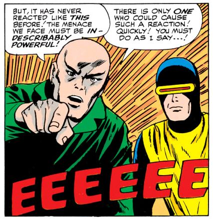
In this case, there are pages where Cain Marko's face appears a bizarre pink as if he's suffering from extreme embarrassment or some kind of disfiguring rash. Poor guy. No wonder he went mad with power when he found the Cyttorak Ruby.
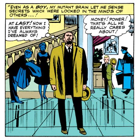
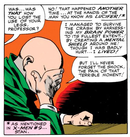
What I don't understand is why Toth took this job in the first place. If Lee wasn't shy about expressing his artistic opinions, Toth was the original let 'em have it guy. He must have looked at these layouts and thought, "Oh balls!" Plus, Xavier's backstory is cliched and melodramatic (although these guys make a pretty good case for it even while pointing out Stan Lee's apparent difficulty with psychic terminology). It's rather talky for a book so packed with characters, too. And, as part one of two, it's all build-up and no climax.
Toth liked to draw airplanes and cars and he was aces on period pieces. Portions of this story take place in flashback, but there's nothing setting it in any particular era visually, and just one sequence featuring a car that looks pretty contemporary to me, a mid-60s model in a scene that takes place sometime in the 1940s. Toth preferred classic Errol Flynn-style swashbuckling heroism, but there's not a single sword-fight anywhere in this story.
My best guess is the Warren and DC jobs weren't coming frequently enough and publishers like Dell didn't pay high enough a page rate, so he gave Marvel a shot in hopes of picking up some much-needed money. I don't know. Who can fathom genius, especially one as mercurial as Alex Toth?
He must have had his reasons because here's Toth working over Kirby layouts. It's not as if Toth never drew superheroes-- we have a classic Flash and Atom team-up from the year before which cuts X-Men #12 to shreds, a run on Black Canary and an often-reprinted Batman story, plus some other gems scattered throughout his bibiography. This should have been one of those.
Anyway, if the lack of any other Toth Marvel work is any indication, Stan Lee wasn't too pleased with the outcome of his little science experiment. Werner Roth would pencil part two, similarly working over Kirby lay-outs with happier results, as "Jay Gavin" before becoming the regular penciller under his own name. Toth would go on to do sterling work in Warren's Blazing Combat, and for DC's horror and war titles in the 70s, but never again would he draw Marvel's heroes for comic books. For TV, yeah. A couple of years later, he did designs for Hanna-Barbera's Fantastic Four cartoon. But we never got to see Toth's take on The Avengers or Doctor Strange. I, for one, would have loved to have read a Toth Amazing Spider-Man or Daredevil. I can't help but think if Lee had just trusted Toth to do his thing-- the way he seems to have let Gene Colan-- and come up with a plot playing to his strengths rather than trying to merge him with Kirby, we might have had a stand-out issue, an oddity nonetheless, but something really special. Maybe it wouldn't have sold, though. Whatever else you can say about Lee, the man knew how to move books.
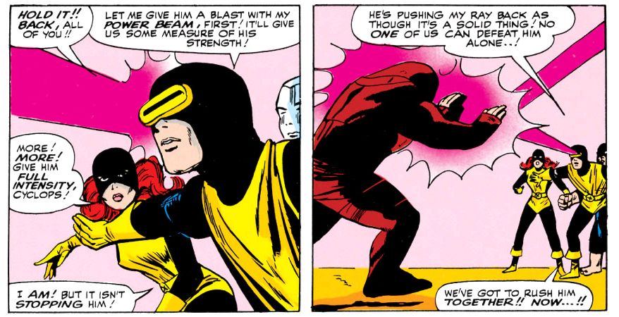
Now if someone can explain to me why Cyclops's famous ruby-red eye beam is magenta.

No comments:
Post a Comment