Sunday, December 29, 2013

Uncanny X-Men #118 (February 1979): Bad New Mutants Go To Japan!

Script: Chris Claremont; Art:  John Byrne and Ric Villamonte

Enjoy this spectacular double-page spread from Uncanny X-Men #118 (February 1979), pencilled by John Byrne and inked by Ric Villamonte.  Maybe Terry Austin was off that month.  Agarashima, the city on fire here, is completely fictional but the visible architecture in Byrne's rendition is plausible enough.

Except for Mt. Fuji in the background.  An online source tells me Agarashima is in Miyagi prefecture, which is way up north along the eastern coast of Honshu.  Actually, that same source reports the city to be "300 kilometers north of Tokyo" and misspells the prefectural name as  "Miyago."  This may be a fictionalized flourish on Chris Claremont's part, freeing him to use his imagination and create a fanciful Marvelized Japan.

Fake Miyago or very real Miyagi, it's a likely location for a medium-sized port city, which is what Agarashima appears to be here.  Mt. Fuji is much farther west, so there's no way if this city resides 300 kilometers north of Tokyo you would see it looming that large in the background because it would be about 500 kilometers away.  I live in a city in the same prefecture as Mt. Fuji, about 116 kilometers away, and even when we can see it from here (it's visible from several vantage points on clear winter days when it's wearing its snow cap), it's only about the same size as my thumb.  So this is more than likely a little artistic license on Byrne's part as well.  We just need some cherry blossoms blown out to sea by the conflagration to achieve perfection.

So, with all that in mind (or better yet, out of it), let's just admire this glorious drawing, huh?  Unfortunately, after this image, there's not a lot of travelogue imagery in this story.  Much smaller panels, and a lot of the action confined to interiors.  By the next issue, the X-Men are on a volcanic island off the coast where they fight a pissed-off nutjob named Moses Magnum, who wants to sink Japan, so we're denied more John Byrne-drawn vistas of late 1970s Japan.  Think what he might have done with Tokyo.  I would love to have seen it.

You know, not on fire.

Wednesday, December 25, 2013

The Roxy "Freefall" Spaulding philosophy of holiday getting...

Gen13 #16; words by Brandon Choi, J. Scott Campbell and Jim Lee; art by Campbell and Alex Garner with Tim Townsend and Tom McWeeney; colors by Joe Chiodo


Season's greetings!  Actually, when I suddenly remembered this moment existed, I was hoping it was within the context more of a holiday-themed Gen13 I could toss at you, but this is the only part of the story in Gen13 #16-17 (January-February 1997) that directly references Christmas.  The rest involves the Roxy, Caitlin and Sarah being captured by a fellow "Gen-active," a genius toy company magnate who happens to look and dress like Max from Where the Wild Things Are and will never grow up.  So he can mate with them.  I'd... uh... forgotten that part.

No, Roxy does not learn a seasonal lesson about how it's wrong to be selfish or that it's the "thought that counts."  She doesn't find out what life would have been like for her friends if she'd never been born.  She doesn't fly off to the North Pole to save Christmas by rescuing jolly ol' St. Nick from his evil twin brother.  She doesn't help recover a small town's presents from the anti-Christmas troglodyte who lives just north of there on the top of a mountain with his put-upon animal companion.

She learns she doesn't like wearing teddies.

Monday, December 23, 2013

New Mutants Winter Holiday Extravaganza starring Dani Moonstar!

If there's anything the New Mutants love more than ostracizing Kitty Pryde or cuddling up together on the sofa with some popcorn to watch Magnum, P.I., it's enjoying seasonal hijinks in the snow.  Let's take a moment to share a few holiday memories with Dani, Sam, Roberto, Rahne, Xi'an and all the rest.

The snow love starts as early as New Mutants #4:

New Mutants #4 (June 1983); words: Chris Claremont; art: Sal Buscema and Bob McLeod

These sequences are useful for showcasing each kid's powers or personality, and for comedic relief.  Outdoor frolicking later helps the team quickly recover from the apparent death of leader Xi'an Coy Manh and welcome new additions Amara Juliana Olivians Aquilla and Illyana Rasputin to the team roster.  Amara shows her holiday spirit by helping plan a surprise party for a moping Professor Xavier.  Did you realize the Xavier School for Gifted Youngsters allows its students to get out of class early during inclement winter weather, even though they both live and study inside the school itself?  I didn't, either.  Here's proof, though:

New Mutants #14 (April 1984); words: Claremont; art: Buscema and Tom Mandrake

We all know how Dani shuns clothing in favor of what Xi'an jokingly calls l'aventures naturelles.  Leave it to the coolest mutant around to don a winter ensemble consisting of assless chaps and a loincloth even as the mercury dips below zero...

New Mutants #17 (July 1984); words: Claremont; art: Buscema and Mandrake

As someone who grew up in the Colorado mountains, Dani has probably developed a greater tolerance for low temperatures, but this is a bit much even for her.  After a quick hallucination as frostbite sets in, it's time to repair to the mansion to warm up with some hot cocoa and possibly a long inner monologue about recent events. 

This next example isn't so much fun and festive as it is moody and menacing.  For Dani, snow isn't just about having fun and walking around half (or wholly) naked.  It's also about undertaking spirit quests.  Here's a dark and troubling page by Bill Sienkiewicz from New Mutants #18, where Dani goes solo against the demon bear that consumed her parents.

New Mutants #18 (August 1984); words: Claremont; art: Bill Sienkiewicz

With Chris Claremont's genius for involving characterization, New Mutants rarely goes wrong when the story focuses on Dani, the best of all its characters.  But what's this?  Looks like Dani's not the only New Mutant trying for a membership in the Polar Bear Club.  Check out Sam Guthrie and Illyana in this slapstick sequence set at a local airport.

New Mutants #29 (July 1985); words: Claremont; art Sienkiewicz

Okay, so they're not just flying around in swimsuits because they enjoy it.  They do.  But more importantly, they're chasing after kidnappers who have just spirited away Roberto and Amara.  This happens while Dani and the others are fighting for their lives in a wartorn dreamscape inside a kid's mind.  No snow there, though, which is why I left it out.

I'd hoped to find an issue with the team decorating a Christmas tree, lighting Chanukah or Kwanzaa candles, with Rahne doing her best Tiny Tim impression and Amara sharing a few Saturnalia traditions, but the only overt reference to a winter holiday comes in New Mutants #38, where the kids attend a party at Salem Center High School.  Dani, despite wearing a sweet party-appropriate black and yellow striped winter coat, decides to hang out in the Xavier school stables with Brightwind, her winged horse from Asgard.  Instead of the ghosts of Jacob Marley and Christmases Past, Present and Future, she gets a visit from what I believe is Thor in the guise of a frog.

New Mutants #38 (April 1986); words: Claremont; art Rick Leonardi and Sienkiewicz

While Dani proves largely impervious to cold due to her upbringing and frequent nudity, her young pal Rahne Sinclair has the natural advantage of being able to transform into a wolf.  Each time she and Catseye (a member of the Hellfire Club's off-brand version of our heroes they call the Hellions), meet, they shapeshift into their "furforms" and go do lord knows what together.

New Mutants #39 (May 1986); words: Claremont; art: Keith Pollard and Del Barras

Around this time, new school headmaster Magneto decides it's better for his charges to become Hellions themselves, which leads to an extended run of issues where practically everyone wears magenta costumes.  And also to conflict with some of the Avengers.  Which, appropriately enough for today's theme, takes place in a scenic snow-frosted wilderness.

New Mutants #40 (June 1986); words: Claremont; art: Jackson Guice and Kyle Baker

But what of the most important of all the kids, Dani Moonstar?  Not wanting any part of this magenta nightmare, she bugs out for her hometown in Colorado where she spends a lot of time...  you guessed it... in a stable with Brightwind.

New Mutants #41 (July 1986); words: Claremont; art: Guice and Terry Austin

I've never been, but I imagine with the Rocky Mountains being right there and all Colorado must have some beautiful winters.  During this particular story, a would-be boyfriend from Dani's past turns up and she has to engage in a fast draw duel with the personification of Death itself to save the guy's life (even though he's a complete creep).  It's your typical "guy likes girl, girl wants to be just friends, guy gets drunk and crashes his truck then goes into insulin shock, girl gunfights Death to save guy's life" story.

As if the Hellions costumes weren't bad enough, the team received their "graduation" uniforms soon after.  Poor Sam gets stuck in a purple and white jumpsuit with some kind of rejected prototype helmet left over from the Robocop pre-production phase and kneepads and Dani, much to her horror, has to wear a top that seems to have been woven from an old carpet Professor X had stored in the mansion's attic.

New Mutants #54 (August 1987); words: Claremont; art: Buscema and Austin

Amara looks like she just came from the Jem and the Holograms concert, or else she's splitting the visual difference between Spider-Man's animated friend Firestar and one of Santa's elves.  But with Rahne providing the perfect fifty-issue bookend by once again knocking over one of her teammates in the snow we've reached an appropriate stopping point.

Happy Holidays and a joyous 2014 to our reader!

Tuesday, December 17, 2013

Fun with search keywords

I'm working on a few new posts, but the holiday season is really kicking my butt so it's slow going.  In the meantime, here are this month's search keywords that tumble my blog on Google, plus the number of views they generated:

1. planet of the apes ape with rifle (5 views)
2. alex toth "bravo for adventure" (3 views)
3. tomb of Dracula comic book (3)
4. alex toth (2)
5. andy grittith cartoon (2)
6. barber shop hair (2)
7. girls from hopey locas (2)
8. golden key star trek comic covers (2)
9. mary blair (2)
10. photos of man sobbing (1)

Interesting.  We've discussed Planet of the Apes a few times here, but never with a particular emphasis on the apes' rifles.  Alex Toth is another popular subject for me, as is Marvel's Tomb of Dracula comic.  The spelling of Andy Griffith is unfortunate, but apparently Google understood.  I love Jaime Hernandez's Locas stories, and Hopey is my favorite character in them.  Mary Blair was a genius and my belief in her genius gained reinforcement from a Disney museum show we went to a few years back that featured a heapin' helpin' of Blair's preliminary designs for different movies, heavy on the Alice in Wonderland.  I don't write about her very often because this is a book about comic books.  Gold Key Star Trek remains a fave.  And the photos of a man sobbing are probably of me every time DC reboots its universe or stumbles into some horrific, self-inflicted public relations disaster.

Since we're approaching year's end, here are my all-time search keywords.

1. cassandra cain (346)
2. batgirl porn (206)
3. alicia Silverstone batgirl (189)
4. roddy mcdowall (169)
5. batgirl boobs (113)
6. claude akins (106
7. dani moonstar (81)
8. harlem globetrotters cartoon (80)
9. cassandra cain tim drake (73)
10. thomas magnum (69)

Lots of Batgirl-related searches.  Two Planet of the Apes searches, unless one is for The Misadventures of Sheriff Lobo.  Did I write anything about that show?  I should do a fake comic book cover for it sometime.  Of course we have Dani Moonstar on the list.  She's my all-time favorite comic book character and I probably reference her once a month.  Even that "thomas magnum" search relates to her.  I'm shocked Isis and Cindy Lee haven't made this list.

Wednesday, December 11, 2013

Heroes on buildings and differing looks/Fighting some tentacles/webbing some crooks/These are few of my favorite Spidey things (artists)...

Editor's Note:  I've really neglected Spider-Man in this blog, and I apologize for that.  I'm about to make up for it with one giant post!  Here we go!

Spider-Man has gone through a lot of artists over the decades, and while his costume basics have remained the same, some artists have taken it upon themselves to tweak the details.  For some people, the Todd McFarlane version of Spider-Man is their favorite.  Huge eyes, lots of weblines on the red parts, really exaggerated insect-like poses and fingers that resemble circumcised penises and feet made out of garden spades.  Some may be into the black costumed Spider-Man.  Or the Ultimate Spider-Man.  Or that guy who dresses like Spider-Man and climbs skyscrapers.  Whatever your taste, Spider-Man has been around long enough there's probably one for you, and that one is more than likely the one by whatever artist handled the character when you first got into him.

I'm pretty damned old, so my first Spidey crush was on what was probably a John Romita Spider-Man on a Mead Trapper-Keeper I had in elementary school back in the late 1970s.  Given the era, it could also have been a John Buscema or Gil Kane drawing.  Actually, it may not have been a Trapper Keeper at all, but a folder or even a notebook.  There's a chance it's the one with the cover to Amazing Spider-Man #135 (which means Romita), but I remember it more as a collage of cover images, which means it could be any combination of artists.

Whichever one it was, and however vague my memory of its specifics, what I definitely remember is how it imprinted in my brain a certain vision of what the ideal Spider-Man looked like.  After all, that Spidey matched up well with the Mego Spider-Man, the Spider-Man on the The Amazing Spider-Man TV series, the one on The Electric Company, the bodybuilder who dressed like Spider-Man at the mall we had our photos taken with and, most importantly, the Spider-Man still appearing in Marvel comics like The Amazing Spider-Man, Peter Parker the Spectacular Spider-Man, Spidey Super Stories and even in the Hostess Fruit Pie ads.  Spider-Man de rigueur for the 1970s.

Then I learned of Steve Ditko from a Dr. Strange story collection. That he was the original Spidey artist meant I had to give his rendition careful consideration in light of its preeminence in Spider-Man history.  Well, it didn't take long for Ditko's vision to take over my imagination.  Here's a typical Ditko Spider-Man.

Amazing Spider-Man #8 (January 1964) Art by Steve Ditko

This is from Amazing Spider-Man #8 (January 1964), touted on the cover as a "Special 'Tribute to Teen-Agers' Issue!!"  Since the character himself is a teen-ager, Ditko's Spider-Man is muscular in a youthful, long-distance-runner way, but isn't quite as classically proportioned as some later versions.  While this isn't particularly a good example of it, Ditko also tends to put heavier shadows in the costume's blue areas, which makes me think his intention is for that part to be navy blue rather than the royal blue the subsequent Spideys sport, or even black.  But given the way comic books treated colors back then, and with all the recoloring and touch-ups in the years since, it's hard to say.  What we can see is Ditko favors larger eyes with heavier black outlines, to emphasize the insect-like aspect of Spidey's mask.  He aso gives Spidey more underarm webbing than most artists-- and it runs from his belt all the way to his gloves!

Using the three-tier page format, Ditko chops action into small increments, which makes sequences more movie-like and easy to follow.  But he also uses mostly medium shots, which keeps the action at arm’s length.  It’s simple storytelling at its finest, and reduces events to something approaching the comic book version of documentary-like as opposed to the heightened or epic.  Spider-Man’s powers may be the one fantastic element in a world Ditko means to represent our own, but he’s hindered by the same things we deal with ourselves and so we identify with him even if we’re not right in his face masking ourselves as him.  With his funky take on facial expressions and body language—with his rough-hewn finishes few of Ditko’s people are blatantly gorgeous—this makes Spidey’s adventures just a bit larger-than-life rather than massive.  There’s our trod-upon hero (literally) coming out from under a door, in the confines of some functional corridor rather than high above a cityscape.

John Romita took over the title when Ditko left, but we'll look at him later because we're doing this in order of what I own.  So keeping that in mind, here's John Buscema's version, inked by Jim Mooney, from a few years later.  We have to acknowledge the influence of Romita's slight revision of the costume, but the rest is Buscema all the way.

Amazing Spider-Man #76 (September 1969) Art by John Buscema and Jim Mooney

Buscema’s Spider-Man (from an issue actually printed within my lifetime!) is muscled like some gorgeous Renaissance sculpture come to life, a full nine heroic heads tall.  Spider-Man, not Spider-Teen.  Buscema puts us inside the action and this time, the entire thing is made up of fantastic elements—other than the (fairly) realistic buildings, but even they’re skewed with deep perspective shots.  By varying panel size and shape, changing point-of-view and enlarging the images so he can fit only four on a page, Buscema creates a heightened dynamism that’s at odds with Ditko’s reductionism.  This isn’t to say one is right and one is wrong.  They may represent differing philosophies or thought processes on what constitutes heroism.  Or maybe Buscema just liked big takes.  Both are totally valid approaches, but I like how Ditko's Spider struggles a bit more.  On the other hand, Marvel tended to push Buscema’s powerful approach to storytelling on us through things like How to Draw Comics the Marvel Way.  This had a huge influence on my tastes as a teenager.
 
I don't see any armpit webbing on this page, but that may be because Jim Mooney forgot to ink it.  They include it on other pages, but it's subtler than Ditko's.
 
As much as I love both Ditko and Buscema, these days my preferred Spider-Man artist is his second penciller, none other than the aforementioned John Romita.  Let's take a look at his Spidey.

Amazing Spider-Man #88 (September 1970) Art by John Romita and Mooney

This is a clever sequence from the September 1970 story, "The Arms of Doctor Octopus!," where, true to its title, Spider-Man fights Doctor Octopus' arms.  Only the arms.  The good Doctor controls them from his prison cell.  Romita's Spider-Man is slightly slenderer than Buscema's, but they share body language.  Romita also brings us inside the action with this two-tier layout.  In the Buscema page, we have three Spideys roughly the same size with a smaller one for variety.  Romita gives us three Spidey sizes:  small, medium and large.  It's not quite as bombastic as Buscema's, but it's still bold.  Romita's characters tend towards the pretty, maybe due to his romance comics background.  I don't think anyone handled the soap opera stuff in Amazing Spider-Man better than Romita.  Slick Mooney finishes keep some surface consistency with line weights and the treatment of Spidey's blue areas.  I haven't seen the pencils for this page or the Buscema one, but I'm going to guess Mooney has a great deal to do with the near-identical eye and web pattern treatments.  The color choices here interest me, but I'm not sure how much is due to the original colorist and what might have been changed in the years since.  Anyway, it works.  Since Doc Ock's arms are gray and wouldn't have popped in the foreground otherwise, notice how the buildings on the Buscema page are gray, but the colorist here used a lot of yellow and yellow-orange.

Also, THOP!  FLAK!  BROK!  And the return of the armpit webbing.  It's finer than Ditko's and only reaches Spidey's elbows.

While I've stated my preference for Romita, I wouldn't care to meet the fan who finds fault in Gil Kane's interpretation.

Amazing Spider-Man #121 (June 1973) Art by Gil Kane and Tony Mortellaro

Here's our first extreme close-up!  It appears in Amazing Spider-Man #121 (June 1973), in a story you may have heard of called "The Night Gwen Stacy Died."  Not sure what happens in that one, and with an obscure title like that, your guess is as good as mine.

But I am pretty sure Ditko, Buscema and Romita all used close-ups before Kane.  But Kane, like Ditko, excelled at facial expressions.  Look at some of his cover work with those giant screaming heads.  Kane puts extreme close-ups to effective use throughout this issue.  Yeah, Peter Parker's face is hidden under a mask most of the time, but the idea's basically the same.  This is an important little moment Kane chooses to emphasize with a cutaway to Spider-Man holding his head because it "feels like a thermometer is about to burst--"  Spidey on this page isn't feeling well, and in his one high-flying moment of web-swinging, Kane gives him wonky body language, then confines him to wall-crawling and slipping in windows and crouching on newspapers.  I like the last panel especially, with the high angle from-behind shot giving us both Spider-Man and the pumpkin bomb he's reacting to all in one shot.  There's a nice use of a missing panel here, with Spidey on the windowsill cutting to Spidey in the room in such a way the omitted leap is implied.  It's almost animated.

No armpit webbing.

Ross Andru, who drew Amazing Spider-Man for five years (impressive!) gives us two superheroes for the price of one, but we're going to ignore Nova and his golden bullet-helmet.

Amazing Spider-Man #171 (August 1977) Art by Ross Andru and Mike Esposito

Once again, we have medium shots and three panels in a row with high angle views, the last with a larger foreground Spider-Man inducing vertigo as Nova drags him through the air.  And then an inset panel with the two of them so high they're tiny to the cops left behind on the ground.  Andru's Spider-Man retains the crouching body language of Kane's, but is noticeably chunkier than any of the ones we've looked at previously.  He's got the Ditko-style dark shadowing on his blue uniform areas (maybe inker Mike Esposito contributed that part), but again, none of the armpit webbing.  Did Marvel abandon that look, or was that an Andru flourish?  It's not as if the armpit webbing has any real function and it wouldn't have worked in the panel with the largest Spidey anyway-- it would have obscured his chest and been a challenging artistic exercise for Esposito, like when a penciller puts speedlines in front of an object.  How do you look through those?  Do they distort the background image?  Just how much of that should remain for clarity's sake, or for simplicity?

Andru came over from DC where he worked on war comics and Wonder Woman.  Can you see any of those elements informing his work here?  I know he did a classic take on Wonder Woman and he's giving us a clean, house-style Spider-Man on these pages.

Oh, and the yellow sky in the inset panel.  That was originally the work of Glynis Wein, who colored a pile of Marvel books.  It reminds me of Harvey Comics.  For some reason, colorists at Harvey seemed to love making the sky yellow.  Here it makes a good depth contrast for the figures heavy on the blue side in the foreground. In fact, whoever colored this seems to have put some extra effort into popping figures by contrasting cool colors on top of warm (although you still have to put up with Nova's yellow arms).  I'd love to see the original printed page to see how accurate Marvel has recreated Wein's colors here.

And there you have it.  Ditko, Buscema, Romita, Kane and Andru.  They're in my Spider-man Hall of Fame.  Yeah, I like the way Ron Frenz and John Romita, Jr. and even John Byrne-- to name three more-- draw the character, but when I think Spidey, I think Ditko, Buscema, Romita, Kane and Andre.  Their versions combine into my platonic ideal of Spider-Man.

Tuesday, December 10, 2013

Wednesday, December 4, 2013

The Worm of Thrace That Makes Things Worse or the Art by Marie Severin That Makes Everything Better

First we're going to talk about 1981's Dragonslayer and the Marie Severin-illustrated comic book based on it, and then I'm going to tell you why I'm including Eddie Deezen (who had nothing to do with the making of either) in this sentence

Dragonslayer is, I suppose, a cult favorite these days.  Maybe it was a little too obvious the spawn of Star Wars (naïve young man on a hero's quest, spunky love interest, old mentor, pre-dating George Lucas but owned by him after May 1977) ever to strike box office riches.  But ten of us like it.  We don't have any cultish rites as yet, but we're working all that out at our monthly meetings that always take place at the stroke of midnight during the new moon period. 

Dragonslayer has so many wonderful qualities, it's long overdue for nostalgia-hungry Internet people to brave its shadowy, flame-scorched lair and bring it forth into the dawn of its new age of popularity.  There are winning performances from Peter MacNicol (later one of the best things about Ghostbusters 2, and an absolute riot as an enthusiastically boneheaded camp counselor in Addams Family Values), Caitlin Clarke and, in the role of wise wizard, Sir Ralph Richardson (doing that Obi-Wan thing Star Wars made a requirement of older British actors in the 70s and 80s).  It has a powerful score by Alex North (a movie music master who also scored Stanley Kubrick's Spartacus and worked on the director's 2001: A Space Odyssey before Kubrick decided to use classical pieces).  Not the least among all these estimable qualities is its dragon, the mighty Vermithrax Pejorative, brought to fierce, fiery life by Phil Tippett and a lot of talented special effects geniuses at ILM through the magic of their "go motion" process and some full-sized body parts.  Vermithrax Pejorative is the movie dragon by which all others must be judged and found wanting.

The story takes place in the Dark Ages (which weren't really as dark as modern myth makes out; we prefer to call those days the early Middle Ages).  A kid named Galen is a sorcerer's apprentice and Urland, a nearby kingdom, has a nasty dragon infestation consisting of our friend Vermithrax and her babies.  The king there has instituted a lottery whereby they randomly choose a maiden to dress like a bride and feed the dragon.  As in, the dragon feeds on her.  A deputation from Urland comes to visit Galen's boss, the renowned wizard Ulrich.  A mouthy boy Valerian in the party turns out to be a spunky girl in disguise and it's not long before she and Galen are making goo-goo eyes at each other.  Eventually, the youngsters have to confront Vermithrax and put an end to the death and destruction even if it means also eliminating the last vestiges of magic and fun in the world.

Let's wait for a minute or two while pop culture rights itself and this movie gets the acclaim it deserves.  There.  Now Dragonslayer has ascended to its rightful place as one of the great films.

After striking riches Jed Clampett-style with its 
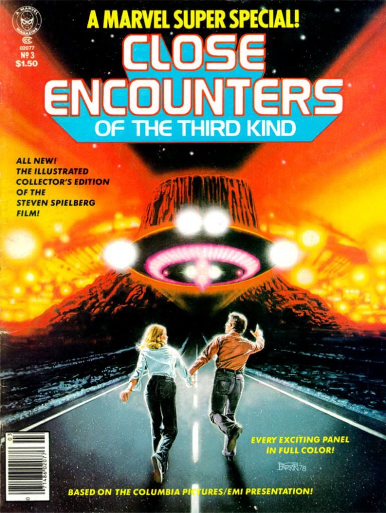
Star Wars adaptation, Marvel wasn't about to let any other comic company join in the fun and profit so they started licensing practically every sci-fi or fantasy movie out there and releasing them in deluxe magazine format they called the Marvel Super Special.  The bigger, prettier print jobs favored instant classics like my beloved Close Encounters of the Third Kind and the lushly beautiful Archie Goodwin-Al Williamson adaptation of The Empire Strikes Back


This also led to some really strange and wonderful comic freakshows like Marvel Super Special #17:  Xanadu, the Illustrated Story.  Imagine that-- a whimsical Olivia Newton-John musical as a comic book!  I guess having missed out on the Grease lucre really burned Marvel's collective bums.  Too bad Xanadu became a notorious flop as a film and an oddity of a comic book. 

Dragonslayer, on the other claw (whoa, steady there, boy, don't get too stupid too fast), was a natural choice to make into a comic.  For one thing, it has few, if any, song and dance numbers to translate into pen and ink and scattered prose.  And for another, witness Marvel's success with fantasy properties like Conan the Barbarian, Kull the Conqueror and Red Sonja.  Conan was making semi-regular appearances in Marvel Super Special and Marvel had previously devoted three whole issues to their homegrown Doug Moench fantasia Warriors of the Shadow Realm, also known as Weirdworld.

Denny O'Neil's charming script hits the proper story beats, as expected.  But what O'Neil also does so well is illuminate the film's underlying themes of changing ages.  He doesn't miss the subtle tragedy of both Ulrich and Vermithrax being the last of their respective kinds.

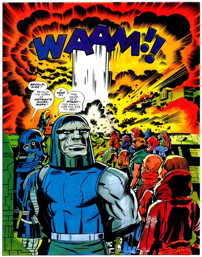
But here's the best part.  Marie Severin is an absolutely inspired choice for art duties on Dragonslayer.  Among her many scattered Marvel art jobs penciling and inking characters like Namor and Spider-Man, Severin had already provided interiors for Marvel's Kull comics, and covers for that series and Conan the Barbarian.  Strong prep for Dragonslayer.

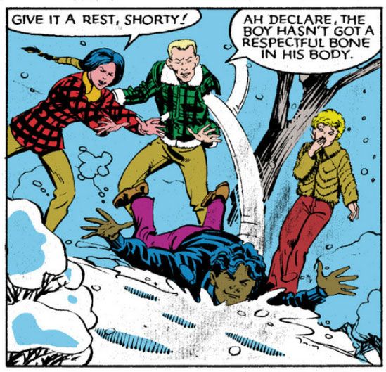
This art is pure joy.  Maybe it's due to her humor comics background, but Marie Severin absolutely aces the "acting," which I find many artists ignore or else botch completely.  In comics, true masters of acting are rare.  Comic book artists tend to pose their characters in weird, inhuman ways with every muscle tensed rather than develop unique body language.  And blank expressions when nothing much is happening, or downcast eyes when characters feel sad, or clenched teeth with neck tendons and veins bulging to the point of bursting for every other emotion.  Big, simplistic takes on big, simplistic feelings.  There are action scenes and plenty of screams and curses in Dragonslayer, but there are also a lot of moments where quirky people simply talk to each other.  If the characters turn into blank-faced nothings seemingly reproduced from clothing store mannequins, readers miss out on the mood and character personalities.  An artist is responsible for this stuff, too, not just the punches and kicks.

On Dragonslayer, Severin takes time to draw individual expressions and well-observed poses for every character on the page and really brings them to life.  Especially vivid is the unearned cockiness Galen displays right before the king tosses him in a dungeon as a big phony.  But even the kids Galen entertains at a celebration each have unique facial expressions that tell us what they're thinking and enrich the moment.  Some are delighted, some are a bit more dubious.  Are they important?  Maybe not, but Severin apparently felt it was necessary to go above and beyond, and I applaud.


She also does a lot to build the world these people inhabit.  Aided by some ornate inking by John Tartaglione, Severin packs the pages with images that recreate in two dimensions the film's funky, lived-in production design.  Dragonslayer's Dark-- er-- early Middle Ages were not those of fairy tale or chivalrous legend, despite the scaly menace of Vermithrax and the magical story elements.  It's more like the one from Monty Python and the Holy Grail:  dirty and smoky, with tumble-down castles falling to ruin.  Especially spectacular are the pages inside Vermithrax's lair-- Severin colored the book as well, and the lighting effects she manages on these pages raise the room temperature.  You can almost feel the heat and smell the stink of burning oil and sulphur. 

The only flaw in her storytelling is she tends to minimize Vermithrax.  We get one massive head as the dragon glares at Galen but for the most part Severin confines the great beast to smaller panels.  A full-page panel of Vermithrax in flight, spewing flame, would have been perfection.  As if to make up for that, Severin and Tartaglione do a knock out job on Vermithrax's baby dragons.  Valerian calls them basilisks, but I prefer the term kittens.  Dragon young should be called kittens.  The artists render the dragon kittens in loving close up so we get to see every bump and scale. 

Anyway, it's a good looking book.  The Earl Norem triptych cover pretty much sums up the magic that is Dragonslayer.  Maybe if they'd used it as the movie's one sheet it might have fared better at the box office.  Or not.  Such visual riches shouldn't be hoarded and hidden away by dragons-- it needs a reprinting at once.  Casiordorus Rex demandeth it!  Snap to it, people!  Chop chop and lickety-split!  Handle it, Roy, handle it!  Handle it!   As long as there isn't a joyless, rote, CGI-heavy remake with Sam Worthington as Galen and Megan Fox as Valerian.  Or some CW Network refugees.  There's no way some sullen-faced former underwear models could compete with the charms of MacNicol and Clarke.

Okay, back to Eddie Deezen.  Dragonslayer director Matthew Robbins also directed 1978's Corvette Summer, the movie where Mark Hamill builds a custom Corvette Stingray only to lose it to a sleazy auto shop owner/car theft ringleader played by Kim Milford, who essayed lead schlub Billy Duncan in Laserblast, a low-budget sci-fi revenge flick (mocked impressively by Mystery Science Theater 3000 at the end of its seventh season).  Laserblast is where Eddie Deezen made his film debut. 

Marvel Super Special #4 The Beatles Story is a comic book biography of those four lads from Liverpool.  Eddie Deezen knows more about the Beatles than you and I put together ever will.  Eddie Deezen turned down a role in the Bill Murray-starring hit Meatballs for a part in the John Belushi-and-Dan Akyroyd-starring flop 1941.  Eddie Deezen voiced Mandark on Dexter's Laboratory


The Beatles, Marvel Comics, Laserblast, Corvette Summer, Dragonslayer, Dexter's Laboratory:  they all come around in the end to Eddie Deezen.  We like Eddie Deezen as much as we like Marie Severin.

Thursday, November 28, 2013

Close encounters of the mail order kind starring Marvel Super Special #3: Close Encounters of the Third Kind

Bob Larkin painted the cover for Marvel Super Special #3: Close Encounters of the Third Kind (1978) and it's typically gorgeous work.  Larkin worked in bold, vivid colors.  Larkin wasn't painterly or as dynamic as as his stable-mate, Earl Norem (they both contributed memorable covers to Marvel's Planet of the Apes black and white magazine).  Larkin favored a sharper finish, not quite photorealistic, but startlingly close enough for a kid in the 1970s who wanted to see what his favorite superheroes would look like if they came to life. 

I don't know who the key figures on this cover are.  Let's call them Not Quite Richard Dreyfuss and Sort of Melinda Dillon.  I seem to remember in those days you couldn't always get the licensing rights to do exact likenesses of actors, so Larkin flexed his screen-accurate art muscles on the UFOs and the cosmic light show around the Devil's Tower in the background, which they apparently could get the likeness rights to.  Just kidding.  Everyone knows the Devil's Tower is in the public domain.  No wait, actually I own it.  I'd forgotten momentarily, but I'm pretty sure I have the papers around here to prove it.  Please send my back payments, Mr. Spielberg and the new ownership of Marvel.  Thank you.

The point is, when you find a copy of Marvel Super Special #3 for yourself, you end up with this Bob Larkin painting that will knock out your eyeballs with its startling beauty even if he had to settle for brushing in a couple of stand-ins for the movie's real stars.  And inside the book, you get an Archie Goodwin adaptation of one of the prime 1970s blockbusters-- second in our youthful instant-classics pantheon in those days to a little flick called Star Wars (and Close Encounters is in every way the superior work of art even if its pop culture cachet has never equaled that of its cinematic big brother)-- over Walt Simonson pencils and Klaus Janson inks.

Script: Archie Goodwin/Pencils: Walter Simonson/Inks: Klaus Janson/Colors: Marie Severin

Think about that for a moment and ask yourself, "Was this magazine worth the $1.50 they charged for it back in 1978?"  Admittedly, it's a silly question we can only answer in the affirmative.  Resoundingly so.  I paid slightly more for mine and now I'm going to bore the hell out of you by telling why.  First, we have to time travel back to 1979 or 1980.  We either had Jimmy Carter or Ronald Reagan in the White House, or maybe in some alternate universe, both fused into a two-headed creature that could never come to an ideological agreement with itself, and so ran around in circles before collapsing exhausted in the Lincoln bedroom, panting and begging for an end to its misery. 

In our reality, this was before the direct market, or at least its earliest days, and before my town had anything resembling a comic book store.  We had to get our comics at bookstores, convenience stores, pharmacies and the occasional gas station.  None of those places would reliably stock oversized comic book magazines.  And back issues?  Back issues were what your big brothers or their friends gave you when they were finished with them, and my brothers and their buddies were all sports playing guys into muscle cars, funk music and girls, not comic books.  I once received a hand-me-down Weird War Tales from one of these cool dudes-- instead of a beating-- and it was one of the happiest days of my life.

Script: Goodwin/Pencils: Simonson/Inks: Janson/Colors: Severin
So I didn't even know a Close Encounters comic existed until almost a year or so after they printed it.  There used to be this mail order outfit called Heroes World.  Marvel eventually took them over, but in the 1970s and early 1980s, they put ads in comics for things like Mego action figures and those huge "Treasury Edition" magazines both Marvel and DC used to put out.  One day I was reading some comic or other-- probably Micronauts-- and my eyes landed on a list of Marvel Super Specials and there it was, a comic based on one of my favorite movies at the time. 

We didn't have DVDs or even VHS then, so the only way to repeat the experience of movies you loved when it left the theaters was to buy comic book adaptations, or novelizations (or the occasional Foto-Novel), then wait for ABC to buy the broadcast rights.  I already had scattered issues of Planet of the Apes, Star Wars, Battlestar Galactica and this huge King Kong magazine from either Gold Key or Whitman.  This meant I had to add Close Encounters to my film comic library.  You're looking at me as if I had a choice.  Trust me.  I didn't.  I can't remember how I got the money, or the exact price (although $2.25 plus shipping and handling comes to mind), but I do remember it took forever to come in the mail.  So long I assumed I'd been ripped off, which happened to kids sending money to companies that advertised in comic books from time to time.  Then it came in a cardboard envelope and I was not disappointed.  In fact, it not only impressed me as a story but it also changed the way I thought about comics.

First of all, it accurately recreated the movie experience in a way no film adaptation had for me before.  Star Wars was fun, Battlestar Galactica adequate.  Close Encounters topped both.

It didn't matter that the inside wasn't photo-realistic, or that we wouldn't have Dreyfuss, Dillon, Teri Garr or even Francois Truffaut going through their motions.  Despite Marvel's inability to score the license for the actors' likenesses, Simonson and Janson occasionally came litigiously close enough as far as I was concerned.  I can imagine other kids reeling in disappointment when they first laid eyes on the off-model Roy Neary carving his mashed potatoes into a lumpy hill while his stunned family looks on in panel designed specifically by Simonson to showcase their growing emotional distance from their troubled husband and father by isolating them in a flat black space.

I was relieved Simonson and Janson at least got his "type" right.  After all, George Tuska's Taylor in Planet of the Apes looked more like screen Hercules Steve Reeves than screen Ben-Hur Charlton Heston.  At least the comic book Dreyfuss wasn't nine heads tall with a physique out of a Renaissance fresco.  The Truffaut character, on the other hand?  I still don't know who that hawk-nosed guy resembles, but it's not the man who directed The 400 Blows.  But he is a relatively minor part of the story and on-panel just a few times in the comic, so I gave Simonson and Janson a pass there, too.

Script: Goodwin/Pencils: Simonson/Inks: Janson/Colors: Severin

As far as the other visual elements go, Simonson's panel layouts and sequential moments are some of his most cinematic storytelling in a career full of the stuff.  You can tell he was just as enthralled with the material as anyone buying this book would have been and he gives it his all, what one of my brothers' baseball coaches would have called "110 percent." I say it's more around 150 percent.  Simonson exaggerates body language a bit striving to match the film's emotional beats, but he also does these action-to-action panel sequences that transpose Spielberg's framing and pacing to a static page as well as any artist I've seen.  I wanted my usual superhero fare to duplicate these kinds of panel-to-panel action transitions as well, because it meant something closer to the way we perceive time than the usual dynamics and poses with speedlines.  This was my introduction to that sort of comic storytelling years before I ever heard of guys named Eisner, Krigstein, Steranko or Kojima.

Sometimes I'm not so keen on Klaus Janson's heavy-handed inks, but he and Simonson are matched well here, and the way he treats lighting in this book hasn't been equaled, at least not in any comic I've seen.  This is of utmost importance when dealing with Close Encounters, because light is practically a character in the movie.  People mock J.J. Abrams and his supposed lens flare addiction, but Steven Spielberg had cinematographer Vilmos Zsigmond practically paint the screen with light, and Janson follows suit, especially in the climactic encounter where he manages to do something I would have considered possible-- make static drawings look not simply like dazzling lights, but moving ones as well.  Seriously.  Janson manages to mimic moving lights with inked lines.

In his afterward (which I read as often as I did the comic part), Goodwin cheerfully explains some of the concerns a writer has when adapting from one medium to another.  You don't get a soundtrack when you read a comic, so Simonson came up with all kinds of innovative ideas for full-bleed artwork and panel arrangements to try and capture a bit of the John Williams magic.  There's also a problem with timing jokes.  In the movie there's a funny bit involving gas masks and Goodwin and team duplicate it, eliciting almost as much laughter from me reading it as the movie did when I was watching it.  Goodwin also takes time to praise Marie Severin's coloring job, and it is indeed first rate.  She really shows what a colorist can do with the limited and flat palette available in those days.  And so Goodwin gave me my first lesson in writing for comics as a craft, and the kinds of things pencillers, inkers and colorist do as well. 

Up to that moment, I had been used to experiencing a comic as simply a thing unto itself.   Words, pictures, colors make a story as if by magic.  I knew artists' names because I loved to draw, and had a vague idea of what went on behind the scenes because I read Marvel's Bullpen Bulletins and the editor's messages in DC's books, too.  But in an essay probably shorter than the one you're reading now, Goodwin educated me on a writer's responsibilities and how the artists actually thought about what they were doing and planned images for effect.  I also learned the word "onomatopoeia."  A comic didn't just poof itself into existence.  People like Goodwin, Simonson, Janson, Larkin and Severin made them with their minds, their hands, their talents.  Knowing that didn't take away any of the wonder of reading a comic book.  It added to it. 

More than thirty years later, it still does-- no matter who the writer or artist or colorist is-- and I will always have Archie Goodwin to thank for that.

Monday, November 25, 2013

X-Men #101: Phirst Phoenix... and Wolverine gets all wiggly?

Uncanny X-Men #101 (October 1976) brings a bruised and battered group of X-sters back from a mission into space.  In the preceding issues, they'd taken a Starcore space shuttle-- accurately drawn for the most part (as was the Harrier jet in X-Men #94) by Dave Cockrum, even though NASA's real thing wouldn't get off the earth for another five more years-- to an orbiting space station (nothing like anything anyone's ever put up there, but still pretty cool) where they fought Stephen Lang (or, as some authorities have it, Steven Lang).  Lang is human, but more than that, he's a complete nutjob who hates mutants the way lions and hyenas hate each other. 

Maybe even more so, because Lang stoops to murdering even a non-mutant USAF officer who calls him out on just how insane his schemes are and lions and hyenas only kill each other in their feuds.  I can't think of a single lion who went so far as to bump off a leopard for telling him he's gone around the bend with the anti-hyena robot building enterprise.  Lang captures the team and forces them to fight for their lives in space.  It takes a couple of issues, but the good guys eventually prevail and, on the way home, fly through a solar storm.  Only Jean Grey (or Marvel Girl as she was known then) can pilot them safely back. 

The intense radiation, depicted psychedelically by Cockrum, triggers Jean's transformation into Phoenix, the all-powerful.  But let's let Chris Claremont tell us what the new Jean Grey is all about as only he can:

X-Men #101, script by Chris Claremont, art by Dave Cockrum and Frank Chiaramonte

Ahhhh!  My, that's some good Claremont.  "I am fire!  And life incarnate!" has always struck me as a characteristically Chris Claremont phrasing.  This may be because he was the guy who taught me the word "incarnate" in the first place.  It's certainly not a word one slips into everyday conversation, at least not when I was a southern kid and living in my childhood home, where people were letter carriers, school secretaries and baseball players, not all-powerful mutants.  And so this is the exact moment "incarnate" entered my vocabulary.  To me, "incarnate" and "eldritch" are forever Claremont words, and when I read them in other comics, I always assume the writer has stolen them from Claremont's run on Uncanny X-Men.  And by shouting this phrase, Phoenix lets us know she's here, she's for real, and readers look out!

This is the issue where Claremont found his X-voice.  While he’d already shown a sure hand at characterization, giving each rookie in his cast (and even the previously-established veterans) distinct personalities and moods, the first few issues trot out a tired Avengers villain, a random to the point of being non sequitor demon attack and some story elements from the first X-Men series.  The new faces and the ultra-detailed Cockrum art are the draws, not the stale plots.  I know things were beginning to spark before #101.  Claremont had already started one slow-building subplot about Professor X's strange dreams of distant interstellar conflict.  This has a major pay-off later, and for the moment it meant Professor X gained what he'd largely lacked before-- a personality. 

But the Phoenix story as it begins here is something else altogether.  Claremont allowed it to flicker around the edges of succeeding issues as he dropped clues and intriguing interludes before the whole thing blazed up into major event unto itself, at once epic in scope and intensely personal as well.  Jean Grey’s transformation into the most powerful of all the X-Men also serves notice Claremont’s stories will be about the women as much as the men of the group.  Jean and Storm wouldn’t act as cheerleaders or simple love interests, or worse, damsels in distress, with the stories really being about the boys in the band.  They wouldn’t be co-stars in someone else’s adventures.  They’d be stars, too.  The women would get to drive the narrative as much as anyone.

Cockrum emphasizes this moment in all its drama by having Phoenix dominate the page in a fury steam and lightning, one of those razzle-dazzle comic book light shows.  It's also significant her rebirth takes place as she bursts from water-- both Claremont and Cockrum would have been fully aware of the symbolism.  As she rises we see she's got this startling new costume and even seems to have more hair.  The rest of the team end up crowded into those narrow panels on the left so Phoenix can own the entire space to the right.  If you were holding this comic, this would be the outside part of the page, and this placing promises more Phoenix to come because she's the last thing you see before you turn to the next.  Jean Grey and X-Men would never be the same.

But what's this?  Back in those early, free-wheeling days before the X-Men became one of the major pillars holding up the Marvel cosmology, there was another little subplot happening, one Claremont didn't choose to develop into a major storyline.  Back then, Wolverine wasn't a huge fan favorite and star of every single comic Marvel puts out each month plus his own movie series.  In the first year or so of X-Men, he was just a short asshole mainly known for having fought the Hulk, but Claremont wasn't about to leave him as simple or one-note as all that.  So the team rebel, the loner who doesn't need anyone (needed by no one in return, it seems) turns out to have a bit of a sweet side.  Seems Wolverine has a cute little crushy-crush on none other than Jean "Phoenix" Grey herself.

X-Men #101, script by Claremont, art by Cockrum and Chiaramonte

Aww!  Like a lovestruck high school boy, he's not sure how to go about wooing her, but in his insecurity he plays the arrogant fool in his mind.  Little bit of the caveman, I suppose.  Claremont's narration is pretty harsh on the poor guy, though, don't you think?  I mean, yeah, Wolverine thinks some dickish thoughts while awkwardly trying a tender gesture, but does he deserve the caption box hectoring he gets here?

X-Men #101, script by Claremont, art by Cockrum and Chiaramonte

Probably.

In the last panel Claremont really lets the guy have both barrels, even though everyone involved knows there's a heart inside Wolverine's gruff, hairy, somewhat psychotic exterior.  Actually, I've always thought of the intrusive, judgmental narrator as representing Wolverine's self-recriminations.  That he didn't really like himself.  It would be a while before they humanized him... and then overexposed him... but isn't it fun to see Wolverine getting a case of the goofies over Jean?

Sunday, November 24, 2013

Steve Rude does Black Friday the right way!

From the Steve Rude Art Newsletter e-mail

I love getting these updates from the Rudes.  And the Dude has been hyper-creative lately.  There's a new Nexus storyline appearing in Dark Horse Presents and now this Black Friday Blitz.  If you're interested, this may be your big chance to get a Batman drawn by Steve Rude.  He usually refuses to draw Batman commissions.  I'm seriously considering asking for a Dani Moonstar.  It's pricey, but it's worth it.

Edit-- Oops!  Rude's not doing commissions right now because of his Nexus schedule.  So that gives me time to think of something truly special to ask for when he opens his commissions list again!  Although I'll happily do without as long as it means he's drawing Nexus.

Thursday, November 21, 2013

Dani Moonstar versus Sarah Rainmaker (or How I learned to stop worrying and love Gen13)

Epitomizing 90s fluff, Gen13 was a kind of MTV Real World look at superheroics on one hand, an excuse for near-nudity and fart jokes on the other, and just some guys good-naturedly riffing on their favorite New Mutants and Uncanny X-Men storylines, plus throwing in a Trent Reznor clone as a villain for good measure on the third.  Or one of your feet, if you're not an alien or mutant creature.  Outrageously derivative, cluttered with pointless storylines that go nowhere, at times little more than a vehicle for J. Scott Campbell's "good girl" art-- and also so light and breezy entertainment I couldn't get enough of, so much so I even wrote a fan letter.  That's something I had done only once years before, to the fine folks responsible for making Sgt. Rock

And a lot of other readers felt the same way, at least for a while, because Gen13 inspired Gen13 Bootleg, a spin-off series with stories and art by the likes of Alan Davis, James Robinson, Walt and Louise Simonson, Adam Warren and even a two-issue miniseries by Adam Hughes which I think of as a largely forgotten near classic.  No less than Warren Ellis himself took a hand at writing the team's adventures in one regular series annual and one for Bootleg.  Image/Wildstorm also published DV8 and a number of mini-series.  Then the fun stopped.  Writer Brandon Choi and Campbell decamped and new creative teams came aboard.  They tried to use the comic's powers for good, but its zeitgeist had passed and subsequent attempts at revival in the years since have failed.

But back in those days, most Gen13 readers wanted to read about super-strong, super-smart, super-bodied team leader Caitlin Fairchild and the various ways she would lose her clothes, the "youngest and spunkiest member of the team" Roxy Spaulding and gross-out comedic relief -- with a code name dated even then-- Percival Edmund "Grunge" Chang.  There was also Bobby "Burnout" Lane, who had kind of an emo personality and a soul patch but otherwise made little impression on anybody.

But I, being forever contrary, preferred little-regarded Sarah Rainmaker, who was slightly more popular than Burnout only because, well, the main purpose of Gen13 wasn't beefcake.  I liked her because the creative team didn't seem to, and because she was more than a little similar to my beloved early-teens hero Dani Moonstar.  I mean, besides both being Native Americans. 

Poor Sarah Rainmaker.  The original writers used her mostly as a straw-figure to mock feminism, campus activists and also to do a bit of that MTV-style "amorphous sexuality tease aimed at hetero boys" stuff that later made such a star of Kate Perry.  But written sympathetically by Hughes in Gen13: Ordinary Heroes a more interesting, deeper character comes through and makes me wish they'd tweaked Rainmaker in the monthly to something a bit less... well... insulting.  Sometimes they did.  Often they didn't.  Anyway, maybe what I really I liked all along was this alternate Hughes-inspired version of Sarah Rainmaker I had in my mind.  One more righteous and less of a strident punching bag with a lot of "Take that, Political Correctness!" dudebro-humor wear and tear. 

Still, if you're going to do your own version of The New Mutants, of course you're going to do your own version of that book's most vital character and obvious star.  You know who I'm talking about from the title of this post, so with no further ado, here are some Dani Moonstar moments echoed by Sarah Rainmaker.

1.  Fabulous footwear.  In Marvel Graphic Novel #4 New Mutants (September 1982), Dani makes damn sure Professor X recognizes not just her individuality but her cultural heritage by accessorizing her one-size fits all uniform to something more unique.  The Gen13 kids received their own super suits right from the start, but obviously Rainmaker was paying attention when Dani set a precedent.  Because I'm about as Native American as Vladimir Putin, I have no idea how appropriate Rainmaker's boots are-- Dani is Cheyenne, Sarah is Apache and those are two distinct cultures-- but I do know when things look similar because I watched Sesame Street growing up.

Dani:

Marvel Graphic Novel #4: Script by Chris Claremont, art by Bob McLeod

Sarah:

Gen13 #8: Script by Brandon Choi, Jim Lee and J. Scott Campbell, art by Campbell and Alex Garner... or Richard Friend!

2. Swimming nude.  Dani makes a point to swim au natural in New Mutants #3 (May 1983) and Rainmaker follows (birthday) suit in Gen13 #1 (March 1995).  Chris Claremont treats this moment seriously and tastefully and it leads to a revealing (personality, not body) moment between Dani and her friend Xi'an Coy Manh where they bond and we get to know both of them better.  When Rainmaker takes a dip, Choi and Campbell play it as a striptease and while we do get to know a little more about the cast from this (Sarah likes to show off, the guys are pantingly hetero-sexist), the characterizations are roughly at the level of a beer commercial.

Dani:

New Mutants #3: Script by Claremont, art by McLeod and Mike Gustovich

Sarah:

Gen13 #1: Script by Choi and Campbell, art by Campell and Alex Garner... or Sandra Hope!

3.  Jungle adventures with anachronistic cultures that result first in wearing rags and then even more revealing outfits.  In New Mutants #8 (October 1983), the kids travel to the Amazon rainforest, have a lot of misadventures in which Dani first has to wear a swimsuit and then torn clothing.  When she and the rest of her team end up in Nova Roma, a hold out from the days of Imperial Rome, they adopt cultural-appropriate clothing.  Then a sorceress shows up and tries to sacrifice Dani, which requires her to wear a chain-mail bikini outfit stolen from a Red Sonja comic and then a low-cut evil sorceress gown.  When the Gen13 gang takes a similar journey to Africa in issues 3 through 5 of their comic (July-October 1995), they come across an all-female society of supermodel Amazonians who favor skimpy metal swimwear of their own.  Rainmaker quickly goes from ragged prisoner to shiningly metallic masturbatory fantasy warrior before you can say "Psyche-Mirage-Moonstar-Spellbinder-Dark Rider."

Dani:

New Mutants #10: Script by Claremont, art by Sal Buscema and Tom Mandrake

Sarah:

Gen13 #5: Script by Choi, Lee and Campbell, art by Campbell and Garner, Friend and Scott Williams 

4.  That leadership thing.  Despite being a year or two younger than Sam Guthrie, the more capable Dani quickly takes over the top spot in the New Mutants team after first leader Xi'an Coy Manh goes missing.  In fact, she's already pushing Xi'an out of the top slot as early as New Mutants #4 (June 1983), with her friend standing right beside her!  When leader Caitlin Fairchild temporarily quits, Rainmaker makes an attempt to do the same in Gen13 #12 (August 1996), only to have mentor John Lynch (supposedly this ultra-tough black ops veteran) appoint his own dopey son over the smarter, more mature and combat-skilled Rainmaker in what's obviously a decision based solely on nepotism.  Burnout has shown absolutely zero leadership skills to that point, and kind of a mopey, shrinking-violet personality, while Rainmaker's intelligence is second only to Caitlin's, plus she's much wiser and more self-assured in many ways.  No wonder she reacts unfavorably to Lynch's completely illogical move (although in Lynch's defense, he may be pitting the two against each other in a "survival of the fittest" competition-- although that could also wreck team morale and field effectiveness in the long run as well, so maybe he is an idiot after all).  This also positions Sarah as the Dani-style team rebel.  In the same vein, both characters seem to have an innate talent for combat tactics, as well, with the New Mutants becoming more of a fighting force to be reckoned with under Dani's command, and with Sarah frequently barking out orders of her own during the many confrontations in Gen13.

Dani:

New Mutants #4: Script by Claremont, art by Bucema and McLeod

Sarah:

Gen13 #12: Script by Choi, Lee and Campbell, art by Michael Lopez and Troy Hubbs (I think) 

5.  Tussles with teammates.  I seem to remember Dani doing this a lot more, but I must be more than a little mixed up and fully conflating her with Sarah at this point.  I'm surprised Dani didn't beat up those two idiots Sam and Bobby two or three times a day with that temper of hers.  Instead, she seemed to take out her aggressions more on inanimate objects.  And despite frequently referencing the martial heritage of her Cheyenne people, she wasn't all that adept at fighting.  Oddly enough, in New Mutants #1 (March 1983), it was Xi'an who first went fisto-a-fisto with Dani-- well, actually, she choked the hell out of Dani and slammer her head against the floor with good reason: Dani had accidentally used her powers to pull images of her Xi'an's violent, tragic past out for all to see.  While the New Mutants had their share of inter-team arguments, it would be more than a year later, in New Mutants #14 (April 1984), before we'd see another instance of Dani-on-friend violence, this time a playful shove into the snow for Roberto DaCosta.  Sarah, on the other hand, goes full on kung fu queen on Bobby Lane after he made a poorly-timed snide remark at her expense during their leadership crisis. It happens in Gen13 #12.

Dani:

New Mutants #1: Script by Claremont, art by McLeod and Gustovich
New Mutants #14: Script by Claremont, art by Buscema and Mandrake

Sarah:

Gen13 #12: Script by Choi, Lee and Campbell, art by Lopez and Hubbs (I still think)

Okay, now I'm obviously reaching.  But I believe I've made my point-- there are certainly parallels, enough so Sarah Rainmaker became my favorite Gen13er.  What's been fun for me looking for these little moments is contrasting the writing on both series.  While Claremont's dialogue is sometimes stilted and a bit advanced for his characters' ages, his stories and characterizations are nothing if not sincere.  He genuinely cares about his cast and immersing the readers in their world.  Plus he displays the literary chops of a true writer's writer, someone in love with language.  If any of his work here is derivative, it's of real life or novels.  And occasionally movies.

By comparison, the Gen13 characters-- scripted by no less than two writers at a time!-- usually speak casually and naturally (unless there's need for some hard expository dialogue, that is). Actually, their dialogue is almost exclusively made up of then-current catchphrases and youth lingo.  While as individuals they're amusing enough, they're more tongue-in-cheek, broadly-sketched types owing most of their personalities to television shows and other comics (and not just New Mutants).

There are some interesting comic book characters in Gen13, but it would take other writers to flesh them out into real characters, especially under Warren who managed to make the book as smart as it was funny and sexy.  And, oddly enough, that's when the Gen13 finally died.

Sunday, November 10, 2013

Part Two: "Kirby’s Unfinished Opera" by Gary Chapin (another guest essay!)

(Here's the second part of Gary Chapin's epic look at Jack Kirby's Fourth World...er... epic.  Part one is here.  You're really going to enjoy this!)

Now’s the Time

Mark Evanier, in the closing essay for Volume 3 of the Kirby’s Fourth World Omnibus, points out the critical reaction to Kirby’s treatment of Deadman. Kirby, said this critic (I paraphrase), clearly did not get the Neal Adams Memo. Graceful lines, art school realism, and noir subtlety “were” the way of “now.” Kirby represented “the past.” Adams and company represented the future. This is a point of view I would have heartily, and stupidly, embraced at the time.  “The future” is not a fixed point, however. And even the present is a bit slippery.  My “now” is different from your “now.” There’s a joke that says, “The golden age of music is 12.” My golden age of Kirby is 45. This is my “now.”

But Then Was Not

After around a year, the wheels came off the bus (or super cycle) of the Fourth World. Sales dipped, and books were canceled. The remarkable achievements that were “The Pact” (New Gods #7) and “Himon” (Mister Miracle #9) and “The Death Wish of Terrible Turpin” (New Gods #8) were not seen as masterpieces at the time.  The combat between Orion and Kalibak in the Turpin story will remind you what sort of glory can be found in a slugfest. 

New Gods #7, March 1972 (Jack Kirby with inks by Mike Royer)
 
But then it ended. The last issue of the New Gods (“Darkseid and Sons,” #11) was, in fact, brilliant (the run from #7 through the end is worth everyone’s time). The story didn’t end as Kirby wanted it to, but it was a very effective stopping point with a lot of “What?? What just happened???” moments. It was very satisfying. The end of the Forever People was much more of a mess, possibly because their action was always peripheral to the New Genesis/Apokolips story being told in NG and Miracle.  “The Kids” end up stranded on a paradise planet in a faraway dimension when the Pursuer’s lance blows up, “destroying” the Infinity Man. While it technically makes sense, the pretext is as weak as it sounds.

Mister Miracle lasts a bit longer than the other two, but when the Big Story falls away, it becomes a series of one-off monster stories. This didn’t have to be a problem. Kirby spent the ‘50s being the master of one-off monster stories.

New Gods #8, May 1972 (Jack Kirby with inks by Mike Royer)

According to Evanier’s essay, though, Kirby was feeling demoralized and his heart wasn’t quite in it. You only have to notice that one of the stories begins with Miracle and Barda stumbling on a “haunted” house while walking in the woods near their house. Yeah, time for a new direction (which took him to the Demon, Kamandi, et many al., so one can’t entirely complain).

The Problem with Endings

Kirby’s vision from the beginning of the Fourth World was an enclosed story that reached through a number of books and ended in a Fourth World Ragnarok, closing the book on these characters for good. I don’t know how he ever thought that was going to happen. 

New Gods #11, November 1972 (Kirby with inks by Mike Royer)
 
It seems almost quaint, looking back from the other side of the graphic novel naissance, but in 1972, DC Comics was not going to let Kirby develop amazing properties – which is what he was brought in for – and then have them succumb to irrevocable destruction.

This may have been the one place where Kirby – a man preternaturally in synch with comic book aesthetic – may have had an ambition for something that can never exist in the superhero-comic book medium: an ending. This wasn’t a function of the times Kirby was writing in, but a function of the medium. Just consider the New Gods. We’ve had The Hunger Dogs, Kirby’s own imperfect – but beautiful! – attempt at an ending. We’ve had Death of the New Gods. We’ve had Final Crisis, where Darkseid is “finally” killed. 
 
Wait, who was that who was featured in the new Justice League 23.1?
 
To butcher Fitzgerald, “There are no last acts in comic book superhero lives.” Even characters who are never brought back, are constantly being brought up (e.g., Jor-El, Gwen Stacy). I wouldn’t be the first to suggest that while Crisis of This, That, and the Other Thing had all the hallmarks of a Ragnarok, they lacked the one key element:  the end of the world. They weren’t resetting the DC universe, they were resetting the DC stylebook.

DC Graphic Novel #4: The Hunger Dogs, January 1985 (Kirby with inks by D. Bruce Berry)

I think Kirby really wanted the end of the world for his characters. He had the Wagnerian urge. But like so many great creators he was an inventor, not a destroyer. He began things. He began great things. And not a single one of them – not Cap, not the FF, not the New Gods – has ended. And even if they fall into a space where they seem to have ended – books get cancelled – there is always a new issue coming down the line.

But this is not the problem with endings. The problem with endings is that our experience of the work is shaped by “how things turn out.” Forget how things turned out. These are astonishingly rich stories, executed to a ridiculously high degree; the creation of a visual aesthetic that’s analogous to Tolkien’s linguistic aesthetic. This will always be true, no matter how things turn out. Kirby could not achieve his operatic ambition, but that’s irrelevant. I love these books.

Gary Chapin usually blogs about French accordion music over at www.accordeonaire.blogspot.com.