Thursday, March 31, 2011

And a Gene in Every One: A Look at Some Gene Colan Horror Stories

One of the neatest surprises about Dark Horse's Eerie Volume One hardcover archive monstrosity is how many Gene Colan stories it contains. I hadn't realized Colan did any work for Warren Publications. I mean, I knew he had to have done something before Tomb of Dracula at Marvel. He obviously didn't just magically appear out of nowhere, or descend in a silver orb-like spacecraft from another planet or emerge from some pocket dimension, hand Stan Lee some samples, lift his Rayban Wayfarers and say, "Dig this and dig it good, Daddy-O, I wanna draw Dracula for you cats."

What the heck am I babbling about?

Colan has always been a master of extreme foreshortening, able to twist and turn the human figure in any direction. Very useful because he isn't the kind of artist who draws simple eye-level panel compositions. No, he likes to use high "camera" positions or his patented "worm's eye view" low angle shot. And then he breaks up the page with all kinds of crazy panel shapes, the results frequently looking like shards of broken glass arranged on the paper. Tom Palmer laid down some impressive inks on Colan's Tomb of Dracula pages, but here in Eerie, we get unfiltered Colan with his characteristic heavy shadowing-- but also marvelous ink washes where he creates an illusion of value and depth with just a few well-chosen gray tones.

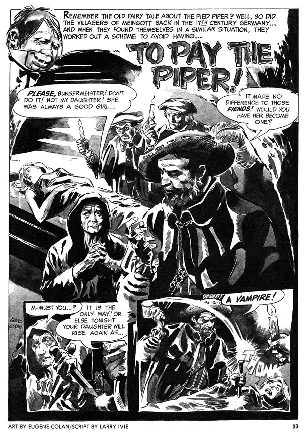
His first Eerie story is a twisted retelling of the old Pied Piper legend, "To Pay the Piper," which substitutes vampires for rats. This time, the cheapskate villagers are as familiar with the story as we are, so they resort to outright murder so they don't have to pay, only to suffer yet another twist involving werewolves. The final panel-- the punchline-- is a bit too crowded to be fully effective (or as horrific as it should be) but the story's creepy European setting prefigures Colan's depictions of Marvel Universe Transylvania.

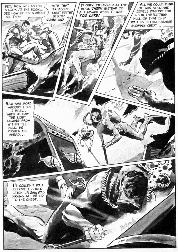
More original is "Full Fathom Fright" (Eerie #3), this time with a script by Archie Goodwin that allows Colan to go bonkers with the fractured panel shapes. This story goes from the booby hatch to Davy Jones' Locker as we first see a mental patient throwing a monster hissy fit, then learn all about the undersea misadventure that made him that way. Goodwin puts Colan's storytelling and rendering skills to their fullest. The undersea sequence is particularly nice, with Colan creating a real sense of weightlessness, with deep water shadows and lighting effects. And the final gag panel with its Lovecraftian conclusion is nice and large and much more effective this time.

Eerie #4 features "Hatchet Man," a grisly Goodwin-Colan take on that horror comic evergreen, the deranged axe murderer. As opposed to the polite, mild-mannered axe murderer, I suppose. What is it about geeks with axes that so fascinates horror writers and readers? The blunt simplicity of the weapon? We've seen it a billion times on EC covers alone, but for some reason we never quite grow tired of these Lizzie Borden-style "forty whacks" antics. This effective little story has an obvious psychological element that's slightly reminiscent of the movie Psycho but features some startling action sequences where Colan chops the action itself into wedge-shaped panels that showcase his ability to depict bodies in motion and in pieces. And if you ever wanted to see Bob Newhart totally lose his shit and go on a killing rampage, then this is the story for you.

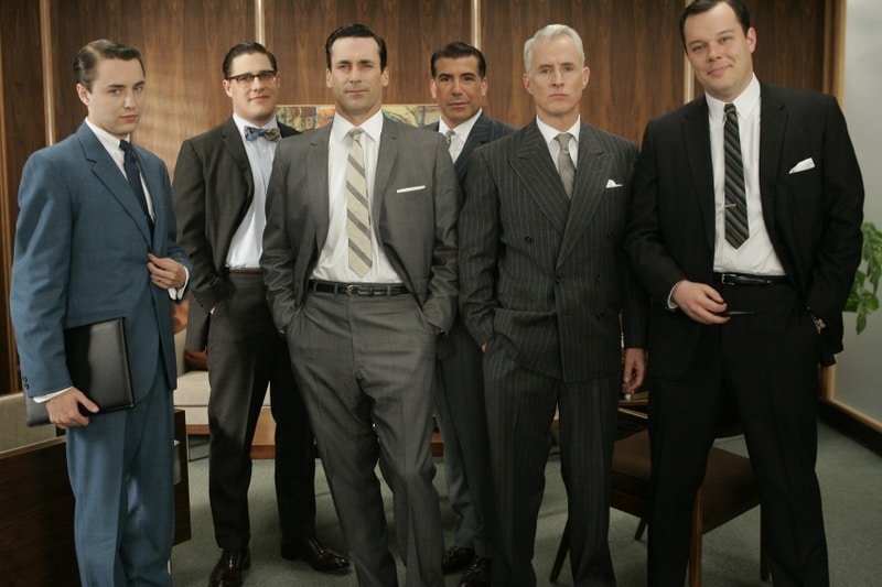
The final story, "A Matter of Routine" (Eerie #5) seems a little rushed. The figures are simpler and the ink washes read a bit flatter than in the previous shorts. It's kind of a nightmare version of the Mad Men era-- a fedora-wearing flannel-suited commuter type (he's even got a 1960s George Grizzard buzz cut) gets off his afternoon train, slips the key in the door at home and steps quite literally into Hell itself. Goodwin's narrative captions are in breathless second person: "You fall to the scorched black cinders of earth, your only escape route banished..." and the denouement is an extremely lame "Was it all a daydream or do I dare open this door after all?" type cop-out. Not the finest work by either gentleman, but still an interesting cultural relic of a bygone era.

It also features axes.

Wednesday, March 30, 2011

Alex Toth and the Pie

In 1977, Alex Toth illustrated "Daddy and the Pie," from a Bill DuBay script. It appeared in Warren Publications' UFO and Alien Comix #1, dated January 1978. People were going crazy for all this space alien stuff about that time. Probably had something to do with Star Wars and Close Encounters of the Third Kind setting box office records. Or maybe it was because Zontarr, ambassador from the planet Horvis VII, was all over TV in the mid-70s during his futile campaign to convince the people of earth to give up their dangerous nuclear weapons programs-- which threatened galactic civilization-- and his more successful efforts to popularize John Travolta via the sitcom Welcome Back, Kotter and disco music. Poor Ambassador Zontarr. Today he teaches political science at a community college and smokes way too much pot.

"Daddy and the Pie" hearkens back to those message stories EC used to run where they'd sucker you in with gloriously drawn gore and freaky octopus-like creatures then teach you some kind of life lesson, like in that one tale about the little mutant girl who was so misunderstood. "Daddy and the Pie" also has a distinct Ray Bradbury feel in its mix of small town nostalgia, the melancholy truth of just how crappy we humans can be to each other and science fiction. The moralizing doesn't overwhelm the plot, thanks in no small part to Toth's beautiful drawings. He evokes a sense of mystery and wonder on each page, and the heavy use of blacks along with ink washes make this one of his finest pieces. I was all set to write enthusiatically about how brilliant DuBay is for having the boy narrate the story in a kind of naive voice and how that contrasts with the action to give us a more complete understanding of what really happened with Daddy and the Pie-- then I re-read it and realized the narration is pretty spot-on, with Toth's images merely amplifying DuBay's script.

Oh well. DuBay does tell the story from the boy's limited perspective and it's a script worthy of Toth's best efforts. The kid learns that heroism isn't beating up bad guys the way the two-fisted ruffians in the movie serials and radio adventures do. It's also quietly helping others and accepting them for who they are. Just doing the right thing and asking nothing in return.

He learns this not only because of the Pie's influence on his life, but also because the example his father sets. As DuBay has him tell us, "I was lucky to have two heroes all my own... ...Two of the biggest, bravest legends ever to walk God's green earth. Daddy and the Pie." Children need parents they can look up to in the absence of saintly blue aliens. When kids inevitably encounter various forms of hate and prejudice they need strong role models within their own families to teach them open-mindedness and acceptance of differences.

Ultimately, however, "Daddy and the Pie" also reminds me of that Kenny Rogers song, "The Coward of the County." Some people-- and blue giants from other worlds-- can only be pushed so far before they have to give up pacifism and counter aggression with mysterious glowing orbs that focus mental power to wreak retribution. DuBay and Toth wisely keep the action offscreen, making us imagine its horrors, rather than fully depicting and and possibly glorifying it in the way comics and films frequently do. The Pie is fully benign but he, like the less evolved people who finally drive him to reaction, is capable of destructive acts. In some ways his sacrifice and victory in the town is the most human moment in the story. By not showing it-- by confining it to a couple of small, dark panels with flame on the horizon and ominous "BOOM! BLAAMM! KA-BAAMMM! BOOM!" sound effects, DuBay and Toth tell us this is also the least heroic thing the Pie does. This capacity for meeting violence with violence-- even when justified-- is perhaps a universal failing of all sentient beings. That we even bother to try and overcome this is a much more heroic act than burning down a town, even if it is full of bigots.

This story is also similar thematically and in plot to the 1953 Western classic Shane, starring Alan Ladd.

Monday, March 28, 2011

Do you ever think about Fred Hembeck?

I do. Actually, I have off and on over the years. To me, Fred Hembeck has always been something of a mystery. Who is this guy? Where did he come from? Why does he draw knees as circles with spirals within them? I'd see a Fred Hembeck cartoon in some comic book-related publication, have a little chuckle, ask myself these questions...

Then forget to find the answers.

Well, no more. Just the other day I was reading my ragged, torn copy of Comic Book Artist #11 ("Celebrating the Art & Life of Alex Toth!") and I encountered none other than... HEMBECK! Yes, that Hembeck. Hembeck caricatures himself interviewing Dr. Bruce Gordon, otherwise known as Eclipso. We in the biz like to call it the "ol' interview shtick." Hembeck perfected it. In a typical Hembeck strip, he has the subject answer questions in character, yet very much aware of his or her existence as a fictional construct. In this case, Dr. Gordon complains about how Alex Toth drew him in contrast to how his original artist Lee Elias did.

It's very meta. I believe it's an approach that somehow melted into my consciousness over the years due to these infrequent exposures to Hembeck. Only I've taken it a few steps further, or made it even more dada. My versions of various comic book heroes are self-aware in a Hembeckian way but sport personalities almost diametrically opposite of their in-story characterizations. One major difference between the two of us is Hembeck has such a deep knowledge of comic book lore-- characters, alter-egos, continuity changes, storylines, creators-- the Watcher probably uses him as a fact checker, while I usually get things wrong no matter how many times I consult back issues or artists' websites.

And yet only recently did I bother to research Fred Hembeck on the web. From his website, I learned Hembeck started his Dateline:@#$% stip in 1977. Which means I've been aware of Hembeck since I was about 9 years old. And he doesn't always do the "ol' interview shtick," as evidenced by this strip narrated by Peter "The Amazing Spider-Man" Parker all about Betty Brant. And even when he does, there's no mistaking Hembeck's affectionate yet absurdist take on superheroic history.

Which brings me to my final point. Or only point. What I enjoy about Fred Hembeck is he has what I consider the perfect attitude towards comics-- they're to have fun with. Yeah, there are all those graphic novels that tell serious and deep stories in all kinds of artistic ways. I love those. But the superhero, romance, crime and horror comics that many of us started off with were colorful, cool and frequently silly. Even in our favorite stories of cosmic grandeur, there's an enjoyable element of the ridiculous. Stakes are high, emotions are operatic, costumes are garish and impractical. Sometimes you can almost see the creators winking at us, as if to say, "Kid, even I can't believe the wacky stuff we're pulling here!"

Hembeck often points out the more ludicrous elements or uses the same finger to poke into plot holes, but he does so with love. He makes me enjoy these old comics all the more for his pulling off of masks to reveal the goofy, somewhat dazed characters beneath, characters who sometimes get as irked at how they're drawn or written as we fans do. Characters who grit their teeth and weather poorly constructed storylines and stumble through botched plot points with the same awareness of just how shabby things can be that we have as readers. That they're trapped within the stories makes it all the funnier when they complain to Hembeck.

So yes, I think of Fred Hembeck. I'm happy I finally-- after almost 30 years of thinking about Hembeck-- learned a little bit about his career.

Saturday, March 26, 2011

Happy Birthday Leonard Nimoy!


Whoa! I almost missed the second Star Trek birthday this month! I feel terrible about that, too, because I'm not only a William Shatner fan, but also a big Leonard Nimoy booster. Nimoy, for lack of a better word, is simply awesome.


One thing I've always loved about Nimoy as Mr. Spock is his portrayal of Spock's boundless curiosity. Nimoy's Spock isn't devoid of emotions; he just keeps them tamped down. There's always the sense no matter how bizarre the phenomenon the Enterprise encounters, Spock secretly enjoys it as a learning experience. Giant amoeba? Abraham Lincoln? Planet where the Roman Empire never fell? Spock loves it all deep down inside. And all that comes to the surface is that raised eyebrow and an understated, "Fascinating."

Happy birthday, Mr. Nimoy!

Let's go nuts for the Superfriends!


From the sublime-- Steve Rude, Syd Shores and Jack Kirby-- back to the ridiculous again. Here's Hanna-Barbera Batman trying to stop an awkwardly drawn animation-style Superman from... talking to/inhaling/talking to a scribble he holds in his palm.

The scribble came first (pen test), then I decided I'd have Superman holding it. And when he came out looking vaguely like Superfriends Superman (much to my surprise), I decided to swipe a Toth Batman head and stick it on a totally original body to produce this awkward scene. Drawing time: less than 5 minutes. Coloring time: all freakin' afternoon, baby!

Friday, March 25, 2011

Steve Rude talks process

There are a lot of art books about comic book artists. Most of them-- even the very best ones-- tend to dwell on biography, which is not something I'm all that interested in. Unless it's Jack Kirby who grew up in a rough part of New York City, co-created Captain America and then fought in WWII and then partnered with Stan Lee to invent almost the entire Marvel Universe. Even if his line had been insurance sales, Kirby would've still had a pretty incredible life.

What I want to know more about from my favorite artists are their process and tools. How do the greats make the art we love to look at so much and what do they use to make it? One of the great moments of my life was when I got to talk shop with another Jack-- none other than Jack Davis. He let me in on the kind of paper he uses, the brushes and little insightful tidbits such as how his initial sketches are a lot of "scribble-scrabble." That kind of info can be hard to find, probably because most books on comic book artists aren't written by artists but by fans who experience the work from an audience's perspective. Recently, Steve Rude completed a commission to recreate the splash to Captain America #34 from way back in 1944.

According to the Dude, the original is by Kirby himself, but the The Jack Kirby Museum website blog attributes it to Syd Shores. I have no idea what the truth is. Maybe it's Shores working over a Kirby layout. Or vice versa. The Museum says it was done "well after S[imon] & K[irby] departed Timely," and I have no reason to doubt their expertise-- but do you want to tell Steve Rude he's mistaken? I sure as hell don't!

Artist controversy aside, what's important here is Rude didn't merely copy the splash. He zoomed in the plane of vision, tightening the composition, and he gave it more depth of field. In Shore's original, everything takes place along the same plane, which flattens the perspective. Rude pushes the background farther back in layers. This means his version isn't as jumbled and frenetic, but no less action-packed. He also changed Bucky's pose from running along beside Captain America to leaping from the sky above him. Rude's colors are more naturalistic rather than the crude yet vibrant primary-and-secondary color scheme the original comic uses. Yellow sky, Nazis in yellow or green uniforms with purple helmets!

The resulting painting is fun. It captures the spirit of early Captain America without being a mechanical recreation. Whoever commissioned it is getting a beauty. And the rest of us are lucky enough to have been able to follow along as Rude posted his initial sketches, washes and the finished piece as he completed them. He's also posted a short step-by-step on working on this painting as well, complete with a mention of Alex Ross-- who, as Rude notes, "has made a career working in this method."

This is the kind of stuff that fascinates me. Rude goes into his thought process-- the things that go on inside the mind before an artist even touches pencil to paper. He had the original, but he says he's not one of those guys "who get off on this historical stuff." And besides, the image in his head and the one from the comic didn't quite jibe. So he gathered up all the photo reference he would need for uniforms, weaponry and the like. Then Rude started drawing.

Here's where Ross and Albert Dorne enter the story and I abruptly die and float away to art heaven.

The finished artwork looks like this
.

Thursday, March 24, 2011

Conut the Bubbleheadian

Know, O prince, that between the years when the oceans drank Atlantis and the gleaming cities, and the years of the rise of the Sons of Aryas, there was an Age undreamed of, when Dark Horse Comics published a title called Conan the Cimmerian and proud artist Joseph Michael Linsner painted its shining covers. Hither came Joel, bald-headed, sullen-eyed, pen in hand, a comics blogger, a doofus, a dork, with gigantic melancholies and miniscule abilities, to tread the jeweled artwork of the Earth under his sneakered feet.

I like Linsner's covers. It's also very cool Dark Horse has been using painted covers on their Conan books. Some of the more recent ones have been reminiscent of Earl Norem's work on The Savage Sword of Conan and those Curtis/Marvel black and white magazines-- you know, the ones that frightened me so badly as a child I rarely slept for fear of zombies or vampires or soldier apes climbing out from under my bed and feeding me to enormous mutant frogs.

Anyway, I tried to give this Conan a Gil Kane flavor rather than simply besmirch Linsner. Why offend one artist when you can desecrate the legacy of another at the same time? The Hellboy is from the recent Hellboy: The Sleeping and the Dead #2, where you can satisfy yourself if you've ever wondered what Hellboy would look like if Warren Publishing had printed it as a four color insert in a mid-1970s issue of Creepy or Eerie and had Alex Toth or Grey Morrow do the artwork. Yes, it's every bit as awesome as that description. Well, almost. It's still pretty darned good, though. More Scott Hampton, please.

He's not fighting the ghost of Hopey Glass. She's just there. Once again, Dani Moonstar makes an appearance and invites violence upon Sam Guthrie. I just made up that lounge singer. Out of my imagination.

Tuesday, March 22, 2011

Happy 80th Birthday, William Shatner!


Apparently it's also the 3rd Annual Talk Like William Shatner Day. I did break out my Shatner impression a few times today. Unlike most people's, mine isn't based on Kevin Pollak's famous impression. No, I go to the source-- Shatner himself, portraying Capt. James T. Kirk in the original Star Trek.


I don't do as many... strange... pauses... or SUDDEN EMPHASIS. Which isn't to say mine is better than his, yours or anybody else's. No, it's terrible. Terrible indeed. Mostly what I do is contort my face as if I were Kirk about to use good old human reasoning to defeat a godlike alien or an infallible supercomputer, or I do that sly Kirk grin-- the one he uses before he explains the earthly concept of love or the boy-girl game. Then I sit in our sofa with my legs crossed, my hips rotated slightly to one side, my elbow resting on the arm, my hand raised as I wait for a yeoman to bring me my daily reports. The intrepid explorer, in repose, but ready to jump to my feet to confront Space Apollo and argue that we humans, as imperfect as we are... are still learning and growing... with... great, almost limitless potential for good. If allowed to survive, to explore, to seek the best of all worlds and species and races of the galaxy... to learn from them, certainly capable of emerging from our relative infancy...

We need this chance. A chance for meaningful contact. For peace. Don't let your own arrogance blind you to the fact that you were once what we are now... and that in time, we may come... to be as you are.

Here's a good Shatner by voice acting legend Maurice LaMarche, in which he also drops some exciting news about Futurama:


As fantastic as Pollak's and LaMarche's imitations are, they're still just imitations. There is no Shatner like the One True Shatner, William Shatner himself:


I've been a fan of William Shatner since I was a kindergartner. So Happy Birthday, Mr. Shatner! To celebrate, I'm going to kick back with Checker Book Publishing Group's Gold Key Star Trek reprints-- the best Star Trek comics ever published, bar none.

Monday, March 21, 2011

Wonder Woman, Tom Strong and romance comics


Those are three things I like. The Wonder Woman image is from an Alex Toth sketch. The skaky line quality is all mine, as is the misplacement of her left arm-- it should be in a little closer. In the original sketch, she's playfully tugging on her magic lasso. The Tom Strong portrait is taken from the $1 Watchmen tie-in reprint of "How Tom Strong Got Started," a story that mixes some Tintin, Doc Savage, Tarzan, The Spirit and a few sly little Alan Moore touches all gloriously illustrated by Chris Sprouse and Al Gordon. I paid 190 yen for it and still consider it a bargain. Whereas my version of Tom Strong is strictly bargain basement. And then I threw in a B17 and some romance comic stuff. More Toth.

I'm working on a theory. And it's this-- romance comics and horror comics generally have the best art. Sure, the stories are pat in both genres. Cheating lovers murder someone, said someone comes back from the grave and kills them in some kind of gruesomely ironic twisty way, young woman leads perfect man to believe she's editor of a newspaper rather than its receptionist, it turns out he's not an auto company magnate, he's a mechanic in a garage. I forget which story goes with which genre; you figure it out.

The point is, ignore the scripts and focus on the artwork. If you've got artists like Toth, John Romita, Al Williamson, Jack Davis, George Evans, Johnny Craig, Graham Ingels and the like drawing the stories they're going to be visual treats. Horror comics have the advantage of being able to rely on shock, violent action and gore as well. With romance comics, there are a lot of panels of people merely talking or hugging and kissing, or fretting about lies. Artists have to rely on their rendering and storytelling skills to create emotional involvement and prevent the pages from becoming static even if there's not much physicality. Facial expressions, body language, backgrounds, mood all become substantially more important than panel-to-panel action.

Romance comics are mostly about inner conflict. Inner conflict and stolen kisses. Horror comics have that, too, but external conflict as well. A knife in the eyeball. Sure there was probably a lot of crap art during the horror-romance comic heyday, but who can argue with EC, Warren and the DC horror books Joe Orlando edited in the 1970s? Or romance books by people like Joe Simon and Jack Kirby, Frank Frazetta, Leonard Starr and Wally Wood?

What's Yazawa Ai's Nana but the perfection of the romance form? Glamorous settings, gorgeous cast of characters all in the latest fashions, emotional turmoil and cliffhangers practically on every page. Lushly drawn with an eye for detail and a strong fashion influence.

Okay, it's half-assed theory. But you've got to admit many of those old horror and romance comics had sweet artwork!

Saturday, March 19, 2011

"Batmania 4"

In which a freakish Batman gets squeezed off the page by an even more twisted freak. Fortunately, there's a British paratrooper officer there to direct traffic and keep things sensible and sane. Yes, another sketchbook junk-o-rama.

I am working on some reviews, though. I'm reading John Byrne's new series John Byrne's Next Men from IDW. Now there's a surprise-- I'd heard nothing of Byrne returning to this property. I went to my local comic book store and there it was. During the early 90s comics boom when every publisher started churning out new "universes" and Dark Horse debuted its Legend imprint, Next Men was one of my regular-- albeit somewhat frustrating-- reading titles. The characters and situations intrigued me, the slow pace annoyed me. Then Byrne moved the book into more conventional modes and I abruptly lost interest and stopped reading it. Here we are more than a decade later and I'm reading it again. Full review of the first 4 issues coming up soon!

Also in the works-- a post on Fred Hembeck! Slug from Micronauts! More crazy deconstruction of old Planet of the Apes comics!

Plus the usual frivolity.

Friday, March 18, 2011

TV's Wonder Woman's Costume's Big Reveal's Revelation!

Because I love using possessives, that's why. Oh, you didn't ask. Well, in that case, here's the first image of the costume for the National Broadcasting Company's new Wonder Woman television program starring Adrianne Palicki. Let me tell you-- with a get-up as eye-catchingly kaleidoscopic as this the producers definitely need to lens this program in the new "color" (or "colour") format I've been hearing so much about since the World's Fair. But I must warn parents. Take heed! If you allow them to watch this weekly serial, your children may become unduly influenced by Miss Palicki's variegated duds and experience a loosening of their moral fiber. In this event, they may be led astray down the garden path of flamboyant sartorial deviance that leads inevitably to beatnikdom and then... the grave.

Well, it looks silly but about as good as could be expected, I suppose. The colors evoke feelings of Mom's apple pie and baseball, the latex bustier and high heels fears of the whip. The accessories-- the tiara, bracelets and belt-- plus the stars down the leg are more Toei than Time-Warner; she's the Boobs Power Ranger or some space queen who'd aid the live-action senshi of Pretty Guardian Sailor Moon. She and Kamen Rider could work together on a case, then hang out at Starbucks. What else might they have done? With maybe a couple of tweaks this could actually work much better as the comic book version's costume than her current outfit. Goodness gracious, I'm afraid I wasn't prepared for how goofy it looks on a flesh-and-blood human being person type individual. Who isn't a 4-color drawing.

It can still work. At 5'11" (according to IMDB, anyway), Ms. Palicki is certainly statuesque enough for the part, and those clenched fists promise some feats of strength and combat derring-do. I hope she brings a dignified and powerful presence to the role and overcomes the costume. But I suppose a great deal depends on the show's approach.

The 70s Wonder Woman was extremely campy-- although even as a fan who never missed an episode, I was too young to appreciate this aspect and accepted it as straight adventure a la The Six Million Dollar Man and The Bionic Woman-- and Lynda Carter had a self-awareness about her that made the star-spangled swimsuit work. Plus she had the advantage of looking like a comic book drawing come to life. Stunningly beautiful. As is Ms. Palicki, but even if the new show's scripts are superlative, her biggest battle will be with that outfit. I feel for her. Many a superhero has suffered ignominious defeat at the hands of insane haberdashers.

Any time you put someone in red, blue and gold rubber with stars and stylized eagles and W's all over, it's going to look garish. But most comic book costumes run the risk of making any actor appear ridiculous and by extension, the show in which she or he appears. If your Steve Trevor is played by Lyle Waggoner (late of The Carol Burnett Show), your intention is obviously to embrace this aspect. How Ms. Carter managed not to appear silly and undignified while pretending to deflect bullets with her bracelets truly is a wonder. She was Wonder Woman to me, and I adored her. Now that I'm older, I realize she pulled it off not only because of her physical embodiment of the part-- again, she looked gorgeous in the costume-- but also because she was in on the joke.

In this case, however, there's the David E. Kelley factor. God knows what goes on inside that guy's brain, but when that crazy stuff makes it to America's television sets, people tend to feel... ways... about it. Strongly so. Except for me. I've merely mildy disliked all his shows, to be quite honest, and largely ignored them. On the other hand, my very conservative mom has loved each of them, up to and including Harry's Law.

So my modest prediction is-- whatever this show's quality, people are going to be blogging the hell out of Wonder Woman when it airs. Oh yes, there will be blogging. There will be opinions. Opinions galore. People will discuss its ramifications and ascribe to it a certain level of importance. The costume will matter; it more than likely already does. I'm writing about it, after all.

Some will excoriate Wonder Woman and Mr. Kelley. Others will defend them. They'll want to tell you all about how they came to these conclusions. Some people may take offense. There will be comment hostilities following essays both thoughtful and asinine or both by turns (like this one). Chastisement and rapprochement in equal measures followed by more conflict. The comics blog world may never know peace again. I'ma stay the hell out of it and watch Super Friends:


Can Wonder Woman escape the fate of recent genre failures such as The Cape and the Bionic Woman (they even edgily dropped the "The" and still flopped) remake? Will the show please comic fans and a more general audience? In those plastic pants and leather high-heeled boots, if this Wonder Woman does she really will earn that superlative!

Jillian and Mariko Tamaki have made a new book

I read about this on Jillian Tamaki's site and it's news that has me excited-- which is no small feat in these troubling days where I spend most of my time either doodling or watching the news unfold in Japan. Jillian and her cousin Mariko, creators of of the touchingly written and gorgeously illustrated 2008 Ignatz award-winning graphic novel Skim (whew... out of breath) have a new book coming out from Groundwood Books. It's called Awago Beach Babies and it's something to look forward to.

Skim is pure love in book form. When I was deciding what to discard and what to keep during my final months in Japan-- weight and shipping costs being major factors-- I gave away stacks of graphic novels to my students. I tried to choose ones I thought best fit each person's likes or matched his or her personality. Skim, however, proved problematic. For one thing, there were too many students I thought would enjoy it and giving it to one would have been unfair to the others. For another, the story speaks to me in ways we only speak to our closest friends and I really would have felt awkward giving it to someone with whom I had a more or less professional relationship. Isn't that kind of stupid? Anyway, that's how I felt.

Finally, I selfishly wanted to keep it for myself, dang the weight and expense. Looking back, it might have been cheaper to give it away to one of my closest friends there-- I'm sure she would have appreciated it and treasured it as much as I do-- and then re-purchase it once I got back to the United States. But this was the Skim I first read. When my eyes first saw Jillian Tamaki's art, it was while holding this particular copy. When I learned who Kimberly Keiko Cameron was, it was through Mariko Tamaki's writing on these particular pages.

I'm the kind of person who gets emotionally attached to books. The stories they tell, how they tell them, the emotions they draw forth when I read them, the secrets they reveal.

Wednesday, March 16, 2011

Now to lighten the mood with a rant about Guy Davis


What's happening here? There are two Al Williamson heads there-- Flash Gordon and Dr. Hans Zarkov and then a wary-looking Guy Davis Andrew Devon. That jumbled nonsense to the right is part of a Mike Mignola Hellboy. Three artists whose work I greatly admire represented in one badly-drawn tribute sketch!

So I suppose what I'm saying is this rant is more of a rave. I really enjoy looking at Guy Davis's work. It's a visual pleasure. It's within the Mignola Family of Mignola-esque artists along with Ryan Sook (at one point) and Duncan Fegredo (at least on Hellboy), but he's got a loose, lively line and extremely easy-to-follow storytelling-- in BPRD "King of Fear" #5, there's a 2-page airplane crash sequence that you'd completely understand even if those pages were dialogue-free. And it's not just any old plane crash-- the passengers and crew emerge from the wreckage having been transformed into hideous lumpy crab-monsters. Davis doesn't rely so much on heavy areas of black the way the other Mignola Family (or Hellboy Universe) artists do, so his books are little more colorful and and not so dark.

Unlike a lot of artists who do "photorealism," Davis's looser, more expressive style means his figures are integrated into the backgrounds in a seemless whole-- people, monsters and their environment have a winning consistency. Too many times I'm put off by these almost photographically rendered figures who inhabit blank space or stark, nearly empty rooms. They look pasted in there; there's a disconnect and the whole effect is awkward. Consequently, Davis's stories have more verisimillitude no matter how ridiculous or outrageous the locale.

And finally, Davis's work has appeal, that ineffable quality that makes you want to look at it. Not everyone has that no matter how good they are at rendering. Toth had it, Williamson had it, Kirby had it, Alex Ross has it (to contrast the expressionists... although his storytelling is too static and posed), Mike Allred has it, Steve Rude, Mike Mignola, Kojima Goseki, Los Bros Hernandez, Jillian Tamaki (I'm specifically mentioning her now because of some news about her I want to write about later), some of the artists doing Archie comics-- and Guy Davis. Plus many more I could name. It's not a matter of style; it's a matter of artistic charisma.

I ain't got it. That's the one thing I wish I had, but I find my own work leaves me somewhat cold. It's amusing and it makes me laugh frequently, but that's about it. And I mean my finished, polished pieces, not sketchbook exercises like the ones I've been posting-- although these also crack me up. Oh well.

Tuesday, March 15, 2011

Here's a more comprehensive list of charities

If you are so inclined, please check out this list and the information it contains about various organizations that are attempting to aid Japan during this crisis. This site also contains some useful advice on giving you might want to consider.

Donate money...

Here are links to the three organizations I chose to donate to (partially because I respect their missions and partially because of the percentage of the donation that goes directly to the relief efforts as opposed to administrative functions):

1. Save the Children
2. International Medical Corps
3. GlobalGiving

That's not a knock against these other organizations that are helping Japan now, too, many of which I've donated to in the past. I do things intuitively. Make up your own mind, but please help:

1. The American Red Cross
2. Salvation Army
3. Doctors Without Borders
4. Peace Winds
5. Operation USA
6. International Fund for Animal Welfare (for animal lovers)

This is only a very limited list. There are many other groups, agencies, organizations and foundations that are also contributing to Japan's needs. I urge you to take some time and find the one that feels right for you and help those who need.

Donate directly...

1. Food (instant foods, dietary supplements, baby foods)
2. Warm blankets
3. Clothing;
4. Baby clothes, and DIAPERS!!!!

Attn: Earthquake Relief Supplies
Miyagi Prefectural Office
3-8-1, Honcho
Aoba-ku, Sendai city, Miyagi
980-8570, JAPAN

Attn: Earthquake Relief Supplies
Iwate Prefectural Office
10-1 Uchimaru Morioka city, Iwate
020-8570,JAPAN

Attn: Earthquake Relief Supplies
Aomori Prefectural Office
1-1-1 Nagashima, Aomori city,
Aomori, 030-8570, JAPAN

Attn: Earthquake Relief Supplies
Fukushima Prefectural Office
2-16 Sugitsuma-cho, Fukushima City
960-8670, JAPAN

NOTE: If you send food, please make sure all the items in each box are the same. Also, new baby clothes, not secondhand. That may change if things become more desperate, but apparently that's the rule for now. Believe me, your contributions will be GREATLY appreciated.

(From my friends Jon and Hiromi Bauer)

Saturday, March 12, 2011

Earthquake in Japan...

I'm sure you're aware of this already so I won't go into details. As you know, I lived in Japan for almost 6 years, so I have a lot of friends there. Here are some suggestions by CNN of ways you can help.

"Batmania 3"


Haha! Another catastropiece. This is a quick sketch derived from yet another Alex Toth piece, but the crap on his left lat is part of a leg drawing I was working on before I got the bright idea to desecrate Batman again. I'm going to keep trying until I get this inking thing right, dammit!

Friday, March 11, 2011

"Batmania 2"


This one is made up of a lot of Alex Toth swipes, plus a completely silly Batman inspired by the J.G. Jones cover to DC's First Wave #5. Remember when Batman used a gun and shot all the bad guys? I don't either, but I'm pretty sure he used to do that back in the 1940s.

That Batgirl is based on a Black Canary pose by Toth, but I've rendered the body into nothing more than a black blob. Pretty disappointing. But that bizarre Jughead figure with the incorrect nose dominates this image. I like him. He looks like he's got problems-- his left arm is a twisted, emaciated twig-like thing ending in a large, misshapen hand-- but he seems pretty cheerful so I'm not too worried about him. I admire the way he labels himself "Bughead," in deference to the Archie Comics people who would probably be heartbroken if he went around claiming to be the real Jughead Jones.

Wednesday, March 9, 2011

I call it "Batmania 1"

Yet another sketchbook page, this one with a vaguely Alex Toth-ian feel. This is probably because I crooked that Batman figure on the left from a Toth drawing, and also the silhouetted airplane way over on the right. How did Alex Toth do those gorgeous twiligty skies?

Gilbert Hernandez knows.

When I saw it, I just had to have it!

No, no. I'm rich, but I'm not this rich-- rich enough to pay $1.1 million for a near-mint copy of Amazing Fantasy #15, the first appearance of Spider-Man (before he was amazing). You just know this guy is going to read it sitting on the toilet, with the covers rolled back. He'll probably lick his fingers while turns the pages, too. After he's finished doing his stinky business, he'll just toss the comic into the brass magazine rack along with his wife's Cosmopolitans and Food Network Magazines, plus some battered Times from two or three years ago.

The most valuable comics I ever owned were X-Men (when they were "All-New, All-Different," but before they went and turned all uncanny on us) numbers 94, 95, 96, 97, 98 and 100, plus the first and second issues of Conan the Barbarian. I once bought Cerebus #5 for a quarter at a flea market, then traded it for the first issue of DC's The New Teen Titans-- which, if I'm remembering correctly, was much more popular than X-Men at the time. The cover of which I managed to dot with a sticky piece of a Chewy Sweettart. So if you have a The New Teen Titans #1 with a tiny pink speck on the cover, it's from candy. And it's mine! And I want it back!

How much did I pay for that broken run of early X-Men? I believe it was around 15 bucks, plus the use of my left-handed fielder's glove during PE. This was before we had any idea you might sell a comic book and become fabulously wealthy and live in a gilded palace. Not long after my friend and I completed this transaction, I saw a Mile High Comics ad-- and X-Men #94 was going for $60! That seemed insane. How was it even possible? It wasn't even the first issue! Let's just say my friend was a little... unhappy... when I told him the news. You'd think he'd have shared my joy; after all, if it hadn't been for him, I'd have never known what a Wolverine or Nightcrawler was.

Learning they were approximately as valuable as uranium didn't stop me from taking those X-Men comics to school and passing them around during study hall. Or reading them dozens of times. Eventually a couple of comic book shops opened in our town and I learned you were supposed to seal your comics in vinyl sleeves and store them in acid-free "long boxes." By then I was addicted to comic books and justified my illness to my parents by telling them comics were "valuable collector's items." I learned how wrong I was when I got sick of them and tried to sell them at a comic book show. Apparently, my "key issues" weren't in very good condition. I could trade them for more comics-- yuck-- or sell the entire longbox for about $100. There went a complete John Byrne run on Fantastic Four, almost all my X-Men (except, strangely enough, a few issues from the "Dark Phoenix" era, which I still have hidden away) and close to 100 issues of Amazing Spider-Man including #252.

What do I have left of my first comic book collection? Well, a few odd issues of Cerebus, some New Mutants, Kitchen Sink's The Spirit reprints... and that's about it. During the comic boom of the early 90s I added a lot of Valiant titles and overpaid for New Mutants #87, only to watch it steadily decline as Cable-fever burned itself out through massive print runs and the realization that these stupid things aren't even scarce! I even have X-Force #1, and all the premiere issues of those Image titles you used to hear so much about.

One day, a million idiots will simultaneously attempt to sell their pristine copies of New Mutants #87 and the resulting letdown will cause a miniature existential black hole which will suck the last remaining hope of comic book riches right out of their souls.

Tuesday, March 8, 2011

She dances while dreaming of Batgirl and Conan


Shove over, Alex Ross! The Conan face is a goof on Doug Wheatley's impressive painted cover to Conan: Road of Kings #1 from Dark Horse. This series brings industry elder statesman Roy Thomas back to the character he scripted for about 10,000 issues during the early part of the 20th century when comic book writers wrote millions of pages Monday through Friday, then pitched both ends of a weekend double-header for the price of a steak dinner and a clean cot in the boiler room (they had to supply their own lightbulbs). Wheatley's Conan is wild-eyed and snarling; my Conan just ripped a fart he isn't entirely convinced left his loincloth unsoiled.

Monday, March 7, 2011

Superman vs. Muhammad Ali Deluxe Edition: A Comic Review

Superman vs. Muhammad Ali Deluxe Edition
Publisher: DC
Script: Denny O’Neil
Pencils: Neal Adams
Inks: Dick Giordano and Terry Austin

This is the big one we were all waiting for! I remember seeing the tabloid-sized original at our mall's Waldenbooks way back in 1978 and, as a major fan of both Muhammad Ali and Superman, wanting desperately to buy it. But $2.50 was beyond my price range at the time and there was a question of just where to keep the damned thing. It was monstrous and wouldn't fit easily on any of our bookshelves. In time, I came to think I'd dreamed it all. Superman versus Muhammad Ali? Why would those two ever fight?

Here we are decades later and thanks to our perceived hunger for overblown hardcover "archival" reprints of beloved childhood stories, Superman once more floats like a butterfly while Muhammad Ali stings like a bee. Two pop culture icons take on aliens with the stupidest name—the Scrubb. From the planet Bodace. I was kind of hoping it would be the planet Bonaduce and the erstwhile Danny Partridge might make a guest appearance as Jimmy Olsen, but no such luck.

That disappointment aside, where else can you see Superman punch his mighty fists together to stop a tsunami caused by plasma missiles from outer space? Or Muhammad Ali explain the sweet science from jabs and uppercuts to rope-a-dope tactics to the Man of Steel, then use his famous psych-out pre-fight patter on a bunch of star warriors? Or Superman disguise himself as Bundini Brown before battling an entire armada of enemy starships?

This is an outlandish and at times extremely silly epic-- witness Superman sheepishly explaining to Muhammad Ali why the Fortress of Solitude is full of so much junk and Jimmy Olsen's laughable ringside commentary to a crowd that includes anthropomorphized chickens-- that breathlessly spans light years and features crowd scenes that would have blown Cecil B. DeMille’s mind and bankrupted George Lucas. Neal Adams dazzles with double-page layouts full of space freaks and bizarre interplanetary vistas, and his Muhammad Ali caricature is spot-on.

Preserved in his beautiful prime-- the book apparently was so late in hitting the stores Ali was actually slightly past it in reality-- and transformed into a comic book hero by Adams and inker Dick Giordano, Ali may be the only real life person who could go mano-a-mano with Superman (convenient red sun pocket universes or not); he was and remains that much a legend, a towering figure of the 20th century sports/pop culture scene along with Babe Ruth. I wouldn't be surprised to find this story somehow entering mythological status a couple of thousand years from now (when I'm very old) and Ali's become some sort of demi-god figure whose factual existence academics debate at good ol' Mars University's Classics Department. Okay, I'm stretching things, but not by much.

For his part, Denny O’Neil provides fevered captions with appropriately purplish prose and nails Ali’s distinctive speech patterns. Confronted by an armored green alien, Ali is definitely not nonplussed-- not that you'd expect him to be:

ALIEN: We intend to prove ourselves you superior by showing our standard-bearer is the greatest!
ALI: WHOA... Right there, Dog-face! I AM-- the Greatest! Man... They rank me with Joe Louis... Sugar Ray Robinson.. Ezzard Charles... Archie Moore... Rocky Marciano... Gene Tunney... Jack Dempsey! I ain't agreein' to fight... but if I did, I'd whup your man. I'd stomp him--

If you grew up with Ali on TV and at the movies, you can "hear" this dialogue in your head in the man's distinct cadence; Ali's working himself up and preparing to do some real ass whuppin'.


It seems to take place outside of regular DC continuity. There's no Justice League satellite to warn Superman of the alien armada; he has to fly up into space to look for himself. And while some sort of Athena being makes an appearance at the fight itself to observe (over at Marvel, Stan the Man would've given us the Watcher with appropriately lofty nonsense dialogue, no doubt), there's no sign of Batman or the Green Lantern Corps. It's almost as if Ali's powerful charisma crowded them right out of the universe. So if you're a hardcore geek who has to fit every story into some sort of overarching narrative-- well, you probably should seek psychological help. Here it helps to lighten up and enjoy the weird.

Why? Because there's a sense of the creative team just knocking themselves out (otherwise Ali might have done it for them) to produce something special, an event reminiscent of one of those “Battle of the Network Stars” specials or a Bob Hope holiday show with everyone in his Rolodex invited and then some. And because they manage to convey such a sense of fun, the book works both as a tribute to Ali and as a curious artifact of the 70s, the latter emphasized especially by the inclusion of Adams’s famous wraparound cover featuring such leisure suit era luminaries as Jimmy Carter, Pele, Sonny Bono, Johnny Carson, the entire Jackson 5 (man, they got some shitty seats!), a couple of Sweathogs from Welcome Back, Kotter and a young Ron Howard. If you look closely, you can make out a reunion of sorts for the Fab Four-- that's right; John, Paul, George and Ringo are there in the crowd. No sign of Linda or Yoko. You can also see a few famous faces with mustaches slapped on them because, as Jenette Kahn relates in her afterward, a few celebs balked at making a ringside appearance. And in what kind of world does George C. Scott turn down DC Comics only to be replaced by Kurt Vonnegut?

All this and a selection of Adams's surprisingly tight layout thumbnails. Just buy it and dig it, my babies.