Wednesday, October 1, 2008

"Dog Eaters" is Now My Friend... and a Rumination on "Style"

Today, I got a surprise Myspace friend-request from a graphic novel. Now there's a sentence that would've been completely impossible to think of, much less type, when I first started reading comics at the tender age of 4. That was 1972, before anyone had ever considered using terminology like "Myspace" or "graphic novel" or "today."

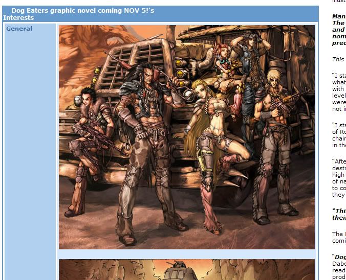
Dog Eaters is a post-apocalyptic story from Dabel Brothers Publishing, adapted by Sean J. Jordan and Guillermo A. Angel from Malcolm Wong's original screenplay. I can't really comment on the story because I haven't read it yet, but Angel's manga-infused art is colorful and inviting.

And now I'm a-gunna tell ya exactly why, pilgrim.

I'm basically old school but I tend not to judge things based on their cultural influences. Either you can draw or you can't (although I find that dichotomy way too reductive... I personally can semi-draw) and if you have the basics down, "style" will follow.

Style, as the concept is generally understood, is vastly overrated. What many of us think of as style are merely the most superficial elements of drawing. Speedlines, cross-hatching, manga-esque eyes, slightly cartooned figures, heavy shadows, scratchy lines, almost geometric figures, "realism." These are the most visual aspects that hit your eye with immediacy, and we use them to describe what certain comic book artists' works look like. We call this his or her "style."

Judging artwork solely based on these elements is like choosing our friends based only on the clothes they wear. Sure, we get a few clues about who they really are from how people dress, but that doesn't tell us if they're good people or not. Doesn't give us the deep-down identity or selfhood that raises them from mere acquaintances to lifelong friends or even lovers, those things that make the relationship more than just pleasant but a necessity for our continuing happiness. Just as personality, compatibility and our personal concept of "goodness" are deeper criteria when choosing friends, so to is the underlying structure of drawing- the bones and musculature- more important than "style."

These basics show you whether or not a person can really draw, has a clue as to what drawing is all about. Anatomy, proportion, weight distribution, line of action, hierarchy of form, perspective, appeal, storytelling. One an artist masters this stuff, style takes care of itself. Too many comic book artists have this totally backwards. They also get confused because some of the true masters- people like Joe Kubert, Kojima Goseki, Takahashi Rumiko, Jack Kirby, Frank Frazetta- tend to distort or stylize the human form to suit their needs.

And even "realists" like Neal Adams tend to use heroic proportions. Classical guy non-realist John Buscema's heroes look like the leapt out of a Renaissance sketchbook (rather than off one of the porno stills some popular "photorealists" trace from these days... photorealism is not a be-all/end-all unto it self and again falls under the category "style" as superficiality).

Even Michaelangelo began stretching the human form towards the end of his career.

I'm not comparing Guillermo A. Angel to any of these. I'm just explaining to you why I might bitch about people using manga style elements to cover up bad drawing one day, then tell you Angel's manga-esque art looks attractive to me another. I don't do the knee-jerk rejection of manga-esque art; in fact, I think that's foolishness indeed and speaks volumes of the rejecter's personal prejudices and ignorance.

Some people like Adam Warren, and apparently Guillermo A. Angel, can do the colorful, fun manga look and even use non-traditional anatomy (check out how long the legs are, how small the heads, how thin the torso is on Angel's female characters) and still show they have a solid grasp on the underpinnings. That's what I pick up on, not necessarily superficial elements like "big eyes" or "overly long legs" (these aren't automatically negatives) or my least favorite of all "details."

Also sometimes mistakenly referred to as "shading," as in, "Manga artists don't know how to do shading!"

In comic book terms "details" frequently means meaningless cross-hatched lines everywhere even though they're neither building tone or modeling shadow on the figure or creating texture and space in the backgrounds. I don't want to raise a shitstorm by giving specific examples. I could- some of them would be quite popular and successful comic book artists beloved by many, and one is almost universally reviled these days (but I don't want to dogpile the guy.) Just check out almost every secondary Image artist of the 90s to see what I'm talking about. Visual noise.

In fact, one of the Big Guns of Image once said in an instructional (destructional would be more accurate, though) video that you should throw in a lot of that kind of stuff in place of actual drawing. He said it with a kind of "those stupid kids won't know the difference and they'll think you put actual effort into your schlock" wink that made me instantly turn off the video and give up on his work entirely.

Visual noise does not detail make. Real detail consists only of what's necessary to make the image work. That's why I appreciate people like Takahashi Rumiko, Jaime and Gilberto Hernandez, Alex Toth and Mike Allred (one day I want to write an entry about Allredrian anatomy... it fascinates me). They put down exactly what's necessary and little more. They have superficial differences, of course, but the basics are there, totally internalized and they don't need to truck in false detail. Al Williamson once inked an old Jack Kirby drawing for TwoMorrows' Jack Kirby Collector (I love that magazine) and crosshatched among the famous Kirby dots in the background. His reasoning? "It needed it." And he is right- it's not exactly pure Kirby but it definitely made the foreground figures pop by making them no longer in competition with the background.

Anyway, Angel's art looks pretty cool. It works. His figures are dynamic, his art is detailed to the correct level and in the right way, and he actually draws vehicles that look like they could work. They commented on my Myspace page with a friendly, art-filled message with some action packed stuff. Cool blood effects, bodies tumbling through the air, machine guns blazing. The more I see, the more I dig it. I wish I could comment more on the story, but I couldn't read the PDF preview. I'll try again later.

Based on what I have seen and just looking at the art, I'd like to check out a few more preview pages. I'm not a big sci-fi/fantasy person. I tend to stop and start at Ray Bradbury and Kurt Vonnegut. But Dog Eaters seems to do that Mad Max punkish-motor-tribes-in-a-desert-wasteland thang I love, and it it's also another thing I tend to like- a finite story. One with a beginning, middle and end. Which hopefully means character development going from point A and coming to its logical conclusion at point Wherever without extending the story past its natural stopping point into absurdity and continuity insanity, a la most serialized comic book monthlies. Some of Malcolm Wong's political and social concerns are also my own, so I give him some credit for developing the book from those, too.

According to MySpace, besides his Dog Eaters screenplay, Malcolm Wong has directed music videos here in Japan... and he and his wife are also responsible for the rebirth of the fashion doll, Blythe. That's also pretty cool. Actually, taken altogether, that's some high-powered cool.

And the final cool thing about this? Thanks to Dog Eaters' friendship, I was able to friend Diablo Cody, kick-ass screenwriter of Juno, one of my favorite movies. In fact, in a year overrun with good superhero action movies I definitely enjoyed, Juno remains healthily ensconced on top of my list as Best Movie Released in Japan in 2008.

Thanks, Dog Eaters!

PS- One day I'll re-explain why I generally reject using the term manga as jargon specifically referring to Japanese comics or Western comics drawn in similar styles. I just use it here as shorthand and out of laziness.

Shut Your Creeping Face, Uncle Creepy: "Creepy Archives" Vol. 1 Review!

Creepy Archives Vol. 1
Publisher: Dark Horse
Stories: Archie Goodwin, Larry Ivie, Otto Binder and more
Artists: Frank Frazetta, Reed Crandall, Al Williamson and more

Capsule review: Collecting the first five issues of that old Warren Publishing horror mag Creepy, this book isn’t likely to scare you (unless you’re a pretty timid soul) but it is going to dazzle you with full-color reproductions of Frank Frazetta’s painted covers and the gorgeous black-and-white work of the greatest artist line-ups in American comic book history.

When I was a kid, we bought comic books from convenience stores. And we tried to get the most comic bang for our comic buck.

Which meant we only sneaked peeks at those pricey b&w titles from some company called Warren Publishing. The ones over on the magazine rack beneath Hot Rod and Field & Stream, sometimes Playboy and Penthouse. Eerie. Creepy. The Rook. Vampirella. They had lurid painted covers with lovingly rendered semi-naked women or fanged werewolves bristling with hair.

And their title logos looked like oozing blood.

To my innocent suburban eyes, the Warren magazines seemed sordid compared to the four-color DC and Marvel books. Maybe it was their location within the magazine display, inches from the pornography, down near the scuffed floor. Maybe it was the degenerate hosts. Uncle Creepy and Cousin Eerie looked decadent, decayed. Vaguely inbred. Like they’d invite you into their crumbling mansions, feed you poisoned gingerbread, then read you dirty limericks as you died.

Even on a bright summer day, south Georgia humid, with afternoon thunderstorms rolling in from the west charged with the molten July heat, school still over a month away, a surreptitious glance at a Creepy or an Eerie story gave me a Halloween night chill… frequently without my having read it thoroughly. But I was an overly imaginative boy who lived near a cemetery.

Wow, I didn't know what I was missing!

Alex Toth, Al Williamson, Alden McWilliams, Jack Davis, Roy Krenkel, Joe Orlando, Gray Morrow, Frank Frazetta, Angelo Torres and Reed Crandall contributed to Warren’s horror magazines at one time or another, and all are represented in this reprint of the first five issues of Creepy, complete with Frazetta’s moody, expressionistic covers and all the original ads for things like an LP of Boris Karloff reading "The Legend of Sleepy Hollow," a miniature Germanium radio, an 8mm projector or a giant plastic fly…

I don't know what someone might've need a giant plastic fly for but I'm a "whatever floats your boat" kinda person.

And yes, the artwork is beautifully reproduced here in a large, crisp format so you can study all the nuances of Williamson’s lithe figures, Frank Frazetta’s never-equaled inking and Gray Morrow’s creamy ink washes. I can’t imagine the original printed stories looked as good as they do on these pages. I can’t imagine any other comics of any other era looking as good as these. Reading this book is like taking an autumn holiday away from today’s tired hacks who seem content to steal stylistic elements from manga to cover poor draftsmanship, or else trace stills from porn videos of Maxim magazine to mimic “photo-realism.”

There’s a mix of old school horror and sci-fi stuff, with each artist well-chosen. Al Williamson and Roy Krenkel visualize an undersea kingdom, the kind of thing they excelled at, and Williamson later playfully and self-deprecatingly casts himself in “The Success Story” as murderous hack cartoonist Baldo Smudge (who gets a zombie-fied comeuppance), but the revelation here is Reed Crandall. He’d done solid work at EC, but in Creepy his art looks like 19th century etchings, fine-lined and sharply delineated, the perfect match for some of the antiquated settings.

As gorgeous as Crandall’s work is, the single most strikingly illustrated story has to be Morrow’s “Incident in the Beyond.” Modeled in lush levels of black and gray wash, it anticipates Richard Corben’s airbrush work during Warren’s latter days.

Worthy of special note as well is Frazetta’s final comic book story, “Werewolf!” Writer Larry Ivie atypically sets it in Africa rather than Transylvania or the Scottish moors, and Frazetta gives brutish “white hunter” Demmon a hulking, almost simian appearance to match his bullying personality. Demmon’s werewolf quarry is little more than a scratchy blob of black brushstrokes with eerie white triangles for eyes and fangs. I can see where Mark Schultz got some of his drybrush techniques.

Alex Toth’s “Grave Undertaking“ rounds out the volume; Toth’s use of inky silhouette and flat fields of gray-tone is almost abstract, making his work here feel experimental compared to the more classical approach of Crandall, Williamson, Morrow and others.

Beyond their art, the tentative, fairly tame stories don’t quite live up to the promise in Frazetta’s covers- especially his issue 4 phantasmagoria, which has to be one of the most delightfully dark and iconographic werewolf images ever. A big orange full moon looming over a castle, fluttering vampire bats, and an oversized wolf-creature eyeing some hapless goober with slicked-back hair, wearing a Sherlock Holmes cloak. A neat touch is the skull and vertebrae lying in the foreground, foreshadowing our friend’s fate.

Most of these eight pagers are cliched (some readers thought so even back then, if the letter pages are to be believed... oh, and look out for at least one name familiar to horror comics fans for his work on a certain swampy thing in the early 1970s), not the least bit frightening and not particularly gory despite the lack of Comics Code Authority oversight.

With heavy usage of Eastern European vampire and werewolf motifs, these initial issues of Creepy come across as quaint. Some tales seem oddly like adaptations of lesser known Universal or Hammer Studios films; lots of 19th century police inspectors and bobbies discovering bloodless corpses, torch-bearing mobs and the like. The settings often look like the same Hammer backlots (assuming they had some) Peter Cushing and Christopher Lee stalked, shot day-for-night on the cheap but in gruesome color. And some, like “Bewitched,” don’t really make a whole lot of sense and hinge on ridiculous chains of events, or conclude unsatisfyingly with clumsy exposition.

You can almost imagine Count Floyd showing up at the end instead of Uncle Creepy, dripping flop sweat and desperately trying to inject some energy into the disappointment: “Wasn’t that some… scary exposition, kids? I don’t know about you, but I find… er… explanations reeeaaalllly scary! Information… it’s… it’s frightening, I… um… tell you… ARRROOOOOOOOO!!!!”

While they (fortunately) don’t feature the sexual imagery common in the Creepy’s from my era, they also lack the visceral impact of those latterday stories. I mean, Bruce Jones’ repellently effective “Jenifer” still makes me feel sick more than 20 years after I first read it, but there’s nothing approaching that level of revulsion here. You could give this volume to an monster art-loving older kid without any worries.

And you should. But don't give that kid anything reprinting "Jenifer" before his or her 21st birthday. Yikes!

This is what horror was before people like Robert Bloch, Richard Matheson and Stephen King updated it to take place in the 20th century, in suburbs with supermarkets and liquor stores.

Best are the tales written by none other than the legendary Archie Goodwin. His plots are tight and well-constructed for this short format and invariably feature an effective little EC twist at the end.

Even his adaptation of Edgar Allen Poe’s “The Tale-Tell Heart” isn’t satisfied with the gruesome spectacle of a man cutting out another’s heart and going mad from guilt. Nope, Goodwin audaciously appends a further O. Henry-like element. “Monster Rally,” featuring the surprise birth of Uncle Creepy (and some of Angelo Torres’ finest work), reads like an homage to the similarly-themed Haunt of Fear tale “A Little Stranger,” the origin of the Old Witch. Goodwin seems to have internalized the EC formula, and his shock endings rarely have to be explained through dialogue because he runs out of pages. No wonder he maintains such a monumental reputation in the decade after his passing.

This is a huge, heavy hardcover that takes its archival mission seriously. It’s expensive (although compared to some of the recent books from DC and Marvel, it’s more than reasonable), but if you’re a fan of classic comic book art from the days when artists could actually draw and seemed intent on blowing readers away with their skills, this one is a must. I’m not sure how many more volumes this series will run before they get to the sex and gore, but until then just enjoy these relics of a more cheerfully horrific time.

Fortunately, now that I'm independently wealthy, I have plenty of yen to throw away on Creepy. Well done, Dark Horse.