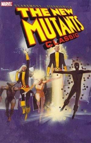
Wednesday, December 24, 2008

And a Merry Christmas to you from all of us here at When Comic Books Ruled the Earth!


Happy Holidays to the one or two people who still occasionally check this moribund comic book blog. This year's festivities included a lively school party with a lot of fine folks and a one-day stint as Santa Claus for 80-plus energetic kids. I hope everyone is looking back on a successful and enjoyable 2008 and looking forward to an even better 2009!

Wednesday, November 26, 2008

Happy Thanksgiving from the NBC Saturday Morning Cartoon Superstars!

NBC’s Saturday Morning Thanksgiving Holiday Feast!

Join us this Saturday at 8am (EST) on your local NBC channel for a Thanksgiving dinner with all the trimmings, featuring all of your favorite NBC Saturday Morning stars!

The Smurfs (8:00am EST/7:00am CT)- When that dastardly Gargamel destroys the smurfberry bushes, can Papa Smurf find the magic spell to set things right in time for the Smurfberry Harvest Feast? And what happens when the Smurflings help Brainy mis-use Mother Nature’s Horn of Plenty? Guest-starring Johan and Peewit!

It’s Punky Brewster (9:00am EST/8:00am CT)- When Glomer goofs up again, it’s up to Punky, Margaux, Cherie, and Allen to fix the holiday turkey before Henry gets home! Will Punky and pals learn a Thanksgiving Day lesson in caring and sharing?

Alvin and the Chipmunks (9:30 EST/8:30 CT)- Alvin, Simon and Theodore compete with the Chipettes for a spot on a Spacy’s Thanksgiving Day Parade float. Will Alvin’s dirty tricks ruin Thanksgiving for everyone, or will he learn the true meaning of friendship and giving thanks?

Mister T (10:00 am EST/9:00 am CT)- Mr. T and his daring yet caring gymnastics team volunteer at an inner city youth center on Thanksgiving Day. When a gang of mean punks try some rough stuff, it’s a cranberry bet that Mr. T and the kids will show them the error of their ways in time for pumpkin pie!

Spider-Man and His Amazing Friends (10:30am EST/9:30am CT)- Spidey, Iceman and Firestar fight the Juggernaut. Guest-starring those uncanny mutants, the X-Men!

Wednesday, October 1, 2008

"Dog Eaters" is Now My Friend... and a Rumination on "Style"

Today, I got a surprise Myspace friend-request from a graphic novel. Now there's a sentence that would've been completely impossible to think of, much less type, when I first started reading comics at the tender age of 4. That was 1972, before anyone had ever considered using terminology like "Myspace" or "graphic novel" or "today."

Dog Eaters is a post-apocalyptic story from Dabel Brothers Publishing, adapted by Sean J. Jordan and Guillermo A. Angel from Malcolm Wong's original screenplay. I can't really comment on the story because I haven't read it yet, but Angel's manga-infused art is colorful and inviting.

And now I'm a-gunna tell ya exactly why, pilgrim.

I'm basically old school but I tend not to judge things based on their cultural influences. Either you can draw or you can't (although I find that dichotomy way too reductive... I personally can semi-draw) and if you have the basics down, "style" will follow.

Style, as the concept is generally understood, is vastly overrated. What many of us think of as style are merely the most superficial elements of drawing. Speedlines, cross-hatching, manga-esque eyes, slightly cartooned figures, heavy shadows, scratchy lines, almost geometric figures, "realism." These are the most visual aspects that hit your eye with immediacy, and we use them to describe what certain comic book artists' works look like. We call this his or her "style."

Judging artwork solely based on these elements is like choosing our friends based only on the clothes they wear. Sure, we get a few clues about who they really are from how people dress, but that doesn't tell us if they're good people or not. Doesn't give us the deep-down identity or selfhood that raises them from mere acquaintances to lifelong friends or even lovers, those things that make the relationship more than just pleasant but a necessity for our continuing happiness. Just as personality, compatibility and our personal concept of "goodness" are deeper criteria when choosing friends, so to is the underlying structure of drawing- the bones and musculature- more important than "style."

These basics show you whether or not a person can really draw, has a clue as to what drawing is all about. Anatomy, proportion, weight distribution, line of action, hierarchy of form, perspective, appeal, storytelling. One an artist masters this stuff, style takes care of itself. Too many comic book artists have this totally backwards. They also get confused because some of the true masters- people like Joe Kubert, Kojima Goseki, Takahashi Rumiko, Jack Kirby, Frank Frazetta- tend to distort or stylize the human form to suit their needs.

And even "realists" like Neal Adams tend to use heroic proportions. Classical guy non-realist John Buscema's heroes look like the leapt out of a Renaissance sketchbook (rather than off one of the porno stills some popular "photorealists" trace from these days... photorealism is not a be-all/end-all unto it self and again falls under the category "style" as superficiality).

Even Michaelangelo began stretching the human form towards the end of his career.

I'm not comparing Guillermo A. Angel to any of these. I'm just explaining to you why I might bitch about people using manga style elements to cover up bad drawing one day, then tell you Angel's manga-esque art looks attractive to me another. I don't do the knee-jerk rejection of manga-esque art; in fact, I think that's foolishness indeed and speaks volumes of the rejecter's personal prejudices and ignorance.

Some people like Adam Warren, and apparently Guillermo A. Angel, can do the colorful, fun manga look and even use non-traditional anatomy (check out how long the legs are, how small the heads, how thin the torso is on Angel's female characters) and still show they have a solid grasp on the underpinnings. That's what I pick up on, not necessarily superficial elements like "big eyes" or "overly long legs" (these aren't automatically negatives) or my least favorite of all "details."

Also sometimes mistakenly referred to as "shading," as in, "Manga artists don't know how to do shading!"

In comic book terms "details" frequently means meaningless cross-hatched lines everywhere even though they're neither building tone or modeling shadow on the figure or creating texture and space in the backgrounds. I don't want to raise a shitstorm by giving specific examples. I could- some of them would be quite popular and successful comic book artists beloved by many, and one is almost universally reviled these days (but I don't want to dogpile the guy.) Just check out almost every secondary Image artist of the 90s to see what I'm talking about. Visual noise.

In fact, one of the Big Guns of Image once said in an instructional (destructional would be more accurate, though) video that you should throw in a lot of that kind of stuff in place of actual drawing. He said it with a kind of "those stupid kids won't know the difference and they'll think you put actual effort into your schlock" wink that made me instantly turn off the video and give up on his work entirely.

Visual noise does not detail make. Real detail consists only of what's necessary to make the image work. That's why I appreciate people like Takahashi Rumiko, Jaime and Gilberto Hernandez, Alex Toth and Mike Allred (one day I want to write an entry about Allredrian anatomy... it fascinates me). They put down exactly what's necessary and little more. They have superficial differences, of course, but the basics are there, totally internalized and they don't need to truck in false detail. Al Williamson once inked an old Jack Kirby drawing for TwoMorrows' Jack Kirby Collector (I love that magazine) and crosshatched among the famous Kirby dots in the background. His reasoning? "It needed it." And he is right- it's not exactly pure Kirby but it definitely made the foreground figures pop by making them no longer in competition with the background.

Anyway, Angel's art looks pretty cool. It works. His figures are dynamic, his art is detailed to the correct level and in the right way, and he actually draws vehicles that look like they could work. They commented on my Myspace page with a friendly, art-filled message with some action packed stuff. Cool blood effects, bodies tumbling through the air, machine guns blazing. The more I see, the more I dig it. I wish I could comment more on the story, but I couldn't read the PDF preview. I'll try again later.

Based on what I have seen and just looking at the art, I'd like to check out a few more preview pages. I'm not a big sci-fi/fantasy person. I tend to stop and start at Ray Bradbury and Kurt Vonnegut. But Dog Eaters seems to do that Mad Max punkish-motor-tribes-in-a-desert-wasteland thang I love, and it it's also another thing I tend to like- a finite story. One with a beginning, middle and end. Which hopefully means character development going from point A and coming to its logical conclusion at point Wherever without extending the story past its natural stopping point into absurdity and continuity insanity, a la most serialized comic book monthlies. Some of Malcolm Wong's political and social concerns are also my own, so I give him some credit for developing the book from those, too.

According to MySpace, besides his Dog Eaters screenplay, Malcolm Wong has directed music videos here in Japan... and he and his wife are also responsible for the rebirth of the fashion doll, Blythe. That's also pretty cool. Actually, taken altogether, that's some high-powered cool.

And the final cool thing about this? Thanks to Dog Eaters' friendship, I was able to friend Diablo Cody, kick-ass screenwriter of Juno, one of my favorite movies. In fact, in a year overrun with good superhero action movies I definitely enjoyed, Juno remains healthily ensconced on top of my list as Best Movie Released in Japan in 2008.

Thanks, Dog Eaters!

PS- One day I'll re-explain why I generally reject using the term manga as jargon specifically referring to Japanese comics or Western comics drawn in similar styles. I just use it here as shorthand and out of laziness.

Shut Your Creeping Face, Uncle Creepy: "Creepy Archives" Vol. 1 Review!

Creepy Archives Vol. 1
Publisher: Dark Horse
Stories: Archie Goodwin, Larry Ivie, Otto Binder and more
Artists: Frank Frazetta, Reed Crandall, Al Williamson and more

Capsule review: Collecting the first five issues of that old Warren Publishing horror mag Creepy, this book isn’t likely to scare you (unless you’re a pretty timid soul) but it is going to dazzle you with full-color reproductions of Frank Frazetta’s painted covers and the gorgeous black-and-white work of the greatest artist line-ups in American comic book history.

When I was a kid, we bought comic books from convenience stores. And we tried to get the most comic bang for our comic buck.

Which meant we only sneaked peeks at those pricey b&w titles from some company called Warren Publishing. The ones over on the magazine rack beneath Hot Rod and Field & Stream, sometimes Playboy and Penthouse. Eerie. Creepy. The Rook. Vampirella. They had lurid painted covers with lovingly rendered semi-naked women or fanged werewolves bristling with hair.

And their title logos looked like oozing blood.

To my innocent suburban eyes, the Warren magazines seemed sordid compared to the four-color DC and Marvel books. Maybe it was their location within the magazine display, inches from the pornography, down near the scuffed floor. Maybe it was the degenerate hosts. Uncle Creepy and Cousin Eerie looked decadent, decayed. Vaguely inbred. Like they’d invite you into their crumbling mansions, feed you poisoned gingerbread, then read you dirty limericks as you died.

Even on a bright summer day, south Georgia humid, with afternoon thunderstorms rolling in from the west charged with the molten July heat, school still over a month away, a surreptitious glance at a Creepy or an Eerie story gave me a Halloween night chill… frequently without my having read it thoroughly. But I was an overly imaginative boy who lived near a cemetery.

Wow, I didn't know what I was missing!

Alex Toth, Al Williamson, Alden McWilliams, Jack Davis, Roy Krenkel, Joe Orlando, Gray Morrow, Frank Frazetta, Angelo Torres and Reed Crandall contributed to Warren’s horror magazines at one time or another, and all are represented in this reprint of the first five issues of Creepy, complete with Frazetta’s moody, expressionistic covers and all the original ads for things like an LP of Boris Karloff reading "The Legend of Sleepy Hollow," a miniature Germanium radio, an 8mm projector or a giant plastic fly…

I don't know what someone might've need a giant plastic fly for but I'm a "whatever floats your boat" kinda person.

And yes, the artwork is beautifully reproduced here in a large, crisp format so you can study all the nuances of Williamson’s lithe figures, Frank Frazetta’s never-equaled inking and Gray Morrow’s creamy ink washes. I can’t imagine the original printed stories looked as good as they do on these pages. I can’t imagine any other comics of any other era looking as good as these. Reading this book is like taking an autumn holiday away from today’s tired hacks who seem content to steal stylistic elements from manga to cover poor draftsmanship, or else trace stills from porn videos of Maxim magazine to mimic “photo-realism.”

There’s a mix of old school horror and sci-fi stuff, with each artist well-chosen. Al Williamson and Roy Krenkel visualize an undersea kingdom, the kind of thing they excelled at, and Williamson later playfully and self-deprecatingly casts himself in “The Success Story” as murderous hack cartoonist Baldo Smudge (who gets a zombie-fied comeuppance), but the revelation here is Reed Crandall. He’d done solid work at EC, but in Creepy his art looks like 19th century etchings, fine-lined and sharply delineated, the perfect match for some of the antiquated settings.

As gorgeous as Crandall’s work is, the single most strikingly illustrated story has to be Morrow’s “Incident in the Beyond.” Modeled in lush levels of black and gray wash, it anticipates Richard Corben’s airbrush work during Warren’s latter days.

Worthy of special note as well is Frazetta’s final comic book story, “Werewolf!” Writer Larry Ivie atypically sets it in Africa rather than Transylvania or the Scottish moors, and Frazetta gives brutish “white hunter” Demmon a hulking, almost simian appearance to match his bullying personality. Demmon’s werewolf quarry is little more than a scratchy blob of black brushstrokes with eerie white triangles for eyes and fangs. I can see where Mark Schultz got some of his drybrush techniques.

Alex Toth’s “Grave Undertaking“ rounds out the volume; Toth’s use of inky silhouette and flat fields of gray-tone is almost abstract, making his work here feel experimental compared to the more classical approach of Crandall, Williamson, Morrow and others.

Beyond their art, the tentative, fairly tame stories don’t quite live up to the promise in Frazetta’s covers- especially his issue 4 phantasmagoria, which has to be one of the most delightfully dark and iconographic werewolf images ever. A big orange full moon looming over a castle, fluttering vampire bats, and an oversized wolf-creature eyeing some hapless goober with slicked-back hair, wearing a Sherlock Holmes cloak. A neat touch is the skull and vertebrae lying in the foreground, foreshadowing our friend’s fate.

Most of these eight pagers are cliched (some readers thought so even back then, if the letter pages are to be believed... oh, and look out for at least one name familiar to horror comics fans for his work on a certain swampy thing in the early 1970s), not the least bit frightening and not particularly gory despite the lack of Comics Code Authority oversight.

With heavy usage of Eastern European vampire and werewolf motifs, these initial issues of Creepy come across as quaint. Some tales seem oddly like adaptations of lesser known Universal or Hammer Studios films; lots of 19th century police inspectors and bobbies discovering bloodless corpses, torch-bearing mobs and the like. The settings often look like the same Hammer backlots (assuming they had some) Peter Cushing and Christopher Lee stalked, shot day-for-night on the cheap but in gruesome color. And some, like “Bewitched,” don’t really make a whole lot of sense and hinge on ridiculous chains of events, or conclude unsatisfyingly with clumsy exposition.

You can almost imagine Count Floyd showing up at the end instead of Uncle Creepy, dripping flop sweat and desperately trying to inject some energy into the disappointment: “Wasn’t that some… scary exposition, kids? I don’t know about you, but I find… er… explanations reeeaaalllly scary! Information… it’s… it’s frightening, I… um… tell you… ARRROOOOOOOOO!!!!”

While they (fortunately) don’t feature the sexual imagery common in the Creepy’s from my era, they also lack the visceral impact of those latterday stories. I mean, Bruce Jones’ repellently effective “Jenifer” still makes me feel sick more than 20 years after I first read it, but there’s nothing approaching that level of revulsion here. You could give this volume to an monster art-loving older kid without any worries.

And you should. But don't give that kid anything reprinting "Jenifer" before his or her 21st birthday. Yikes!

This is what horror was before people like Robert Bloch, Richard Matheson and Stephen King updated it to take place in the 20th century, in suburbs with supermarkets and liquor stores.

Best are the tales written by none other than the legendary Archie Goodwin. His plots are tight and well-constructed for this short format and invariably feature an effective little EC twist at the end.

Even his adaptation of Edgar Allen Poe’s “The Tale-Tell Heart” isn’t satisfied with the gruesome spectacle of a man cutting out another’s heart and going mad from guilt. Nope, Goodwin audaciously appends a further O. Henry-like element. “Monster Rally,” featuring the surprise birth of Uncle Creepy (and some of Angelo Torres’ finest work), reads like an homage to the similarly-themed Haunt of Fear tale “A Little Stranger,” the origin of the Old Witch. Goodwin seems to have internalized the EC formula, and his shock endings rarely have to be explained through dialogue because he runs out of pages. No wonder he maintains such a monumental reputation in the decade after his passing.

This is a huge, heavy hardcover that takes its archival mission seriously. It’s expensive (although compared to some of the recent books from DC and Marvel, it’s more than reasonable), but if you’re a fan of classic comic book art from the days when artists could actually draw and seemed intent on blowing readers away with their skills, this one is a must. I’m not sure how many more volumes this series will run before they get to the sex and gore, but until then just enjoy these relics of a more cheerfully horrific time.

Fortunately, now that I'm independently wealthy, I have plenty of yen to throw away on Creepy. Well done, Dark Horse.

Sunday, September 28, 2008

Fair was Helly Glover: "Hellboy: The Crooked Man" 1 Review

Hellboy: The Crooked Man #1 (of 3)
Publisher: Dark Horse
Story: Mike Mignola
Art: Richard Corben
Colors: Dave Stewart

Capsule review: Mike Mignola and Richard Corben take Hellboy deep into the misty Appalachian mountains where he finds himself battling a twisted (but sharply dressed) evil for the souls of a wandering hillbilly and his childhood friend. Rustic witchcraft lore and a unique setting make for one of Hellboy’s most atmospheric and affecting tales.

My list of top horror comic artists is pretty short these days. Sure, there are the old masters, the guys who did stuff for EC and Warren back in the olden days before I was born. But among today’s active artists? Not including a few from Japan, I’d put only Mike Mignola, Richard Corben and Bernie Wrightson at the top. And what a disparate trio. While I’d love to see Wrightson illustrate a Mignola strip, I think Corben is the perfect match for Mignola’s Hellboy.

Strangely enough for two artists who work together so well, Corben’s and Mignola’s art couldn’t be more different. Sure, neither adheres to classical ideas of body proportion, and they both work a kind of moody magic on the page. But Mignola’s figures are abstractly geometric, almost flat, while Corben’s are weirdly textured and more three-dimensional. You can even spot some odd Jack Kirby or P. Craig Russell flourishes in Mignola’s blocky monsters.

Corben, though?

Richard Corben is unique. I can’t think of anyone else whose art his resembles. Oddly stretched or squashed figures, shadows with a crumbly edge that make his figures pop, but also gives them strange fungoid textures. Creepy and nauseating, but in a good way. I mean, we’re talking about horror comics here.

Mignola writes to Corben’s strengths by setting The Crooked Man in the Appalachians of Virginia and peopling the hills with melancholy backwoods types. Corben can distort their bodies almost to the point of caricature and bathe them in pale light and inky shadow. Stick them in haunted dells, thickly wooded and mossy, heavy with portents of evil. Depict in full, sickly detail women who leave their rubbery, cast-off skins lying around on beds in wooden shacks, temptresses who ride on desiccated horses. And a hideously misshapen figure in a top hat who plays both ends against the middle as he does Satan’s work on earth. Or is he, himself, Satan?

Despite the weirdness of it all, Corben gives the most visually ludicrous figure, Hellboy himself, a solid muscularity that makes him almost plausible with his sawed-off horns, red skin and wrinkled trench coat.

After wreaking havoc through Lovecraftian pastiches, Celtic adventures and stock Eastern European set-tos, Hellboy plunges into the folklore of his adopted home country. It’s a more than welcome change and really invigorates this installment. There are only so many times Hellboy can bop undead Nazis or tangle with worms and tentacles from beyond space before it all blurs together. Mignola’s plot and dialogue are heavy on the southern gothic, with down-home characters solemnly intoning lines like, “So one day I found me a squashed black cat… An while my ma was out, I boiled it till it went all to pieces… Then I took that mess down to the creek to wash out the bones.”

These are superstitious earth-folk, and they have good reason to be. Their mountains are haunted places where Satan’s agent shambles through the woods and offers deals too good to be true, and none too safe for the immortal soul. These mountain people seem to approach living half in a nightmare with a tired fatalistic acceptance, and not even the sight of a muscle-bound demon wearing clothes and toting a big pistol throws them off their stride. Hellboy fits right in from the start.

It reminds me of “Jess-Belle” one of the most inventive and original Twilight Zone episodes, penned by Earl Hamner, Jr., who later went on to create The Waltons. Like Crooked Man, “Jess-Belle” is set in the Appalachians (the Blue Ridge Mountains, to be exact) and deals with witchcraft and its consequences. In it, James Best plays a young hillbilly bewitched away from his fiancee by the darkly beautiful and ultimately doomed Jess-Belle, played by Anne Francis. Between that TV story and Hellboy’s, I guess it proves cain’t nobody walk the paths of the fallen without payin’ a heavy toll. We all know whatever Faustian bargains Hellboy’s new pal Tom Ferrell made in his past will come at a similarly heavy price for both him and his childhood friend, Cora Fisher.

I’m not sure what John-Boy would make of Hellboy, but this is as close as we’re likely to come to that particular crossover. Unless Mignola and Corben are building towards a climactic scene where Hellboy bids goodnight to an almost endless stream of hard-working and good-hearted farm people with their various genders appended to their given names.

Friday, September 26, 2008

Blecchhh in Her Own Series: "Batgirl" 1 & 2 Review!

Batgirl 1 & 2
Publisher: DC Comics
Writer: Adam Beechen
Penciller: Jim Calafiore
Inkers: Mark McKenna, Jonathan Glapion and Jack Purcell
Colorist: Nathan Eyring

Capsule review: Batgirl issues 1 and 2... the perfectly-constructed 4-color vehicles for delivering ennui to a new generation of sonambulant comic book fans.

Beechen said that the story will answer all the questions from the last few years, and will address all of the questions of why Batgirl has been acting the way she's been acting, and set the stage for new Batgirl adventures to come. -- quote from some old Newsarama story that no longer exists.

You know, it's never a good sign when your writer's big plan for a new story is to tell you things you already know.

After DC screwed up the Cassandra Cain Batgirl character by turning her into a horrible Dragon Lady stereotypical villain and thereby alienated the character's very vocal fans (which is a kind of irony, I suppose), they took steps to fix things and earn back some good will. Batgirl popped up in Teen Titans, readers found out she was acting screwy because she'd been drugged, Chuck Dixon added her to his Batman and the Outsiders team and all was right with the world. And that's all we needed to know. Bad drugs as a silly, comic booky but acceptable explanation for bad writing. The end.

But here comes the new Batgirl miniseries, written by Adam Beechen and instead of moving forward, he chooses to rehash and overexplain a lot of storylines that for everyone but Beechen had already been dealt with and finished. And to do so in ways that are both boring and surprisingly inept. At one point early in the first issue, Nightwing catches Batgirl sneaking a peek at her Christmas presents and-

Actually, Nightwing finds Batgirl using the Batcomputer to foster a personal vendetta, and they discuss this for a few panels while engaging in a wussy slap-fight... before Batman and Robin come in and also start jabbering away. Talk, talk, talk. At this point, writer Adam Beechen and penciller Jim Calafiore gift the readers with a panel where an ant-sized Robin head groans under the weight of enough copy to explain the Libertarian Party’s presidential campaign platform. Twice.

The plot is your basic vengeance quest. In comic book terms, this means Batgirl gets some deus ex machina help from that old standby, the all-knowing computer, runs around at night beating up random people, then suddenly and conveniently meets strangers who either try to kill her or else offer her vital information. Or both. Take it from Batgirl: cooperative enemies make revenge a breeze!

Batgirl wants to kill Slade (the man who drugged her) and Cain (her father, who is still giving her hell despite that storyline having come to a fairly satisfying conclusion in the original Batgirl series). This is all well and good. Batgirl should be edgy and dangerous. But Beechen has her tell us this practically at the start. Goodbye surprise and suspense.

Wait! Don't close your eyes and nod off yet! I haven't told you the best part! According the Beechen, Batgirl's ultimate motivation- what truly drives her and pumps blood through the secret-bearing chambers of her heart- seems to be... I feel a Dr. Smith imitation coming on here… the pain… the pain... the desire to have a “normal" life.

Just like Buffy in the early days of her vampire slayin’ TV show. Just like cheerleader Claire in the first few episodes of Heroes. Just like so many other teen or teen-ish characters involved in the supernatural or the superheroic. And never mind Batgirl actually tossed away her civilian identity at one point- by revealing her face to a government agency- in order to become more fully Batgirl. Forget entirely this is a woman who made a metaphorical deal with the devil by taking lessons from killer mom Lady Shiva and promising a death duel in a year’s time rather than lose her fighting abilities and give up being Batgirl. And don't worry that she constantly risked Batman's wrath by trying to be Batgirl each time he fired her.

Yeah, wants to be normal. Good one, slick.

Yep, Beechen still does not have a handle on how to write this character. Hasn't a clue. Doesn't really seem to care. After all, he didn't bother to concoct an interesting plot. Out of the story’s many weaknesses and disappointments, this failure to develop a believable characterization for its protagonist is the most damning and inexplicable.

Beechen’s most clever conceit is having Cassandra reveal at one point she’s taken ESL classes. This is an attempt to explain one of the stupider goofs Beechen made in the Robin series, where a girl with hardly any verbal skills has become loquacious and fluent not only in English and Supervillainese, but also in Navaho. Within the space of a year. That must be some ESL school!

This plot element also seems a clumsy attempt to shoehorn a totally lame romance into the story. One look at some bland, nice guy we’ve never seen before and Batgirl’s already in love. And we know this not because the character registers as anything more than a plot contrivance or because Calafiore's art emphasizes anything resembling romance through reaction shots. No, we know this because Beechen has Batgirl (on patrol, no less) thinking about this dull new character’s “nice eyes” and musing that she “hasn’t felt this way since…”

Since some past romance from some other comic I haven’t bothered to read, about some character I don’t give two craps about.

Yeah, guess we’ll have to take Batgirl’s word for it, because nothing else in that sequence informs us of anything other than the ol’ “tell, don’t show” storytelling style popularized by classic Scooby Doo cartoons written for very dim suburban kids is still alive and well at Time/Warner.

Despite some blood in the early going, there’s no sense of danger, no thrill, no atmosphere. Superheroic generica starring a once-intriguing lead turned cliche. It’s fine that Batgirl has verbal chops now to go along with her fists of fury, but does she have to be so chatty? Some people can speak perfectly well but choose not to. Alternately, couldn’t she at least be sullen or moody? Garbo speaks! But has nothing of interest to say!

Instead, Batgirl narrates in familiar super-person style rendering her little more than an interesting costume. She could be anybody now. They should rename her "Li'l Miss Anycharacter." In fact, she is everybody because Cassandra-clones are popping up all over the place. She wasn't big daddy Cain's lone success. That would leave her unique. Interesting. No, now we have Marque. As issue 2's cover copy asks, "Who Is Marque?!"

God, who gives a shit?! She seems to exist mostly to dilute what little narrative thrust Beechen generates with Batgirl's own need for vengeance by showing up with her own, even less interesting one.

Well, I suppose at one point Beechen has Marque tell us who she is including her favorite color and what she ate for lunch each day in elementary school in one giant block of dialogue, and then she and Batgirl play Boggle, Scrabble and Super Password hosted by Burt Convy, but I missed it because I'd fallen asleep from boredom and crumpled my copy into an unreadable ball of colorful paper.

Tired, rote plot. Labored exposition. Teen emo. Perfunctory fight scenes, more A-Team than Kill Bill. Beechen and Calafiore would’ve done well to read a little of Koike Kazuo’s Lady Snowblood to learn how to depict a deadly woman on the vengeance trail. Batgirl should be scary. You should feel afraid of her and for her at the same time. To this end, they could’ve rented Crouching Tiger, Hidden Dragon, and tried to infuse Batgirl with some of Jen Yu's life rage, with the same sense of inevitable tragedy about her. There was a girl who may not have known exactly what she wanted, but it sure as hell wasn't to be "normal." Not after tasting power and independence.

But that would have imparted a little style and substance to this flimsy, thrice-told little tale.

Sunday, September 7, 2008

9th Annual International Manga Summit Concludes Comics Are Educational

Kyoto, home of the Kyoto International Manga Museum, recently hosted the 9th annual International Manga Summit. According to a story in the Japan Times, the manga summit concluded that comics can be used to educate people on a wide variety of topics, from the environment to food safety. It also noted that Finnish cartoonists are increasingly influenced by their Japanese counterparts.

Interesting developments, to be sure. But I declare comic books in general to be fun and entertaining also. Especially Nana. That is some good stuff!

Sunday, August 17, 2008

Do People Have to Be Reminded to Act Civilized?

I guess so! I created this blog to escape from issues blogging, but this is something that disturbs me. It disturbs me that you have to actually tell certain people how to act in public. You'd think parenting, school and socialization would have taken care of these things, but apparently some idiots still haven't gotten the message. Some people can't handle being out in public around human beings who vaguely look like (and in some cases, dress exactly like) those longer-haired, slightly shorter characters in their funny books and on their favorite TV shows.

You know, the not-men. What do they call those again?

In any given group situation, it really does not matter if the person in question is a woman or a man- if they don't want you touching them, if they haven't given you permission to put your hands on them, then keep your damned hands to yourself. The fact that it's a sci-fi or comics convention makes no difference.

Now, I know people wear some outrageous stuff at genre conventions. The Slave Leia costume, a Red Sonja metal bikini and what have you. There will be professional models dressed like Lara Croft or whatever video game goddess is being hyped this financial quarter. And there's a certain relaxation of societal standards to allow for free expression. You're there to geek out in ways you can't at the office. You might meet someone you could be attracted to who shares your esoteric interests. It's totally okay to try to score some phone numbers. Plus, it's during vacation time for a lot of people so cutting loose feels good.

But there are limits. Because here's the thing- clothing does not equal consent. Attendance at a convention does not equal consent. Being simply a woman at a convention certainly does not equal consent. If someone isn't interested in you, be cool about it and gracefully back off. You're not John Cusack in Say Anything.... No means no. No answer means no. An "I'm busy" or "Maybe some other time" means no. Only yes means yes. You really shouldn't have to explain that to anyone over the age of 5 or 6. Certainly not to an adult.

And yet you do. And you do. And you do.

Why do people who somehow have failed to learn this before beginning elementary school get to define fan behavior? Who arbitrarily decided that genre conventions were free-for-all zones where any kind of stupidity goes? Where it's "cool" to grab someone's ass to "see what her reaction was?"

What if I went to a convention and randomly spit in people's faces to "see what their reaction was?" Hell, if they didn't want me to spit in their faces they wouldn't have come to the convention, right?

I'm pretty sure I KNOW how they would react. They'd get upset. I'd get booted out the door. There might even be violence. And you know what? That's not even why I don't do those kinds of things. I don't go around spitting on people because it's wrong. Just as it's wrong to grope someone. Just as it's wrong to make someone afraid. It's simply wrong to abuse people.

No matter how they're dressed. Or where they are.

It's not cool to do these things; it never has been, it never will be. Doing these things makes you an asshole; always has, always will. It's mindboggling that some people don't get this, that they turn off their brains at the convention center's doors and turn into Creatures from the Dorkass Corners of the Id. It's crazy to have to explain basic human behavior to people. It's like trying to explain why you shouldn't touch fire, why you shouldn't point a loaded gun at your head, why you shouldn't eat strange things you find on the highway. Behaviors that are self-evident to everyone except these few jerks.

Who in turn define the rest of us to the world at large. Who seem to define convention etiquette and behaviors for everyone else. And who define a genre convention as a place where three or four maladjusted and misanthropic cretins get to set the standards and tone for the majority who actually know better.

Convention organizers- don't be intimidated by these crude, crass attendees. They represent the smallest fraction of convention-goers. But they make up the entirety of the group doing stupid, outrageous things to the other attendees. Evidently, many conventions DO have anti-harassment policies in place and that's as it should be.

If yours doesn't, then make one. And if it does, make sure all the attendees are very aware of it. Publicize the hell out of it. Make your convention known as a safe space, where everyone can have fun. You know, except the very few whose idea of fun include nonconsensual touching and weird verbal abuse. They shouldn't be allowed to have their kind of fun. And if they tried that at the local shopping mall, they'd be arrested.

You can make a definite statement, put it right on the tickets, right on the signs and in the advertisement, and most people will still show up. It's ridiculous that you should have to explain something that's supposed to be common sense, but spell out in simple, clear terms that sexual harassment and intimidation, that unwanted touching and violence are not tolerated there. Have a visible and clearly-marked place for women to go to (or even men) when they've been violated or harassed. Toss out the jerks. If you want to be cute about it, dress your bouncers like Imperial stormtroopers or the Justice League or something.

I also want to charge the vast numbers of responsible convention-goers not to accept these pissants' definition of who we are and what we do. When you see this stuff happening, confront the situation. You don't have to run up and act like Batman or Wonder Woman, but there are sensible things you can do without being a vigilante. If you read the essay that set this off, that's exactly what the author tried to do. That's just good old-fashioned human decency. A concerned person supporting others to have the most fun possible without ugliness and degradation.

And if your friend comes back to you laughing about pinching some girl's ass or putting his hand down her shirt, tell him outright that's shitty behavior. Don't condone it with your silence. Make him feel the shame he should feel for doing something asinine. Perhaps common sense and humanity will reassert itself and he'll finally learn the damned lesson he should have as a child.

Or, report him to whoever is in charge. Do it in a reasonable way, of course. Screaming about it isn't much of a help, but level-headed insistence that you feel uncomfortable and unwelcome in a place where they allow sexual violence in any degree.

Even if there's not a firm policy in place. Even if there isn't an actual complaint booth. Find someone in charge and let them know your feelings. Everyone do this, immediately. Don't wait until the next day or the end of the convention. Do it immediately. Firmly but politely. If the organizers feel their financial break-even point being threatened, they'll act. If enough fans get involved on a grassroots level, this behavior will stop. Or become less frequent. Hell, I'd be happy if some of the incidents I've read about ended in arrests. I know of at least one involving a creator that more than likely should have if I'm remembering the details correctly.

And if an asshole doesn't come or a groper doesn't get to grope or harass, who gives a shit? Who gave these freak losers the right to violate the human dignity and personal space of others? They can't do that shit at the circus, the carnival, a Renaissance Fair, movie theaters or ballparks; they shouldn't be allowed to do it at a genre convention.

Tuesday, July 29, 2008

Hey, They Finally Nabbed the Joke!

According to the Associated Press, police in Three Rivers, Michigan, arrested a fully grown, adult 20-year-old man dressed like the Joke. The Joke was allegedly stealing posters and other memorabilia related to a popular comic-book inspired movie of some some kind.

Disappointingly, there's nothing in the AP story to indicate if this puckish fellow arrived at the theater accompanied by gnomes or leprechauns. Also uncertain is whether or not his pockets were filled with pennywhistles and roman candles. Or even moonbeams and starlight. There are precious few hints indicating he also tried to steal lollipops or candy bars, or if he leaped into the air with elfish glee and clacked his heels together during the attempted childlike mischief.

No word about how the little pixie planned to make his getaway. Perhaps on rollerskates? In a paper airplane decorated with stars crudely drawn in crayon? Rubber-band propelled toy duck?

The young man (pictured in his police mug shot wearing his "the Joke" makeup and without) also hasn't revealed to the world why he felt he had to dress like the Joke. Personally, I think he looks more like Max Fischer from Rushmore. If only he were wearing a private school uniform jacket, we might assume he was trying to get a teacher fired.

"I don't think that's such a good idea, Max." Max Fischer is a charming, precocious character. Perhaps cosplaying as Max Fischer is overly subtle, especially when it's still almost 3 months until Halloween.

Maybe over the next few months we'll see others proclaiming themselves also to be the Joke. Lord knows, we all take our turn as the Joke. Almost all of us do stupid, silly things from time to time. Not all of us do them dressed like the Joke, though. But for now, this delightfully absurd little fellow is the closest thing to the real Joke we have in today's topsy-turvy media-crazed society. I hope being the Joke makes him happy. I hope being the Joke is every bit as fulfilling as he thought it would be.

Anyway, ladies and gentlemen... comics fans... children of all ages... I give you...

The Joke.

Sunday, July 20, 2008

Howard Chaykin's "American Flagg" as Futurology, Part One

Any useful idea about the future should appear to be ridiculous.
-Jim Dator

Howard Chaykin’s American Flagg was a cutting edge comic for its time. It incorporated a lot of storytelling techniques later borrowed by any number of creators. The use of television screen iconography and pop culture references to provide depth, to amplify and make ironic comment on the action would later serve Frank Miller very well indeed in his acclaimed series The Dark Knight Returns. Thanks to letterer Ken Bruzenak, who served almost as a co-illustrator, Flagg incorporated text and graphic design into the art in creative and original ways, although it can be argued Will Eisner (his Spirit title splashes) and Jim Steranko and Bruzenak (on Marvel's FOOM magazine) did some of the earlier experimentation along these lines. All that’s well and good. Very good indeed.

“Forget all that crap! What about American Flagg’s success as a work of futurology?” you ask. "How accurate are its predictions?"

Well, I’m glad you asked me that particular question because it's been on my mind lately. Futurology is fun for me because I’m a dork. And as a dork, I especially love it when we actually reach the era described in a futurological work and we can see just how accurate or not the author’s predictions were. Just for kicks, because Howard Chaykin probably intended American Flagg to be entertaining first and foremost, not a visionary work of hardcore speculation.

Because that would be stupid. So let’s be stupid. All two or three of us. Together. Being stupid is much more enjoyable in a group. Let’s examine American Flagg as an attempt to predict the future.

Chaykin makes it easy on us because unlike Nostradamus and his poetic vagaries that could mean damn well anything, he provides us with a specific date. 1996, called by Flagg himself “The Year of the Domino.” An anno horribilis. What happened to make it so?

In American Flagg, actor Reuben Flagg (obsoleted former star of Mark Thrust: Sexus Ranger, which seems like something that could've aired on late-night Showtime, Cinemax or even the old USA Network) comes to Earth from Mars to join the Plex Rangers. As a newcomer, he’s the perfect fictional vehicle for Chaykin to describe his futuristic setting. In the first issue, after he’s learned a bit about the PlexMall and the current state of America, Flagg sits down and records a diary entry where he tells how this all came about.

Get your scorecards ready! And… here… we… go:

East coast meltdown. Some sort of nuclear accident. In 1983, when First Comics published American Flagg, the 1979 Three Mile Island incident was still fairly recent news. That was also the year Columbia Pictures released the Jane Fonda/Jack Lemmon/Michael Douglas thriller The China Syndrome. So nuclear safety was a controversial topic around that time. But we didn't have a major nuclear catastrophe in America in 1996, or any major accident in the years since Three Mile Island. The Soviet Union, yeah, and it happened a mere 3 years after American Flagg's premiere. You should read up on the Chernobyl Exclusion Zone. Fascinating stuff. I'll bet if Chernobyl had happened before he started American Flagg, Chaykin would've incorporated something along those lines.

Massive crop failure. Nope, didn’t happen in 1996 and ideally modern growing techniques will keep us in food for the indefinite future. Have we had even a minor crop failure recently? Florida oranges? Georgia peaches? Oh the shifting fortunes of those dependent on the weather.

USSR collapses in Islamic insurrection. Now we’re getting somewhere. The USSR collapsed, only it happened in 1991, 5 years earlier than Chaykin's prediction. The same decade! That's at least as accurate as any TV psychic, right up there with that woman who predicted all the Kennedy assassinations. And even though the Soviet Union's downfall wasn't due to an Islamic insurrection, don’t forget the Soviet defeat in Afghanistan was still 5 years away when this comic debuted. Ultimately, the closest analog to Chaykin's prediction was the horrific First Chechen War, a Muslim separatist conflict which lasted from 1994 to 1996. Huh? Huh? Unfortunately for futurology-accuracy's sake, that was a post-Soviet conflict and the region remains a Russian federal subject. Still, coming that close to the correct collapse date trumps any causal considerations so I have to give Mr. Chaykin a lot of credit for this one. And also for his correct reading of some of the internal regional religio-political strains underlying the external image of Soviet solidarity. I mean, around the same time, Mike Baron and Steve Rude had a Soviet Union still existing 500 years into the future in Nexus!

Food riots shake Western Europe. Not even close. Although French farmer Jose Bove has led protests against McDonald's. Does that count?

International bank system collapses. Nope.

Iran-Israel nuclear exchange. This one is scarily prescient. It still hasn’t happened but recent events make it seem all too likely; Mr. Chaykin may merely have the date a decade or two too early. What’s amazing is that it’s specifically Iran, and not say, Syria or Jordan or some made up Trans-Arabic Alliance. But then again, likelihood isn’t actuality. So any points will have to be deferred for now.

Germany reunited, nukes London. This one is, I think, a little bit of a joke. Mr. Chaykin having a little fun. West and East Germany reunified in 1990, but throughout the rest of the decade they seemed pretty peaceful. Certainly not out for any revenge. Being a mere six years off on the political half of this 2-part event practically qualifies Chaykin as a full-fledged psychic. I also remember a David Letterman Top 10 List on France's jittery preparations for German reunification. Close enough. So partial credit for historical accuracy, partial credit for anticipating a Letterman joke.

California sinks. Physically or metaphorically? Hasn't happened. And may not unless Paris Hilton relocates there. I’ve always been skeptical about this whole notion of California “falling into the sea.” Small islands have blown themselves apart volcanically, and yes, I’ve heard practically my entire life that the Big One will one day drop California into the Pacific. But since California is anchored to a land mass and not floating on top of the water, I’m not sure what the geological mechanics of such an event would entail. Is there some sort of continental shelf drop-off directly off the California shoreline where an earthquake could tumble the entire state into the sea?

Plague spreads. What plague? A plague of annoying smart-ass comic book blogs? If so, well done, Mr. Chaykin! You were only off a few years. Other than that I don’t recall any world-shaking pandemics in 1996.

The U.S. government and major corporations relocate to Mars. Sounds like a good idea to me, but it didn’t happen.

H.G. Wells and Jules Verne tend to get high marks for some of their futurological fictions, while the Star Trek series’ background details seem more irrelevant all the time as we sweep past important dates without Eugenics Wars and WWIII. My favorite sci-fi film series, Planet of the Apes, is getting increasingly ridiculous. There were no faster-than-light interstellar launches in 1973 and where's our 1991 dog and cat plague? What if the world doesn't end in 3955 or 3978? See? Those crazy futurological fools couldn't even keep their years straight!

George Orwell meant his 1984 more as metaphor and criticism than prediction, but that didn’t stop pundits from giving it a thorough workout when that year actually rolled around. Arthur C. Clarke and Stanley Kubrick hung a specific date on their famous space odyssey, but 2001 didn’t see any monoliths excavated on the moon, or artificial intelligences going slowly psychotic in transit to Jupiter.

Actually, that last one is interesting too because it predicts defunct airline Pan Am would one day deliver space-tourists and government scientists to giant rotating space stations that haven't yet materialized and we also now know Velcro-bottomed shoes have yet to come into style for our many thousands of dedicated space flight attendants who must serve microwaved chicken and beef meals in zero gravity.

So, to answer your original question. Is Howard Chaykin the visionary equal to Verne, Wells and Clarke? Is American Flagg a startlingly prescient work of futurology? What the hell do I know? In 1983, I was a junior high kid at the time and mostly into comic books and video games. My idea of 1996 was I'd be a rock star making the fabulous sum of $30,000 a year and living in a space dome with Paulina Porizkova on the dark side of the moon. So basically, I have no idea. Sorry I wasted your time!

NOTE: In our next installment, we’ll examine the futurology of Reuben Flagg’s hyper-violent, hyper-sexualized world of 2030 and see what’s already come to pass and what seems to have been made less likely thanks to various developments in the years between 1983 and now. You know… if I get around to finishing the damned thing.

Saturday, July 19, 2008

Well, There Goes My Big Plan to Invite Alan Moore to See the "Watchmen" Move with Me!

Alan Moore is not a fan of either the book 300 or its film adaptation so he's none too pleased with Zack Snyder's handling of Watchmen. Or, more accurately, that it's being filmed at all, I guess. In that article, he also has a few choice words about DC Comics:

"I don't want anyone who works for DC comic books to contact me ever again, or I'll change my number."

Not a fan, huh? Not fond of those people, huh?

Unlike Alan Moore (and despite myself), I mildly enjoyed the atavistic violence contained in the comic book 300. Well, for the one issue I read before the brainlessness of it all tossed me out of the story. It's one of those works where you deplore the contents but feel exhilarated by certain elements of the execution.

Not the dumbed-down writing. And not the drawings themselves, because Frank Miller's art has become so ugly over the years it's like violence against the eye. Still, he can compose a panel and pace the action on a page like few others. A Miller comic usually reads like you're watching a movie. Although for my comic buying-money no one tops Kojima Goseki, from whom I believe Miller liberally swiped to learn these chops.

However, it turns out Mr. Moore and I are of one mind when it comes to the movie. Despite my mingled horror and amusement at its loud-ass spectacle and a growing desire to turn the channel to anything (even an episode of Walker, Texas Ranger), I managed to watch the entire thing. Cinematically dumb, homophobicariffically dumb and racistastically dumb. If there's a brain located anywhere within 1000 miles of that movie's production, we've been unable to detect it despite employing some of the most sensitive devices yet invented by science.

But Watchmen? I've had hopes that Snyder's slavishly faithful approach taken with superior source material might produce a superior film. But it cuts both ways, doesn't it? If the thunderous flaws of 300 were mostly Miller's, then we're in the clear. If not...

On one hand, the trailer often looks like the comic come to life. Jackie Earle Haley is an inspired choice for Rorschach. Dr. Manhattan looks like Dave Gibbons (who's a fave of mine, by the way) drew him into the movie somehow.

But on the other, now that I've seen footage and can gauge a little better some of the Snyderian aesthetics at work in Watchmen, there are a couple of nagging things that trouble me.

"Like what?" you eagerly ask.

Well, the music choice for the trailer is the same sort of heavy handed goth-metal/industrial emo oafishness that maybe appeals to the demographic 300 was aimed at.

What's the opposite of promising?

You know what would've been really inspiring? A trailer featuring snippets of the film's Vietnam imagery set to Creedence Clearwater Revival's "Fortunate Son." That song features a lot of the angry atmospherics of patriotism curdled, civic virtues betrayed and growing cynicism in the face of a hypocritical nation Moore reveals in the comic and its dystopia-disguised-as-a-utopia setting. Two minutes of blistering, angry rock and sci-fi elements intruding on a seemingly real world setting.

You know- you lull the audience into thinking they're seeing Brian De Palma's Casualties of War Redux or a prequel to Coming Home and suddenly a giant naked blue guy steps over the trees and disintegrates the Viet Cong with his mental powers.

But no one ever listens to my bright ideas.

Also, given the stoopid excesses of 300, I'm a little afraid that some of Moore's grace notes- such as Dr. Manhattan's melancholy sojourn on Mars where he creates a delicate crystalline construct reminiscent of a watch's inner workings, a moment where the character's mental state is as fragile as this thing he's willed into being- will come across as brutally plodding, leaden set pieces.

Jeez, I hope not. I tend to go with my optimistic mode. I just know my respect for Alan Moore as an artist is much higher than any similar feelings for either Frank Miller or Zack Snyder so far. Actually, I don't have similar feelings for them at all. I like Moore's work. Still, Snyder wants this to be the Moore adaptation Moore will embrace, or at least not badmouth so much. And personal quirky qualms aside, I'm still planning on seeing it at the theater.

Sigh... It's just... I guess I'll have to go alone...

Tuesday, July 15, 2008

"American Flagg" to Finally Flap in the Breeze!

This comes to us via the "About Damn Time" department. Image is finally releasing their American Flagg hardcover. It contains the first 14 issues (and a new story) of Howard Chaykin's groundbreaking sci-fi comic series from the 1980s. I think this was one of those First Comics books, along with E-Man.

Think. I can't actually be sure because it's been a long time and I really don't feel like looking all this stuff up again. So, from memory... American Flagg tells the story of Fred Flagg, an itinerant flag designer and all-American patriot who, infused with the power of a thousand American flags, becomes American Flagg, the red-white-and-blue defender of all things American: motherhood, apple pies, college football, celebrity worship, reckless overseas adventurism, stratospheric gas prices, obsession over American Idol and a natural spirit that combines both a shrill puritanism and a prurient pop culture. As a comic series, it was incredibly accurate in its prescience!

Thank god for my photographic memory, because until this book's street date, that's all any of us have to rely on- our memories of Flagg, his stylish leather jacket, his somewhat effeminate boots and Lester McWhiskers, his Garfield-inspired imaginary cat companion.

Why the long delay? This book was announced what seems like an eternity ago, and I was convinced at one time I'd missed its one and only printing. Then I had this vague idea legal issues had tumbled it from a state of exalted grace into developmental hell. After that, I thought it was a UK-only book. Eventually it turned up for pre-order on Amazon.co.jp and I put myself down for a copy, with little or no hope of actually getting one. Now I'm thinking it's a 50-50 proposition and yet I'm still stoked about it.

Actually, it seems the delay was technical. The original art is long gone, so they prepared this book from the comic books themselves. That brings up a myriad of difficulties- look at Checkers Book Publishing Group's delightful Gold Key Star Trek reprint books for one approach to using the printed comics. The people at Checkers seem to just photograph the comic pages, and that's fine; to me, the rough edges add charm to the Trek stuff and bring back memories of the days when comics were ephemera. But American Flagg was state-of-the-art in its day, so a big expensive hardcover full of moires, blurry art and fat linescreens just wasn't going to cut it.

You can read all about the reconstruction work at PW Comics Week, where they have the straight scoop from people who actually know what the hell they're talking about. I find this story fascinating because I'm a former Photoshop jockey/graphic designer and can appreciate the difficulties that went into this. And also that they took it upon themselves to update the colors somewhat. Evidently, Flagg wore "salmon" boots in the original printings. Yikes!

Purists might scream, but one problem I have with all these giant "omnibus" editions and archival reprints is the colors become way too garish, too harsh. Back in more primitive times, purples washed out and passed for certain shades of brown, pinks became subtle, use of magenta was probably subjective and meant to stand in for some other more reasonable color that wouldn't reproduce. Colorists avoided other colors altogether. Slavishly copying these colors themselves may be historically accurate but doesn't take into account the colorist's intent when dealing with poor reproduction and cheap materials. Color schemes that looked fine years ago on cheap, ink-absorbing newsprint often look like a carnival barfed on the slick white papers used today.

I suggest if you must hew completely to the original palette for accuracy's sake, at least take off about 5% or desaturate and soften the harshness. The black line work will stand out that much more and that's really what we want to see. The color should accentuate shape, depth and perspective, not actively compete with or obscure them. Judging by some of the info in this article, the American Flagg restoration team seems to have taken that into account. I really can't wait to read this stuff again.

Considering some of the subject matter, I probably shouldn't have been reading it at all when I was 14.

Monday, July 14, 2008

4 Out of 5 Dani Moonstars Agree...


Comics costumes from the late 1980's were really, really bad. And judging by their dialogue, maybe the rest of the New Mutants concur as well...

These are from the otherwise beautifully drawn (by Alan Davis) New Mutants Giant Size Annual #3, published in 1987. The reigning costume aesthetic at the time included imagery from Danny Terrio's Dance Fever and random elements drawn from Jai-Alai... the World's Fastest Sport!

For the record, Dani is stunned by her teammate Sam "Cannonball" Guthrie's choice of a white helmet, magenta visor, purple jumpsuit... with shoulder pads and a white cummerbund. He watched Sigourney Weaver's performance as an arrogant business exec in power suits from the Melanie Griffith-Harrison Ford romantic comedy Working Girl over 100 times before designing this outfit. Or else he was hoping to become a charter citizen in Janet Jackson's start-up kingdom, otherwise known as Rhythm Nation 1814.

No explanation given as to why he's wearing Dani's bedroom slippers over his superhero boots, though.

And at first, Dani's frightened and more than a little appalled at Roberto "Sunspot" DaCosta's disco getup with pink mask, plus gold wrist and ankle bands... but then she thinks, Heads will turn on Castro Street and maybe that's what he wants. So being the supportive friend and leader she is, she smiles and realizes if it makes him happy, she's all for it.

Doug "Cypher" Ramsey has merely confused her by time travelling to our time and winning an E-Bay auction for a padded vest and a jumpsuit stolen from the Capt. Power and the Soldiers of the Future wardrobe van. After returning to the past, he evidently gave the helmet to Sam and kept the rest for himself. Boys are strange, Dani thinks. And stupid!

She just feels sorry for Rahne "Wolfsbane" Sinclair who, as the youngest member of the team, was forced by Professor X to wear Kitty Pryde's old hand-me-downs.

Only Illyana "Magik" Rasputin retains any semblance of dignity, but Dani has to wonder why an other-dimensional sorceress would use the University of Georgia Bulldogs team colors, before deciding her friend must be a big SEC football fan.

And then she looks at herself and her "Princess Tiger Lily" khaki Danskins in the mirror and vomits uncontrollably for nine hours and has to be put on an IV drip to prevent dehydration.

With these choices, it's no wonder Dani prefers nudity.

Saturday, June 21, 2008

"New Mutants Classic Volume Three:" A Comic Review!

New Mutants Classic Volume 3
Publisher: Marvel
Writer: Chris Claremont
Artists: Bill Sienkiewicz, Bob McLeod, Tom Palmer


Danielle Moonstar picks up her bow and arrows, daubs warpaint on her face and sets out in the snow on a ritualistic hunt for the demon bear that killed her parents. Cheyenne or not, what chance does a teenaged girl have against a 10-foot ursine spirit made of pure evil?

That she spends the next couple of issues in surgery answers that question. Meanwhile, her pals in the New Mutants use every weapon at their disposal to protect her and defeat ol’ Mr. Bear. Mr. Bear… he’s not tryin’ to hurt anyone. He’s just hungry. Pickin’s have been slim up there on Bear Mountain and with the comin’ of winter, the big bear’s gotta move down into the city to forage for…

Sometimes my past life as a folksy nature film narrator intrudes on the present. But you don’t need me to tell you that the worst kind of bear is the demon bear. As human developments (golf courses, shopping malls) encroach more and more on demon bear ranges, these types of encounters will become more frequent and soon we’ll all be painting our faces and taking vision quests to extradimensional virgin Americas, “untouched by the white invaders from across the sea.”

In its day, “The Demon Bear Saga” (as its friends call it) represented a sort of New Mutants renaissance. After a year’s worth of dull artwork, guest appearances by non-starters Team America and disengaged storytelling on Chris Claremont’s part, suddenly The New Mutants was a book worth reading again. The bear itself is a novel villain, inspired no doubt by Claremont’s habitual late-night whippet binges and repeated viewings of Betamax tapes of the 1979 environmental horror flick, Prophecy. Thanks to pollution, in the future all bears will come in hairless, demonic form to attack Talia Shire. Also, Frankenstein girls will seem strangely sexy, but that’s not relevant to Dani Moonstar’s story.

Libelous statements aside, it seems what must have really stoked Claremont’s creative fires was the chance to work with Bill Sienkiewicz, an artist of the Neal Adams school who suddenly decided to add a lot of Ralph Steadman inky splatters, scribbles and cross-hatching to his work and came up with an expressionistic style perfectly suited to Chris Claremont’s Native American fantasia. And with characters like IllyanaMagik” Rasputin on the team, the Sienkiewicz art- heavy on shadows- is the perfect fit.

Sienkiwicz' moody art prevents a total twee breakdown, particularly in the story where a horde of giddy teenybopper girls descend on the mansion to giggle over Tom Selleck (Selleck-obsession was a running sub-theme throughout the series), John Travolta and Michael Jackson, who’s breathlessly declared “the absolute living end, a dreamboat of a hunk and the crown prince of rock’n’roll” by some minor character named Diana who appears to have been modeled on a photograph of someone both Claremont and Sienkiewicz knew. Wrong, kid. He was the “King of Pop.” But that was before the… er… you know.

Actually, I have a theory most of the party guests are based on real people, at least the nice ones. Because there are some suspicious bitchy girls in the mix who don’t get static portrait shots that look like they were drawn from Polaroids.

This story once again proves Claremont's X-people- even the kids- are certainly fond of emotional exposition. A Claremont character never had a feeling he or she couldn’t express either in thought or conversation. What creates dissonance is the reliance on comic book-speak rather than naturalistic dialogue, especially when the character is a non-native English speaker. Bobby DaCosta, I'm looking at you! The hotheaded, charming, womanizing, add-other-cliche-of the-Latin-lover Bobby uses overly ornate language to underscore his foreignness. Maybe that's better than the painful Claremont attempts at dialect whenever Sam or Rahne join the conversations. Och, yui poor wee bairns!

Then again, maybe teachers at Xavier’s School for Gifted Youngsters stock every thesaurus ever printed and emphasize prep for the SAT verbal section. But it strikes me as odd that a teenaged girl raised on a reservation would say something like, “I’d prefer being out of this chair as well. That music’s infectious—I want to boogie,” while her friend, a Russian who spent half her life in a magical limbo schooled by an evil sorcerer would reply, “Give it time, Chief—you’re lucky to simply be alive. You’ve been through too much—fought too darn hard—to muck things up now” and then suddenly gush about “cowboys and buffalo and stuff like that.”

Claremont’s clumsy attempts at capturing 80s youth culture aside, he ably intersperses the makeovers and secondary characters on loan from Judy Blume with the New Mutants’ tense battle with Warlock, a biomechanical space entity making his comics debut. During this era, New Mutants' cast rapidly expanded. In the previous issues we met Amara, the Nova Roman pyrokene, Illyana and now, Warlock. Finally, Doug Ramsey, erstwhile Kitty Pryde love interest, learns his pals are freaky-ass superheroes and joins the team. Doug Ramsey, whose mutant power is… he understands languages.

Believe it or not, Doug's communicative facility comes in handy, because he quickly uses it under dire circumstances in the title's first annual, a would-be sci-fi rock epic in the mold of other would-be sci-fi rock epics, such as Streets of Fire and Rock’n’Rule. Sci-fi and rock are two elements that should never be mixed outside of the highly-controlled experimental laboratory of early Love & Rockets issues or perhaps the camp overkill that was and still is the Queen-infused Flash Gordon flick. "The Cosmic Cannonball Caper" (the cover copy calls it "Steal This Planet," a nod to Abbie Hoffman that makes for a much cooler title but was a couple of rock eras out of date even in the mid-1980s) is no exception, despite the potential inherent in its concept- a space rocker attempts to teleport the earth in order to sell it and everyone on it to a villainous scumbag from another world. Sam Guthrie, the gawky self-doubting Mutant, falls for Lila Cheney, Claremont’s idea of a punk rock goddess… imagine Patti Smith combined with Pat Benatar with an overlay of Olivia Newton-John from Xanadu.

New Mutants co-creator Bob McLeod returns for this annual, but it’s a disappointing reunion. He provides some rushed-looking art with generic settings, strangely empty crowd scenes and the story never fully gels. The space vistas seem lifeless, even Lila’s Dyson Sphere home and Warlock’s ability to become a spaceship in order to save his new pals when Dani Moonstar’s poorly-planned attempt at bridging space and time leaves them gasping for air in the interstellar void.

In the second half of the book, Claremont’s increasingly intricate storytelling leads to our teen heroes practically disappearing in their own title. Storylines from the other X-titles intrude, so we end up spending part of each chapter with Magneto on his Lovecraftian island hideaway. In "The Shadow Within," there's an introductory sequence starring X-Men Colossus and Nightcrawler before we even get to the meat of the narrative where Rahne tries to work out her crush on the oblivious Sam via another recurring Claremont fixation: teens telling goopy fantasy tales with equal parts Cinderella and Robert E. Howard.

Didn’t Kitty already do this in Uncanny X-Men? Some bright person out there tell me- did Jubilee also do this a few years later? Or did teens in the mid-80s indulge in Disneyesque fantasy lives all the time and I was too busy listening to Tom Petty and REM to notice?

This time out, Claremont pushes things into a darker realm, with Sienkiewicz' art transforming from Sleeping Beauty saccharine to Ralph Bakshi seediness to mirror Rahne's increasingly troubled mental state. But the story itself primarily involves Colossus, Professor X, Illyana and teen duo Cloak and Dagger, with the other New Mutants serving almost as supporting characters.

One thing this book proves is you can count on Chris Claremont for subplots galore (also hints of Moonstar nakedness… at one point Sam catches her changing clothes in this volume!). Looking back, this must be one of the reasons we loved this stuff so much- Claremont proves himself a master of introducing new story elements, letting them bubble on behind the main narrative, then explode into two or three issues packed with enough action and text for any 6 lesser comics. If Sunspot mopes about his damaged relationship with his dad, you can be sure Pop Sunspot will show up a few issues down the line with his Hellfire Club (a secret group of would-be world dominators who have it in for the New Mutants) compatriots to cause all sorts of colorful comic book mayhem.

It’s just too bad for Dani Moonstar her little bear tale proves to be her high water mark as the series’ de facto lead and she's generally squeezed out by all the new characters and guest stars in its aftermath. Busy with physical therapy, I suppose. Still, this is Claremont doing some of his best work, tossing out compelling characterizations and situations, ripping through in 2 or 3 issues what writers today can’t seem to do in 12. And with Sienkiewicz splattering ink all over the place, these are some of the most artistically distinctive 80s era stories and easily the most visually interesting of the three New Mutants Classic collections.

Certainly the most essential. But... more Moonstar, please!

Tuesday, June 17, 2008

Boy, Does the LA Times Ever Have It Wrong!

I just got Jack Kirby's Fourth World Omnibus Volume 2 and on the back is a blurb from the LA Times:

"The work presented here shows why Kirby, who died in 1994, deserves to be mentioned in the same breath as Will Eisner, say, or Alan Moore and Frank Miller."

Wrong-O! What they obviously meant is:

"Alan Moore and Frank Miller deserve to be mentioned in the same breath as Will Eisner and Jack Kirby."

You compare the offspring to the parent, baby, not the other way around. It's Kirby, Kirby, KIRBY, then Kirby. With Jack Kirby.

Also, thank the New Gods this volume has Funky Flashman in it. Funky Flashman! Hot damn, I love that story. The angry, bitter lampooning of Stan Lee (who I still like, so don't send any letter bombs my way, True Believers) and the totally unfair swipe at Roy Thomas are hilarious. Here's how Kirby describes him in a "next issue" blurb:

You know him!! I know him!! Everbody gets to know -a "Funky Flashman" The question is --- "Do we need him?" This can become a desperate issue - if a "Funky Flashman" can decide your fate!!! Watch Mister Miracle get taken!!! --- By the con's con-man!! - The Funkiest Agent of them All!!!

We do all get to know a Funky Flashman at some point or other. In some cases, several. What's your worldview? Do Funkys outnumber Kirbys or are you optimistic enough to believe it's the other way around? Find your Kirby wherever you may and love and protect him or her as best you can. That's what Scott Free would do. I'm no pessimist but I have a feeling we're all more Funky inside than Scott Free. That's why we have to cherish our Kirbys all the more.

Oh yeah, Funky Flashman, the conclusion to the infamous Don Rickles/Goody Rickels story, the first appearance of Big Barda and the awesome epic "The Glory Boat," all in one hefty, hardcover volume that's infinitely more fun and more creative than all the monthlies DC has put out in the past 15 years or so... combined! Is this the greatest archival hardcover ever released?

If not, I'd love to know what is!